Handy Start Menu Groups ‘All Programs’ Into Categories [Windows 7]
There is no doubt that Windows 7 is one of the best operating system from Microsoft but I find “All Programs” in Start Menu to be specially annoying (which hasn’t changed since Vista). Searching for a certain program (whose name you can’t recall) is both unproductive and a headache. Thankfully, I am not alone and the folks behind ChemTable software have released The Handy Start Menu to fix this problem.
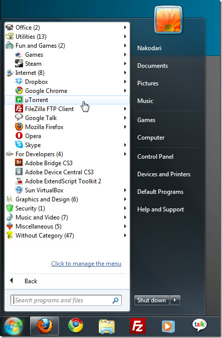
Handy Start Menu groups all programs into popular well-known categories. Instead of browsing a large pile of random folders and applications, this organized approach makes it much easier to find a certain application.
Simply launch the tool and it will automatically group the applications and folders into their respective categories. There are a total of 10 categories – Office, Utilities, Fun and Games, Internet, For Developers, Graphics and Design, Security, Music and Video, Miscellaneous, and Without Category.

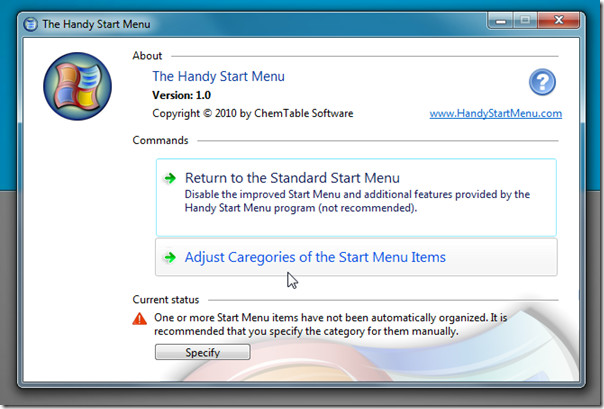
Handy Start Menu sits in the system tray and can be disable in one click by either using the right-click menu or from it’s main interface.

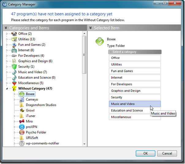
You will find many applications and folders without any category. To organize them into their respective categories, you need to manually specify the category for them. First select the application or folder from the left pane and then select the category from the right pane.

Once all programs have been assigned to their category, click OK. Simple as that!
Overall, we found it to be a very useful and highly productive tool which greatly helps in finding the applications faster and reduces the time it takes to search for them.
It has been developed exclusively for Windows 7, we tested it on both 32-bit and 64-bit OS.

I am quite surprised at how well this software arranges programmes into groups. I kind of expected that almost everything would end up in “without category”.
I only discovered this app the other day. It is awesome, and finally makes the windows menu usable. Many thanks, I have shown it to my boss yesterday, and he loves it also. 🙂
Glad you found it useful!
There is also a re-draw issue when the scroll bar appears during opening / closing categories.
and the font is less than optimal, icons could be configurable too i.e. small / large
and user defined categories — dude, its just a matter of changing the label
nice try though, have removed it until these are addressed
I too have this display problem but am using Vista.
I clearly mentioned that it is for Windows 7 only. You will encounter problems in Vista because it is not build for it. We tested it on our Windows 7 x86 machine and didn’t encounter any problems.
I have a windows 7 x64 pro. It was upgraded from a Vista Ultimate.
Thank you. I have the same system but it’s a new machine, not one upgraded from Vista. I’m guessing I’d have the same problem. I guess I will hold off until they fix the problem.
Seems like a cool app but on my system all the fonts in it are way too light to read and there is no way to adjust the font settings that I see. If they fix this issue I may use it.
Would you tell us what your system is so others might know whether to expect this problem on their systems?
Thank you.