Musix Is A Gorgeous Music Player With ID3 Tags And Playlist Support
Music is a significant part of life for many people. It can make them feel happy or sad, help them block outside stimuli and work better, help them relax, or just help them bust out a move. While these days music can be streamed directly from the internet using services like YouTube and Spotify, the local media library on your computer is often consumed and managed by an offline music player such as WinAmp, JetAudio, Media Monkey and iTunes etc. If you’re looking for a desktop music application that flaunts gorgeous interface then Musix is worth giving a shot. Besides its eye candy UI, the application is focused on providing you all the basic functionality you’d have in other similar apps, such as ID3 tags support, playlists creation, and ability to play MP3 and FLAC files.
Flat UI designs are all the rage these days, Apple got rid of skeuomorphic interface in iOS7, Microsoft turned to Modern UI in Windows 8 and Google is also aiming to go minimal with every new Android release. Musix is no different in this regard, its dazzling design comprises heavily of jet black color coupled with a user-changeable secondary color scheme.
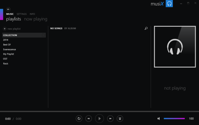
The main UI carries a playlists column to the left, the album cover preview to the right, a few main button for navigation at the top (Music, Settings and Info) and playback controls at the bottom. Upon firing up the first time, the first thing you need to is direct Musix to your music library.
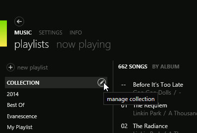
To do that, click Music > Playlists followed by clicking the small button that appears over COLLECTION option in navigation pane under the MUSIC section.
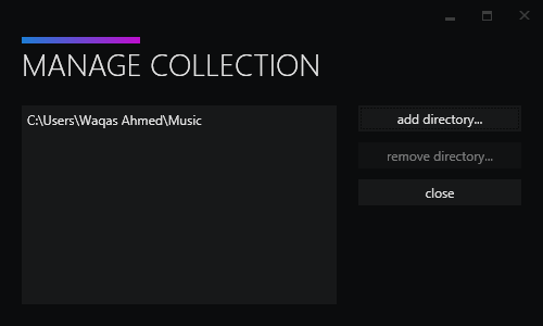
This will open a Manage Collection window, which is used to add the directory that contains your music files. The application supports all the mainstream media formats including FLAC, MP3, OGG, WMA etc. You can specify multiple directories at once and Musix will automatically add music from those folders to the library.
After the specified tracks have been successfully added, you can simply double-click on one to play it. Musix lets you create custom playlists to keep things well sorted and well organized. After naming a playlist, you can drag n drop song(s) on a playlist to add them to it.
The application also boasts a search bar for instantly finding the tracks you’re looking; click the small magnifying glass button at top right area (next to the album art). To view a song’s metadata information, right-click it and select Edit Song info in the context menu. The built in tag editor enables you to either manually enter song information or update via internet if supported.
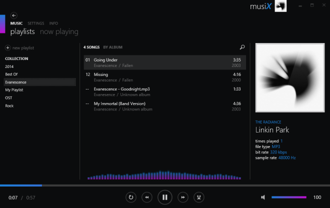
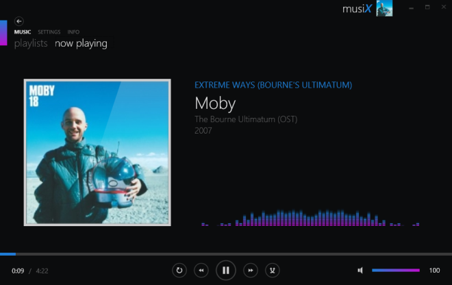
The song that’s currently playing shows up under the ‘Now Playing’ section, where Musix displays the name of song, artist, year and other pertaining details. The app doesn’t have a comprehensive set of visualization effects, but the one that it has looks pretty amazing. Other than that, Musix also boasts the basic shuffle and loop (repeat) functionality.
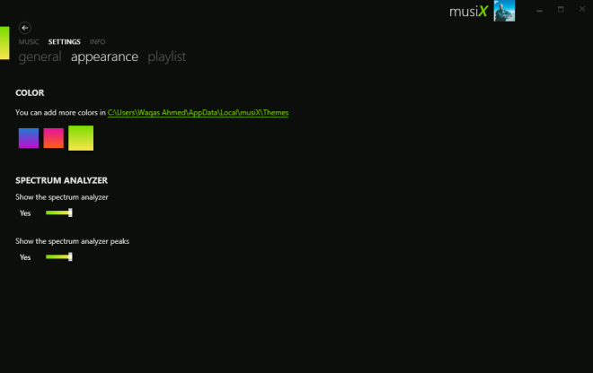
The last interesting bit is the Appearance tab under Settings option which allows you to change the secondary color scheme, and toggle options like spectrum analyzer and its peaks. Additional generic options can be found under Playlists and General tabs.
Musix is a definitive choice for users who love elegant looking apps and require only the basic set of music player functionality. It works on all versions of Windows operating system.

The Flat UI approach to that music app is flawed. It is like someone has got a new hammer and goes everywhere hitting everything and thinking it is useful. A hammer is useful only with a nail. My point is music applications are not about the interface. It is about functionality and less about form. The app has to fade away to give space for the music. I personally have used Winamp and the interface has not changed dramatically since 10 years. It is true that it appears dated but it works.
I start Winamp and minimize it to the background to give way to the music. Aside from the occasional changes and jumps to playlists, I don’t want the app to fill my space.
This is my approach to music consumption. Personally I don’t think this app does anything revolutionary.
Thanks Waqas
You’re welcome, Abdelfatah.
It’s a nice looking player, that’s for sure, but there are a few things that I don’t like:- Library management in this is nonexistent. Also, if you have a very large music library like me, it’s gonna choke on it.
– Slug McSluggish, really, it’s even worse than iTunes or ZUNE.
– FLAC playback causes some major slowdowns.
– No incremental search.
– It’s misreading tags and can slap random albums under one header.
– It’s just another music player that doesn’t offer anything new, no customization and no plugins. (I know it may be too early to say that but whatever).
Very similar to Zune. It’s even as slow as Zune. Caused some very annoying mouse jumping on my system, again, just like Zune. It’s attractive looking, but I’m not personally fond of music players that operate based upon libraries and playlists – I prefer drag ‘n drop from the OS file system along with on-the-fly song selection without having to search. It has potential, but needs some optimization and UI improvements. JMHO.
When I see this, I think of the Zune media player by Microsoft. Musix seems to have copied many of Zune’s best aspects.
I like and still use Zune to this day. Perhaps I can use Musix on my laptop…. I’m hoping it’ll support my media player too!
I took it for a spin and while it looks nice, it’s clearly pretty early in its development. Things i noticed…
– It’s veeeerry slow. It needs quite a bit of optimization.
– With a large collection it’s very hard to get to what you want unless you want to use Search for everything, otherwise you’ll spend all your time scrolling. There should be a Letter system like Windows Phone App list uses or something.
– The Gradients and Reflection aspects looked a little dated. Maybe pure flat colours instead.
– No ‘Artist’ view so it can collect a number of Albums under one heading instead of spreading them out album after album.
Potential though.
Looks like it has lots of potential.
I use MusicBee at the moment, but it does all sorts of weird things when it comes to sorting my collection and misreading id3 tags. Will give this a go.