MPC-BE Is Media Player Classic With Better UI & More Options
Media Player Classic probably needs no introduction. The feature-laden open-source audio and video player has earned quite a reputation and is considered as one of the best media player available for Windows, among the likes of KMPlayer, GOM Player and VLC etc. The only downside however, is the player’s UI that’s reminiscent of Windows Media Player from Windows 95 and 98, that might not likely please everyone. Being open-source software, it allows anyone to custom-tailor it to their needs. If you want the features of MPC with some added eye candy that brings its UI out of the 90s, give MPC-BE a shot. It’s a revamped version of Media Player Classic that – according to its developer – not only looks better than MPC, but also performs faster. Furthermore, MPC-BE isn’t merely about new looks; the developer has also thrown a bunch of extra features into the mix. Let’s find out more about the player after the jump.
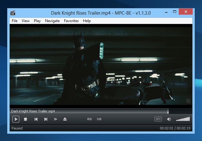
The most significant difference you will notice is the complete UI overhaul, particularly around the navigation area. The black-themed design looks better than MPC’s Windows 98-esque looks. In addition, it also lets you know whether the current video playback is being hardware-accelerated by your GPU or not, by showing you the GPU icon near the volume slider. The navigation bar looks pretty sleek, and houses all the basic controls for pause, play, stop, next, previous, open file and volume, as well as the seek bar. You may also quickly change audio and subtitle streams via their handy buttons in the navigation area. Just like MPC itself, the app handles most audio and video formats without any hiccup.

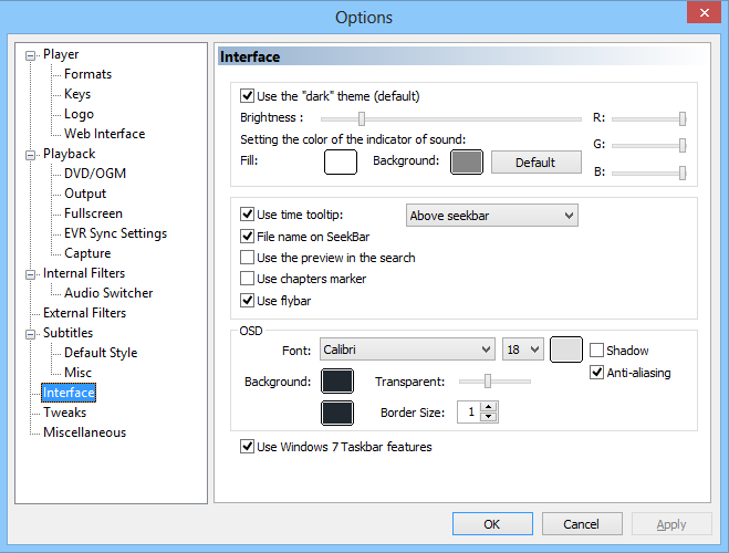
Apart from the main UI, you will also find several changes in the Options window. To open the Options panel, click View > Options on the menu bar. If you have seen the options window of MPC, you’ll notice a few new sections here including Full Screen, EVR Sync Settings, Capture, Interface and Miscellaneous. Each of these sections offers several additional configuration options not available in the original MPC. Furthermore, you will also find a few more options to play around with in some of the sections common to both apps.
One additional settings panel that is not available on the original MPC is Interface. Here, you can make several cosmetic changes including the theme color and brightness, OSD, RGB, anti-aliasing, tooltips, font etc.

To sum it up, if you’re a fan of MPC, MPC-BE is definitely worth a shot as it give you everything offered by the former, and adds much more to it in form of the UI overhaul and the additional options. MPC-BE is an open source application and works on Windows XP, Windows Vista, Windows 7 and Windows 8. Both 32-bit and 64-bit OS editions are supported.

The interface and look is much better however; I compared many videos and found two issues.
1. Videos are not as sharpcrisp as the regular MPC HC
2. Videos also are darker which hides details
So overall I would say its not worth moving to MPC BE until it matched the video quality of MPC HC.
sorry waqas but its video output quality is lower than standard MPC
This is an accurate statement even with the latest build still not as sharp on video as MPC HC.
I have latest Klite codec pack installed, but some formats do not work when played such as .mkv,but play on standard MPC HC. Therefore I have since un-installed it.
How does MPC-BE compare to MPC-Home Cinema?
+1
Ive found it to be a tad darker and not as sharp in some cases. I tried it on Ringo and MPC HC looked about 20% sharper. I have no codecs installed so its just straight up against one another.