Hands-On With The All-New SugarSync For Windows & Android [Review]
SugarSync needs no introduction in the cloud storage realm. Those of you who are using the service would be delighted to learn about the complete overhaul that the company has brought to the table. Meet the all-new SugarSync beta for Windows and Android. Although it’s currently in public beta, the latest variant is arguably a huge leap forward in terms of design and features. The biggest change is probably the revamped interface, for both the desktop and Android offerings. The company has done away with the cluttered File Manager, which worked as a default portal for managing synced content on Windows and Mac. Along with that, there’s a new SugarSync Drive feature that creates a virtual disk on your PC, making file syncing way more lucid. Does the new UI, iDisk-esque functionality for PC and faster syncing capability make it better than its arch rivals? Let’s find out!
SugarSync 2.0 For Windows
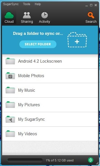
As much as SugarSync was lauded for it’s feature-laden interface, it was equally loathed for being quite difficult to use. The new version is designed to take care of all those issues that plagued prior to Version 2.0. The fresh UI is not only more compact, it does look quite fascinating, too. It houses four main tabs at the top named as Cloud, Sharing, Activity and Search. Cloud displays all the synced folders that made their way to SugarSyc from intertwined devices. To add a new directory, click Select Folder or simply drag and drop the target directory over the application window. The status bar at the bottom lets you know of the available space on your cloud.
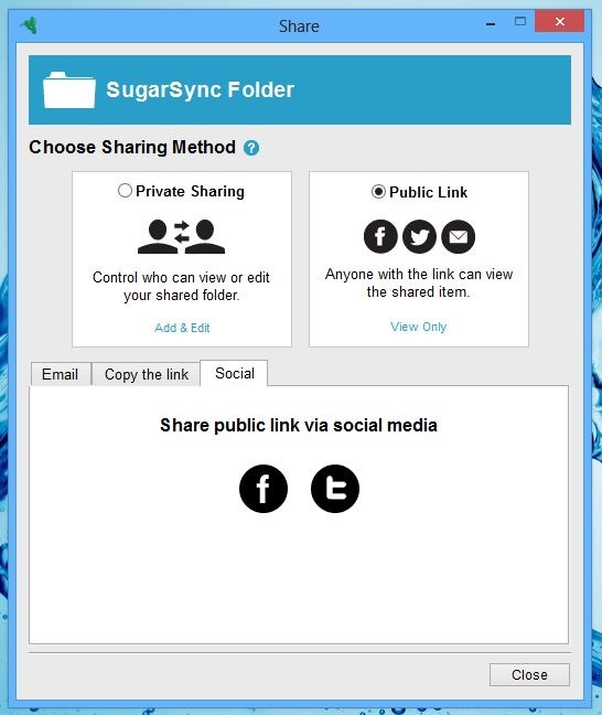
Since, SugarSync is also about sharing files and collaboration, the procedure to share files has also been reworked. Akin to synching the files, you can drop the file over the contact’s name within the Sharing tab. Another noteworthy feature is that, you can share a selected folder with anyone on your Facebook or Twitter account, or simply share the link through the email.
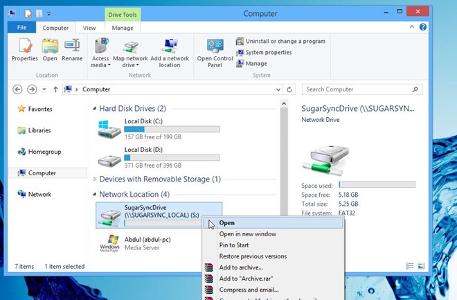
Another nice touch is the new SugarSync Drive. Everything you sync to the cloud appears inside this virtual drive – something entirely new as compared to services like Dropbox. It’s a perfect way to keep an eye on how much cloud space is left. On top of that, you can easily manage the content stored within this drive. It feels nice that you can search and locate files within the Windows Explorer, as if it’s stored right on your computer.
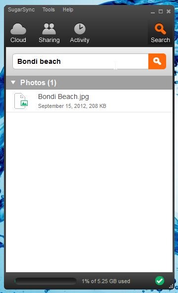
The Search tab will come in handy if you have lots of files synced to your account and don’t have much time at disposal to look for a specific one. This is a new function which instantly finds files and folders stored online. During testing, I tried performing a handful of different searches and it worked like a breeze.
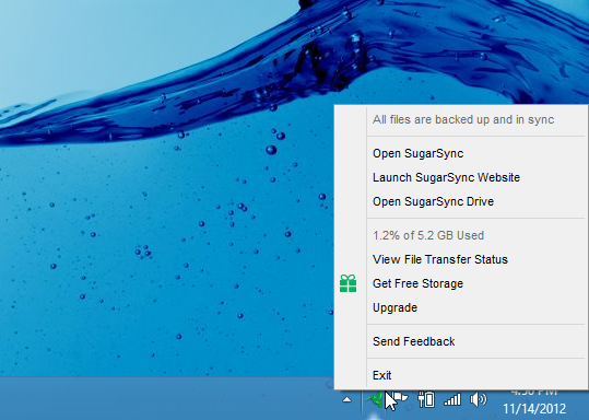
Akin to most cloud storage clients, SugarSync sits on the system tray, quietly performing all the syncing operation. The right-click context menu lets you launch SugarSync (desktop or web interface), open the Drive, view file transfer status or exit the app.
SugarSync 3.7 For Android
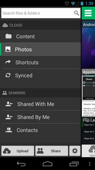
As with the desktop client, the Android client of SugarSync has been totally revamped. Following the latest design convention, the app has shunned the archaic UI to make way for a more contemporary, Holo-ish interface, which certainly has to be lauded as one of the app’s high points. The introduction of the left sidebar helps navigating to the search bar, cloud content, photos, shortcuts (bookmarked content), synced & shared data, contacts and your recent activities. Also included within the sidebar are the options to upload select content, share items with your mates, and access the app’s main settings screen.
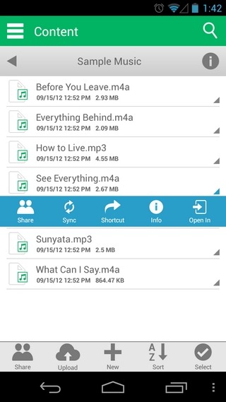
Nothing much has changed from the app’s basic configuration’s perspective other than the addition of the toggle for keeping the sidebar permanently enabled in landscape orientation. Looking at the app’s home screen, we find that the option to switch between contents of a specific device are now accessible via a drop down instead of the old-school style selection from under the “Devices” menu. The support for creation of new folders seems a fresh addition, too, as do the option to sort content alphabetically, and batch-selection of files to include them within the sync mechanism.

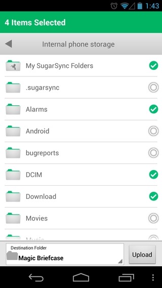
Album and photo thumbnail previews have been enlarged substantially, and there’s a whole lot more that can be done with these images (as well as any file), such as batch selection of content to share, sync, bookmark or open them via third-party file viewers. The app lets you stream videos & music on-the-go, and as ever, the option to browse photos in high resolution is there, too.
Just as a reminder, the Holo-themed Android client of SugarSync (v3.7) is still in beta, so it’s not yet available in the Google Play Store. You can, however, lay your hands on the revamped mobile app by downloading its APK from the link provided below. iOS and Windows Phone users can do nothing but wait for the release of the beta variant for their respective devices.
Download SugarSync 2.0 For Windows
Download SugarSync 3.7 Beta For Android
Waqas Ahmed and Abdul Rehman contributed to this article
