A Complete Guide To Type In Photoshop [Tutorial]
In Photoshop, Type consists of outlines based on vector graphics. Typeface, on the other hand, is a set of one or more fonts in different sizes designed with style and each comprising a coordinated sets of elements of writing. There are a number of typefaces available in more than one format. The most commons ones are TrueType, OpenType and New CID. Photoshop has some vector based capabilities as well. They can be well recognized in type (text) layers. You can easily use them when you resize or scale type, save it in formats like PDF or EPS, or simply print the image to a PostScript printer. So keep in mind, that its completely possible to produce type with crisp and key resolution edges in Photoshop.
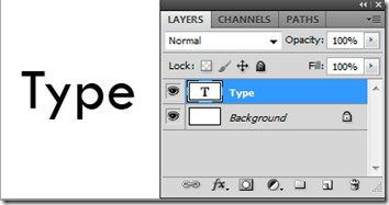
Type Layers


There are three ways in which a type can be created: at a point, inside a paragraph, and along a path. Point type is a horizontal or vertical line of text that begins wherever you click on the clipboard or image. It becomes useful if you only want to add few words to your created image.
Paragraph type uses boundaries to control the flow of entered characters, horizontally or vertically. This becomes useful when creating brochures. Type on a path flows along the edges of an open or closed path. When text is entered horizontally, characters appear along the path perpendicular to the baseline. And when entered vertically, they appear parallel to the baseline. The text will flow in the direction in which the points were added to the created path.
To edit type, simply click an image with a type tool. When in edit mode, you can enter and edit text and perform other commands which we will look into further. Select Move Tool to go back to normal working mode. You can convert point type to paragraph type to adjust the flow of characters properly within a box. Similarly, you can convert paragraph type to point type to make each text line flow independently. To do so select the type layer in the Layers panel. Choose Layer > Type > Convert to Point Text / Paragraph Text.
Horizontal & Vertical Type Tools

Text Tool Bar

The main text tool gives you the features like tool preset picker, text orientation, font family, font style and size, anti-aliasing method, align, text color, create warped text and character & paragraph panel. We have reviewed the tool preset picker above as horizontal and vertical type tools. Toggle text orientation is a quick shortcut to it. It determines the direction of type lines in relation to the document window or the bounding box. When a type layer is vertical, the type flows up and down; when horizontal, the type flows from left to right. You can simple enter a type and adjust it to vertical or horizontal orientation. Font family, style and size are to the point when making type selections.
Anti-aliasing produces smooth-edged type by partially filling the edges. As a result, the edges of the type blend to the background layer. When creating images for the web, anti-aliasing greatly increases the number of colors in the original images. It reduces users ability to reduce the size of image file. The anti-aliasing options available are sharp, crisp, strong and smooth. Moreover Text can be aligned and color can be set.

You can create warped text to add certain affects to your text layer. It wont rasterize your text layer and you can make additions to your text later on when required as well. Text wrapping styles include arc, arc lower, arc upper, arch, bulge, shell lower, shell upper, flag, wave, fish, rise, fisheye, inflate, squeeze and Twist. Settings can be done by further modifying the orientation (horizontal & vertical), bend, and distortion (horizontal & vertical).
Character Panel

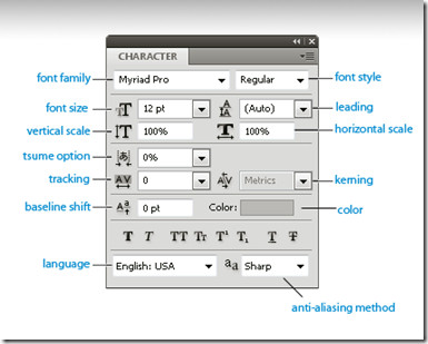
Line character and spacing can be adjusted by setting a lead. You can open the character panel right next to your clipboard and see the changes in effect instantly. Kerning is the process of adding or subtracting space between specific pairs of characters in a text layer. You can automatically kern type using metrics kerning or optical kerning. Metric kerning uses kern pairs to notify about the spacing of specific pairs of letters set by font style. However, when a font includes only minimal kerning or none at all, or you use different type faces in the same type layer, you might want to use optical kerning. It adjusts the spacing between characters based on their shapes.
Use baseline shift to move selected characters up or down relative to the baseline of the text surrounded by it. It is useful when you are adjusting the position of a visible font. Select the characters or type objects and set the baseline shift option. Positive values move the baseline above the original baseline and negative values move it below the baseline.
To turn on tsume option, you must select Show Asian Text Options in the Type Preferences to appear in the character panel.
Formatting Paragraphs

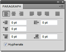
The settings you are going to choose for hyphenation will affect the horizontal spacing of lines and the overall appeal of type on the clipboard. It determines whether words can be hyphenated or not. Choose Hyphenation from the paragraph panel and specify the option which include hyphen limits, zones, capitalized words etc. These settings only be applied to some characters.
Words can be prevented from breaking at the end of each line. Select the characters you want to prevent from breaking and choose No Break from the character panel menu. The text might wrap, if you apply no break rule to a adjacent characters.
Type Effects
A number of effects can be applied to type layers to change their appearance. We already mentioned above using the wrap effect from the text tool bar. You can convert type to shapes, add drop shadow, inner glow and a number of other options from layers blending panel. Type characters can be used as vector shapes by converting them to a work path. It is a temporary path that appears in the Paths panel and defines the outlines of the shape. You can save it and manipulate it after creating a work path. To do so, select a type layer and choose Layer > Type > Create Work Path.

Some examples of type effects using blending options like drop shadow, bevel and emboss, inner & outer glow, pattern overlay etc. Click the layer style button on the Layers Panel or simply right-click and enter into Blending Options. You can fill type with an image by applying a mask to an image layer placed above a type layer in the layers panel. Click here to read a full review.
Rasterizing
Some tools applied in Photoshop, such as filter effects and painting tools are not available for type layers. You must rasterize your type layer before applying any such effects. Rasterizing converts the type layer into a normal layer which makes its content editable to any extent. Once you try to apply such an effect on type layer, a warning message will appear stating that the it requires to be rasterized. Most warning messages provide an OK button, which will rasterize your text layer.
There is much more achievable just for type interfaces in Photoshop. All you have to do is play with all the basic options available including characters, paragraphs, styles, and blending options.

Problem. I want to set up a very simple Photoshop layout that needs two or more columns of text where the text ‘flows’ from one column to another. To be clear it needs to be so that if I delete a line in column one it is column two that becomes shorter. InDesign of course does this, can it be done in Photoshop?
Problem. I want to set up a very simple Photoshop layout that needs two or more columns of text where the text ‘flows’ from one column to another. To be clear it needs to be so that if I delete a line in column one it is column two that becomes shorter. InDesign of course does this, can it be done in Photoshop?
I must say, the series of Photoshop posts is really great for newbies and beginners alike – great job!
I read the complete guide to layers yesterday, and today we got this really comprehensive , detailed review on type ..!!! vary nicely done!. keep it coming! its a great help for beginners!