Toogles Is A Cleaner Alternative YouTube Interface With Better Search
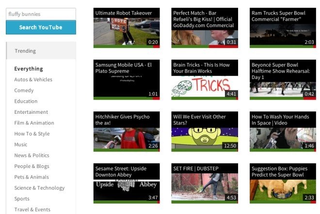
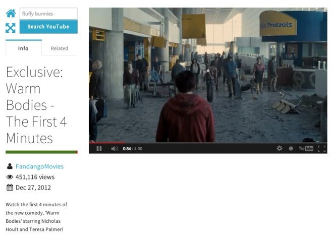
YouTube’s been redesigned twice in the last year. It definitely has an improved interface now, but it’s not exactly what you would call clean. There are video suggestions, ads, promotional backgrounds, comments, likes, share buttons, and the video player itself, making it all look quite busy. Toogles is an alternative web interface for YouTube that takes a different approach to presenting videos hosted on it. Popular videos all appear on the front page of Toogles, and a sidebar on the left takes care of search filters and video categories that you can switch between. When played, a video is given maximum space on a page, with its description and number of views appearing on the left in one tab, and related videos in another. The page resizes automatically when the window is resized, ensuring that the video player continues to get maximum space. The share functions are hidden behind a small button in the video’s title bar that appears when you move your mouse over the player. The left bar can be collapsed to give the video player even more space.
Toogles’ landing page shows you popular videos by default, and the bar on the left lists the video categories. You’ll notice a search bar and a blue ‘Search YouTube’ button. Click it to switch to search mode. You can use the search bar without switching to search mode, but the latter gives you filters to narrow down the results. These filters allow you to sort videos by relevance, upload date, number of views, and rating. The time of upload can be switched from the current day to the current month. Lastly, videos can also be filtered by their length; for instance, videos shorter than four minutes or longer than twenty minutes can be filtered.

When a video is played, it occupies most of the page. A full-screen button at the top of the left bar (which now shows the video description and stats) lets you collapse the left bar itself. As the name implies, the ‘Related’ tab lists all videos related to the current one. Comments are hidden altogether, as is the number of likes/dislikes. When you hover your mouse cursor over the top-right region of a video, a share icon becomes visible, and clicking it reveals sharing options.

Toogle’s interface is quite clean, but it won’t let you sign in to your YouTube account, which can be a major drawback for some. In that sense, some functionality is definitely sacrificed for the cleaner interface. There is considerable wasted space below a video but other than that, you’ll find Toogles gives you a reasonably goo
d viewing experience, especially compared to the default YouTube interface. Toogles also has a Chrome extension that will open all YouTube links on Toogles by default, instead of YouTube.
Install Toogles From Chrome Web Store
