Responsive Inspector For Chrome Is A Great Learning Tool For Responsive Design
Chrome isn’t very big on developer tools, and that’s one of the reasons why Firefox is the go-to browser for most developers. However, for those who do use Chrome, there are many extensions available to help them out in this regard. Responsive Inspector is a Chrome extension that can rightly rival the Responsive Design View that Mozilla introduced in Firefox 15. Responsive Inspector is a two-in one tool; it shows you the screen sizes a website is optimized for, and quickly lets you switch to a different one from the pop-up. Furthermore, it can take screenshots of a web page adjusted to any one of those sizes. For websites that are already optimized for certain screen sizes, you can view the CSS code responsible for that, making it a great learning tool for responsive design developers as well.
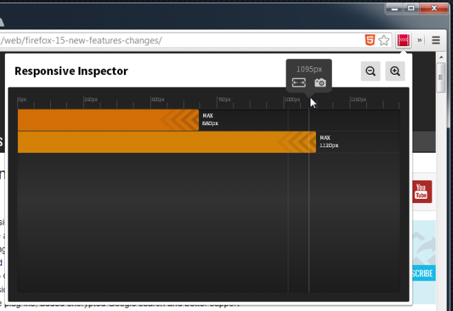
Responsive Inspector adds a square button next to the URL bar that opens a pop-up. The extension shows you all screen sizes that the currently loaded website is optimized for via bars. The screen size is written at the end of each bar, and a pixel scale at the top shows you different screen sizes. Move your mouse over the scale and for each calibration line, a pop will appear to show you the screen size it represents. On this same pop-up, there is a resize button as well as a camera button. Clicking the former will automatically resize your browser window to that width. You can then click the camera button to take a screenshot of it, if you like. The screenshot can be saved to your local drive, or uploaded to Behance.net. If you feel the need for a finer pixel scale, click the zoom in button to magnify it.

To view the CSS used to code the viewing options, hover you mouse over one of the bars that represent a screen size the website has been optimized for, and you will see a { } button appear at the end. Click it to view the CSS code in a new tab. The code is not directly editable, but you can copy it or use the inspect tool to make changes. Responsive Inspector mimics the Responsive Design View in Firefox fairly well; in fact, it wouldn’t be incorrect to say that the extension is a cut above the tool. Where Firefox gives you screen size presets, Responsive Inspector gives you an entire scale and lots of freedom, and then there is the screenshot tool. Presets would make Responsive Inspector much more useful though, and should be added. Though even without those, the extension works exceptionally well.
Install Responsive Inspector from Chrome Web Store
