How to Make a Graph on Google Sheets Without Hassle
Have you ever worked on a spreadsheet with a clustered appearance that makes you wonder if your recipients will ever understand the information conveyed therein? That’s why you need a chart to simplify the readability.
Thankfully, Google Sheets has the option to insert graphs and charts in a spreadsheet, which helps present your work differently and make it more intelligible. Inserting graphs in Google Sheets is relatively easy as you’ll be up and running with a few clicks.
Read on below to find out how to go about it!

How to Insert a Graph in Google Sheets
Google Sheets allows you to create and insert different types of graphs, from advanced radar charts to the basic line and bar charts. To create a graph of your choice on Google Sheets, follow the steps below:
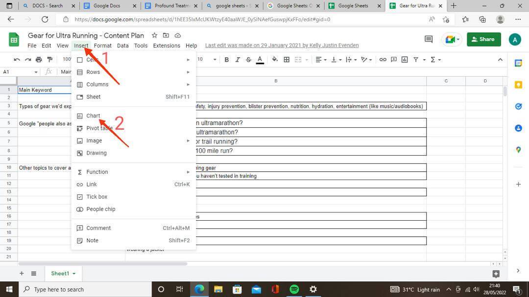
- Open a spreadsheet on Google Sheets
- Navigate to the top menu and click Insert
- Select Chart from the options to open the Chart Editor tool
- A basic, simplified graph will be created for you by default using the data already in your spreadsheet. Go ahead with it if you’re satisfied. Otherwise, use the following steps to customize your graph
How to Change Graph Type with the Chart Editor Tool
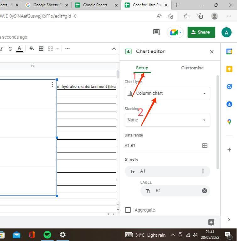
The Chart Editor mini menu automatically pops up on the right side of your screen when you select Chart under Insert in the top menu. Otherwise, you can double-click it if it doesn’t show up immediately. Follow the steps below to change your graph type with the Chart Editor:
- Go to the Setup tab in the Chart Editor menu
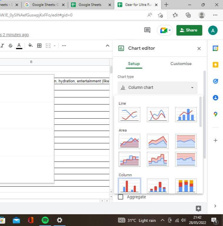
- Click the Chart Type drop-down to see alternate chart types, and then select any one of your choice
- Different chart types are grouped. Anyone you select from here automatically comes up on your spreadsheet using the already available data
How to Customize Charts on Google Sheets
Regardless of the graph or chart type you choose on Google Sheets, you’ll get various options to customize it to your taste, from the titles to font color and title format. You can do all these right in the Chart Editor menu. Follow the steps below:
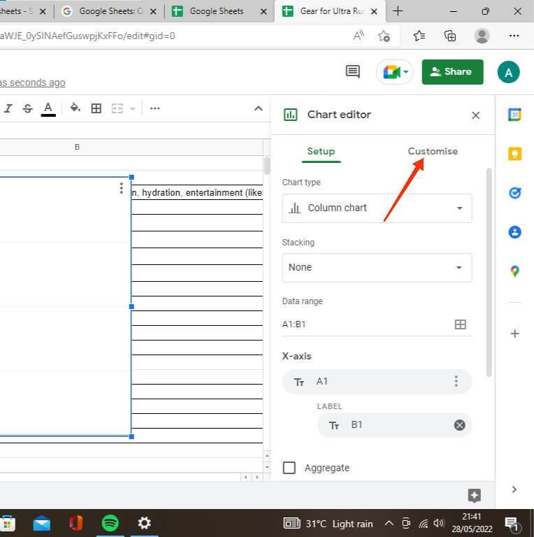
- Go to the Customize tab in the Chart Editor
- Select Chart and Axis Titles to edit your title texts. Google Sheets automatically generates title texts from available data. Use this option to change it as you desire
- Add Axis titles using the Chart and Axis Titles drop-down. Sheets doesn’t add this one by default; thus, you can use this option to make your individual chart axes more straightforward by adding titles.
- Customize fonts and colors using the Chart Style sub-menu. This gives you extra formatting options and makes each of your spreadsheets stand out and easier on the eyes. You also have the option to change background colors, as well as border colors, in this sub-menu.
Final Notes
As you can see, Google Sheets is just as robust as you’d expect Microsoft Excel to be. Although it has its limitations compared to the latter, the myriad of customization options regarding graphs and charts are enough to make any casual user of spreadsheets stick. We do hope you find this tutorial helpful.