Get Rid Of The Circles And Get The Old Twitter Interface Back
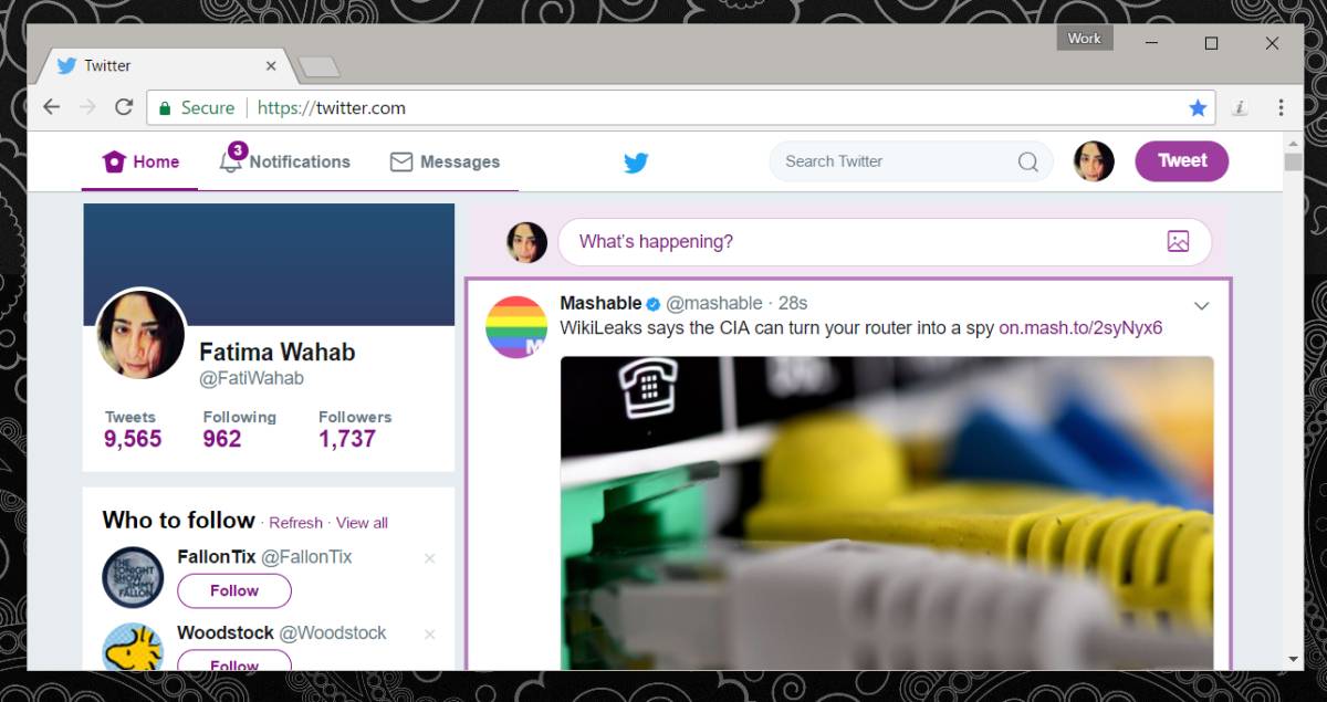
Twitter has just be received a design overhaul. This is certainly not the first major design overhaul the social network has gotten. Twitter has significantly updated its UI in the past and it was met with unhappy users. A more recent change that Twitter made was to remove the favorite icon, a star, in favor of a like icon, a heart. This update however is filing the corners off everything on Twitter. Profile thumbnails are now round. The icons are all different. There’s a new font. People are unhappy. The new UI has been rolled out to both web and mobile users. If you use Twitter from your browser, then you can get the old Twitter interface back with Twitter – Old design. It’s a Chrome extension that restores the Twitter UI you love.

Get The Old Twitter Interface Back
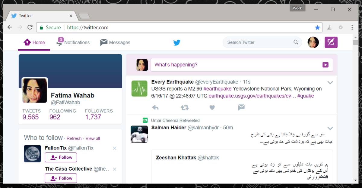
Install Twitter Old Design and refresh Twitter. The old design will return in all its glory.

The extension restores the Twitter UI to the one you were using just a few weeks ago. It’s for everyone who doesn’t like the new font, icons, and circles.
The extension isn’t going any further back. As we mentioned earlier, this isn’t the first major UI overhaul Twitter has had. There have been at least two in the past but Twitter Old Design returns you to the most recent one. There is, as yet, no Firefox add-on that does the same thing but it can’t be too far behind. It took Twitter 24 hours to stir up rage against its new design and this extension was developed soon after.
Of course this doesn’t do much if you use Twitter on your phone. Twitter’s new UI has been added to it official iOS and Android apps. Maybe someone will clone the Twitter app, restore it to its old UI, and package it for Android users but iOS users are out of luck. The app’s old design is hardly worth jailbreaking an iOS device over and there’s no guarantee anyone will develop a way to get the old Twitter interface back.
Is It Bad?
It’s not. It’s just different and people are averse to change. Perhaps it doesn’t look as good in a desktop web browser but on mobile it’s an improvement. The font and its color is easier to read. The design seems to have been somewhat unified across iOS and Android which is a good thing. You can now access your profile and your settings the same way on both apps. There are still differences though but we’re not complaining too much.
Install Twitter Old Design From The Chrome Web Store

Is it possible to change the circles in direct messages back to the old squares? Any extension floating around including that?