Get Responsive Embed Codes For YouTube, Instagram, Google Maps & Vimeo
Embedding web content such as YouTube videos is pretty easy, since the service gives you the embed code and you need only paste it. The problem is, if you’re pasting the link into a website that has a responsive design, the video frame will not resize because the embed code itself is not responsive. Same goes for embeds from Google Maps, Vimeo, and Instagram. If you know how to, you can always edit the code yourself to make it responsive, but a much faster and easier way to do is by using Embed Responsively. It’s a web app dedicated to providing you with responsive embed codes for content on services like YouTube, Vimeo, Google Maps, and Instagram.
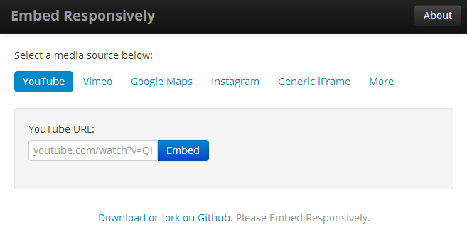
Using Embed Responsively is simple enough. You will first need to find what you’re embedding, be it a location on Google Maps, a video on YouTube or Vimeo, or a photo or short video on Instagram. You need not copy the embed code from the service’s own feature; simply copy the URL for its page. Next, visit Embed Responsively and select the same service there from the options available.

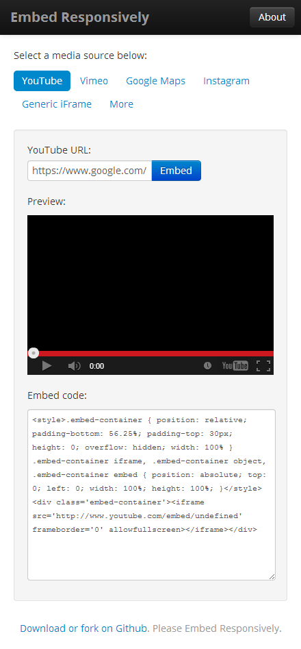
Paste the URL that you copied from the service, and click the ‘Embed’ button. You will see a preview of the video, map, or image that you’re embedding, and its responsive embed code below it. Now all you have to do is paste the embed code on your website like you would with any other auto-generated embed code, and it will work responsively, resizing itself as per the screen size.

It goes without saying that if you want the responsive embed code to work as advertised on your website, the website itself must have a responsive design to begin with, or there will be no point in using responsive embed code. This is because it is your website that has to detect a change in screen size. You can test the code out on the Embed Responsively website itself by pasting a link and then resizing your browser window. You’ll see that the preview that’s generated there resizes as you change the size of the window. It also takes care not to stick to the very edges of the window, leaving padding on either sides.
It might surprise some to learn that the embed code from websites such as YouTube and Google Maps isn’t responsive, especially when services like Twitter and SoundCloud give users a responsive embed code by default. Embed Responsively also helps you find other services that do so, under the ‘More’ tab.
[via The Next Web]

thanks for sharing, used it to make google maps responsive, and it worked.
Good Article!