Compare Two Fonts By Superimposing One Over The Other Using Tiff
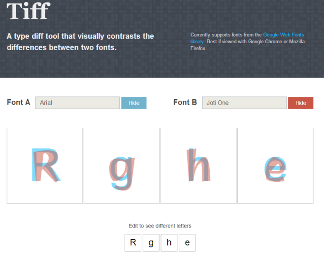
Selecting the right font for a project can get to be quite tough, and not simply because of the large variety of fonts that exist. For the untrained eye, spotting the differences between certain similar-looking fonts can be really difficult because you might not know what to look for. If you think about how some fonts have very subtle differences to begin with, you might wonder if it is at all possible to distinguish one from the other without some tedious examination. Tiff is a web app that makes this process simple. Dubbed “a visual typeface diff tool”, it lets you compare any two fonts from the Google Web Fonts library by superimposing one over the other in two different translucent colors, allowing you to see how the same letters from two different fonts differentiate from one another.
When you first visit the app’s home page, you’ll see that Helvetica has already been selected as one of the comparison fonts. Click the ‘Hide’ button and you will be able to edit it. The app will only compare Google Web Fonts, searching for them live as you start typing the name, and letting you select from one of the auto-fill options that pop up. Simply select two fonts to compare and click ‘Display’. The color of the ‘Display’ button corresponds to the color that font is shown in, in the comparison.

By default, the tool compares four letters: R, g, h, and e, which are good for seeing how curves, letter feet, backs, and loops are made in the font, but you can check the difference between other letters too. Click one of the four boxes at the bottom, and type in a different letter; it will change in the box above too, and you can compare the differences.
You can’t write out full sentences to compare them, though that shouldn’t be an issue since the very point of Tiff is to be able to spot the differences in individual characters of a font, and it does that remarkably well. While the tool would be most beneficial for those who can’t spot such differences too well by themselves, even designers with a well-trained eye can use the tool to explain these subtleties to their clients.
For anyone learning about fonts, the tool can be just as useful, since it shows you the subtle things that differentiate one font from the other. The only change, if any, that might benefit the app is to allow users to save the results. It need not be anything elaborate that requires sign up; a simple snapshot of the differences should do just fine.
[via The Next Web]
