Ubuntu Touch Preview: A Complete Hands-on Feature & Interface Analysis
Since smartphones and tablets got into the hands of masses from being niche devices after the release of the iPhone in 2007, we have seen many players such as Android, Windows Phone, WebOS and MeeGo enter the field, some of which have stuck around and done well, while others have been pushed into oblivion by the tough competition. Nevertheless, it’s a lucrative industry that’s been attracting several other big names lately, the latest among them being Ubuntu Touch for Phones and Tablets. Recently, Canonical released the first Developer Preview of its touch-centric Linux-based OS to give users an early taste of things to come. Does it have what it takes to survive in today’s highly competitive industry, or is Canonical too late to the game? Let’s find out in our review of Ubuntu Touch Developer Preview.
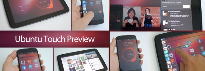
The Making
Considering how far smartphones and tablets of today have come, it is becoming increasingly difficult for a new entrant to come up with an entirely new user interface that doesn’t draw inspiration from what’s already out there, and Ubuntu Touch is no exception. However, before we get into details about what it brings to the table, let’s take a brief look at the user experience offered by a few other mobile operating systems that aimed to change how we interact with our devices.
Today’s mobile industry is dominated by two names when it comes to operating systems: Android and iOS. Though Apple’s offering remains basically a mere grid of icons with basic task switching and an Android-like notification pull-down when it comes to the UI, and Android only started to work seriously on its UI since the introduction of Android 4.0 ICS last year.
In addition to these two, there’s also Microsoft’s Windows Phone that has gained a lot of positive critical reception but hasn’t been quite lucky in capturing a significant market share. That said, it’s actually Windows Phone that has managed to redefine the smartphone user experience with its extremely fluid Metro design language that aims to help users focus on content rather than the user interface itself, and we have seen the likes of Google take inspiration from this in their Magazine style interface introduced in Ice Cream Sandwich that also features fluid side-swiping gestures and large content-rich tiles in many stock Android apps.
Windows Phone wasn’t the only OS to think completely different in terms of the user experience; the ill-fated MeeGo had aimed to redefine the smartphone user experience as well, by eliminating buttons (both hardware and on-screen) entirely in favor of swipe gestures from the bezels – a concept that didn’t quite take off officially in any of the mainstream operating systems so far, but was greeted with arms wide open by third-party app developers, who have integrated it in countless apps to provide users with a more intuitive way to use their devices.
And before both MeeGo and Windows Phone, there was the also ill-fated webOS – Palm’s brainchild that was later acquired by HP with the company, but discarded as a commercial OS along with the devices it was intended to run on. At the time of its introduction, webOS had introduced several features such as the revolutionary card-based full multitasking and task switching UI later incorporated partially in both Android and Windows phone, and a universally accessible, completely unified notification system for all apps that was somewhat similar to Android’s offering, but considerably more feature-rich back then.
In case this has started to sound too much like a walk down smartphone memory lane to you and you’ve started to wonder if we have forgotten that this post is about Ubuntu Touch rather than other operating systems, that’s not the case, we assure you! We’ve brought it all up for good reason, as you’ll shortly see for yourself.
The User Interface
What Canonical has tried to do with Ubuntu Touch is bringing all the aforementioned innovative features of these operating systems together in a way to make them all compliment each other, rather than becoming a hodgepodge of everything but the kitchen sink. Though that’s not to say that they have merely ripped off everything from existing or past operating systems without adding anything of their own. On the contrary, despite taking at least one of the best features from each of the aforementioned operating systems, Ubuntu Touch successfully makes an impression of its own. It looks and feels very much Ubuntu – very much Unity, and in a great way!
Welcome Screen
When you power on the device, you’ll be greeted by a Welcome screen that speaks out Ubuntu, thanks to its choice of nature-inspired wallpapers in Ubuntu’s warm, natural colors. Then there’s the sole information widget that is currently a static placeholder but once fully implemented, it will cycle through a lot of information relevant to both your online and offline activities, ranging from the number of messages, calls and social media updates waiting for you, to the distance you’ve walked (which will be monitored by the device’s GPS when this feature becomes functional).
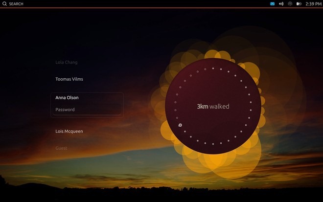
For most of us, phones are purely personal devices, while tablets are often shared by family members or borrowed by friends to do some casual browsing or watching videos, and Ubuntu Touch takes this into account. That’s why the tablet variant comes with pretty much the same multi-user login interface that Ubuntu offers in its desktop OS, complete with a Guest account for the latter scenario. In the Developer Preview, the multiuser feature isn’t fully implemented, and logging in as any user brings you to the same home screen merely with different wallpapers, but this is bound to change in a more stable release, with each user profile having its separate personal content much like in Ubuntu for desktop.
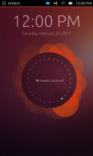
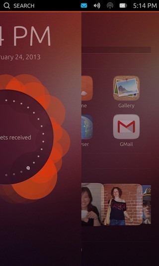
The phone version supports only a single user, and swiping leftward from the right edge of the screen gently slides the Welcome screen away to reveal the home screen. Sounds familiar? It’s the same gesture-based UI we’ve seen in the Nokia N9 running MeeGo. Using this gesture felt extremely comfortable on our Nexus 4 due to the way its front glass curves smoothly on both sides of the bezel without any raised surface to bump in the way.
Home Screens
Once you unlock the device, you’ll land on a gorgeous Home screen that looks unmistakably similar to the Unity dash from Ubuntu’s desktop OS, complete with horizontal content groups to keep it all organized.
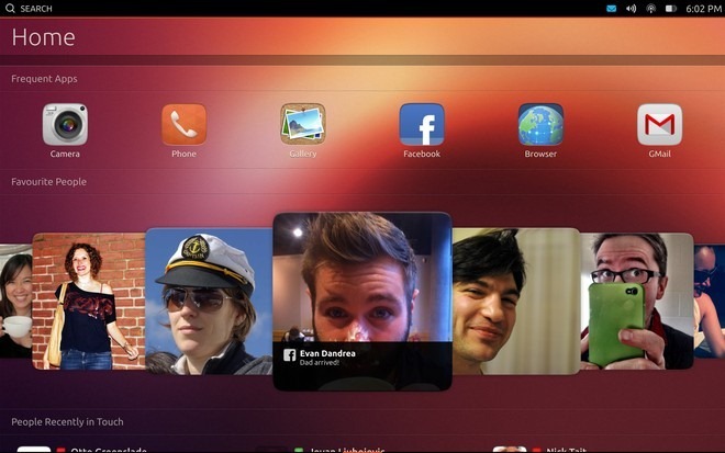
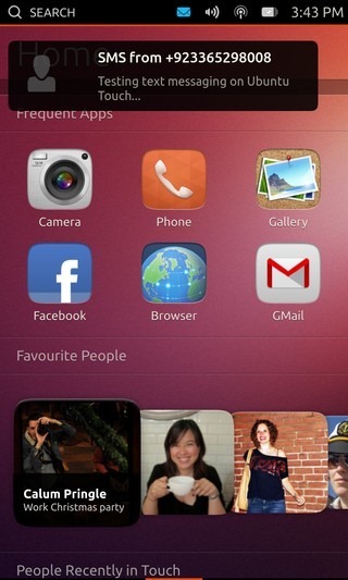
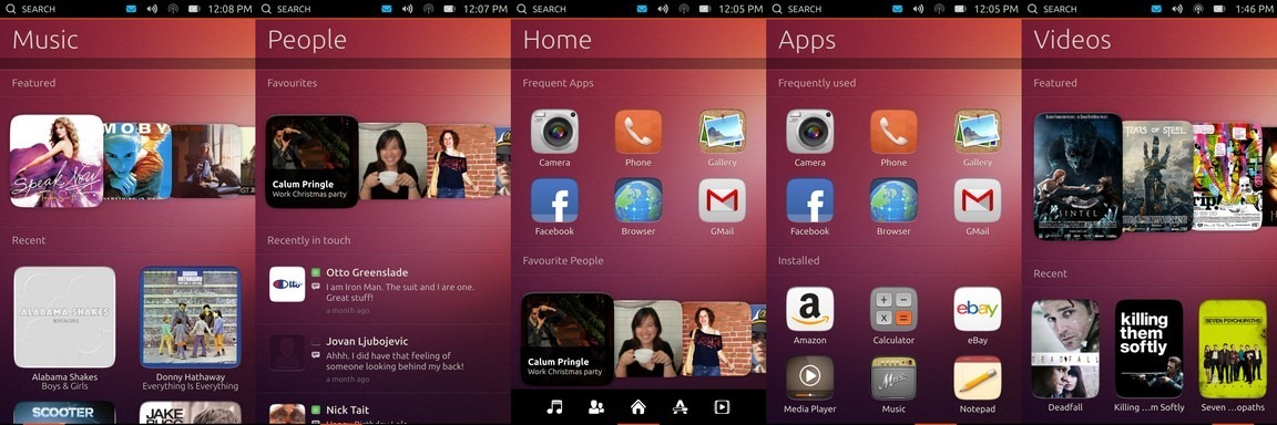
Scrolling sideways from the Home screen reveals similarly categorized screens for People, Music, Apps and Videos, providing you with quick access to your contacts and content without even having to launch any app first. This content-centric interface is in sheer contrast with Apple’s “There’s an app for that!” philosophy and from the looks of it, it’s definitely much more intuitive and immersive. Apart from scrolling between the different home screens, you can also scroll some of the individual content groups on each screen sideways in a carousel view, as shown in the screenshot above for the Favorite People group. This is similar to the design language used by Apple in the latest versions of some stock iOS apps, most notably the revamped iOS 6 App Store.
Apart from the differences due to screen size and orientation, all of these screens are identical on both phones and tablets. The Home screen is populated with groups for quick access to your frequently used apps, favorite contacts, people you’ve recently been in touch with, the music you’ve recently listened to, and the videos currently popular online.
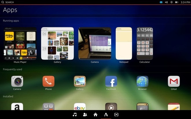
When you swipe to another home screen, you’ll briefly see a bar at the bottom with buttons for all your home screens for quickly jumping to them, as you can see on the Home screen in the screenshot above.The People screen shows you your favorite contacts on top, with recently contacted ones below them, complete with the content of your actual recent interactions with them. Below that, there’s yet another section for your recently added contacts to make accessing them even quicker, and finally there’s an alphabetically organized list of all your contacts.The Apps screen isn’t a mere grid of your apps either; instead, it lists all your currently running apps (if any) on the very top for quick access, followed by the most frequently used ones below them. Next are all the apps you have installed, and lastly there are the apps available for download.
The Music and Videos screens both offer similar groups for featured, recently watched, newly released and top charting/most popular music and videos respectively. Much of all this content other than the currently running, frequently used and installed apps is static in this preview, but it’ll update based on your device use in stable releases.
The current screen arrangement is in order of Music, People, Home, Apps and Videos, with Home being the default central screen. While keeping the Music and Videos screens apart on opposite ends might seem counter-intuitive, it has probably been done to provide quicker access to the People and Apps screens from the Home screen. One way to solve this would be adding the ability to loop through all the screens infinitely by swiping in the same direction, or allowing users to rearrange the screens in an order of their choice.
Launcher
Having quick access to all your installed apps from anywhere in the OS can be a real timesaver. On most mobile operating systems, you need to go to the home screen or app list to launch an app, which adds a step to the process. The Ubuntu Touch Launcher solves this by providing you an omnipresent list of apps that you can bring up from anywhere in the OS with a rightward swipe from the left edge of the screen. It works the same way as the Unity launcher in Ubuntu for desktops does when set to auto-hide.
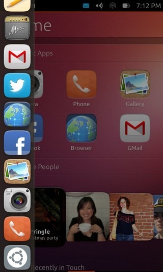
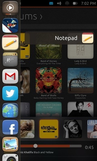
If you don’t lift the finger from the screen after the launcher shows up, you can move your finger vertically over the app icons to directly launch any app, as shown in the second screenshot above. This saves you yet another step, making the overall experience of launching an app both quicker and more fluid.
Context-Sensitive Search
Just like the search box in Unity dash, Ubuntu Touch comes with a universal context-sensitive search feature in form of a button built right into the top status bar to find anything, anywhere. This feature can be used on any screen that supports searching for content. While it is still available in the status bar on app screens, it’s not functional for any of the apps at the moment, but we’re guessing that’s only a limitation in this preview, and it’ll likely work for apps supporting search in a stable release.
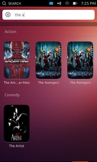
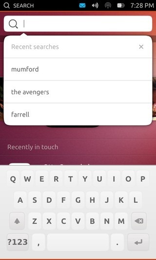
The feature works as you type, updating the results with each keystroke. Searching on the Movies screen shots movie results, while using the feature on the Contacts screen shows matching contacts. You also get to see a history of all your recent searches upon tapping the search box, allowing you to quickly search for those items again.
Keyboard
The keyboard is fairly basic for now. While it looks pretty OK, it offers no advanced features like gesture-based typing, autocorrect, suggestions, emoji etc. This could also be a developer preview limitation.
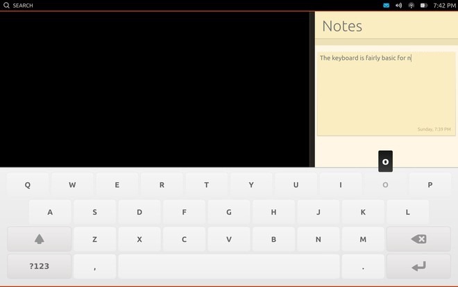
When it comes to the typing experience itself, it was rather OK on the phone, but the width of keys, the placement of the second and third rows, and the lack of any feedback made it more difficult to type on a tablet in our experience. To sum it up, the keyboard can use a lot of improvement and we hope it is revamped significantly in a stable build.
Notifications & System Settings
The right section of the status bar lets you quickly access notifications from all your communication apps, date and time, events and appointments from your calendar, and important controls for various system features such as Wi-Fi networks, flight mode, volume, brightness and battery level. While the drop-down nature of this feature is quite obviously inspired by Android’s notification shade, the implementation is significantly different. Unlike Android, neither all notifications nor all settings and toggles are shown in the same view. Instead, you can simply tap on the status bar area containing these icons, and the ‘Device’ dropdown will let you access all the individual sections. In addition to that, you can also drag down from any individual icon to reveal its own screen directly. You can even switch it during the gesture to any of the other available options by swiping sideways, as long as your finger is still in the upper half of the screen.
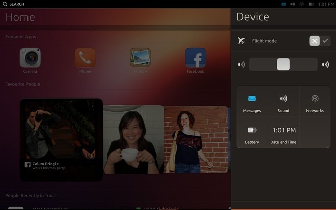
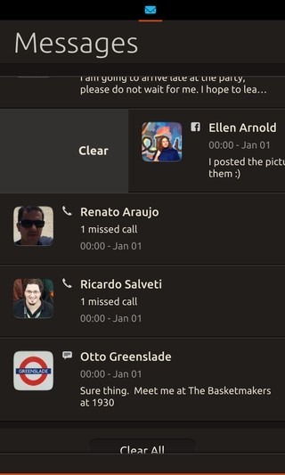
The Messages dropdown consolidates notifications related to all your communication from all the relevant applications, ranging from missed calls on phone or Skype and text messages to emails, Facebook messages, Twitter mentions and potentially more. You can clear notifications using Android-like sideways swipe gestures, or tap on them to reveal options that allow you to respond to them directly based on the notification type.
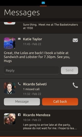
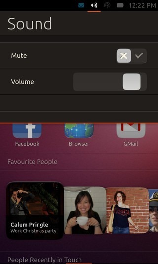
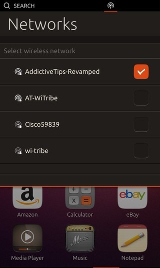
The Sound section lets you quickly mute/unmute your device, or adjust its volume. Similarly, the Networks section shows you all available wireless networks and lets you quickly connect to any of them.
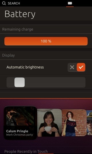
The Battery dropdown shows you the current battery charge level, though in the preview, neither the icon nor the notifications section shows any information about whether the device is currently charging or not. The Date and Time section shows you a digital clock surrounded by a beautifully stylized analog one, along with the current date and day, and all your calendar appointments.
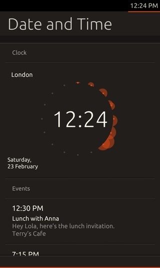
Overall, this is an impressively designed feature of the OS, as it keeps relevant actions grouped together and avoids clutter while still providing you quick access to all of them. It seems more like a blend of the classic system tray concept and the modern dropdown notifications and system settings center.
Also, when you receive a notification, it is displayed in form of an on-screen popup. In the preview, this feature is only working for the received text messages, and you’ll shortly see it in action when we take a look at the Messaging app.
App Switching
All smartphone and tablet operating systems allow you to launch your apps using one or more methods, but the concept behind launching them is the same – you tap an on-screen object such as an app’s icon, a widget button or a media file, and the relevant app shows up on your screen. When it comes to switching between currently running or recently launched apps though, most operating systems have been struggling with different implementations with varied success, and the overall experience offered by them has mostly felt lacking. webOS initially got this right by treating apps as stacks of cards that you could move off each other to reveal the next one using sideways swipe gestures. Even Android and Windows Phone later implemented part of the same idea in form of their app switching lists. Though the best implementation of the concept that we’ve seen was in MeeGo on the Nokia N9. Canonical has also incorporated what we would call a perfect implementation of the same concept in Ubuntu Touch.
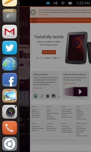
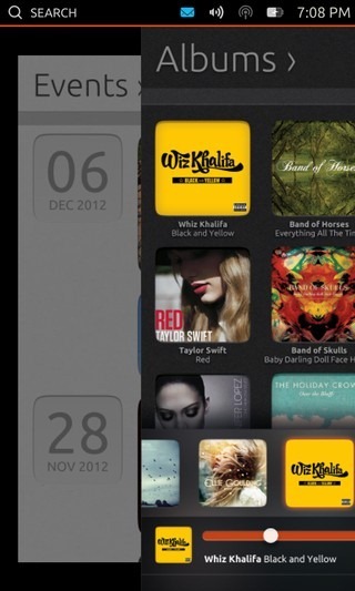
Ubuntu Touch uses two swipe gestures to facilitate app switching. Firstly, you can summon the launcher from any screen with a rightward swipe from the left edge to launch any of the apps that are pinned on it. Furthermore, if you continue the swipe gesture beyond the launcher without lifting your finger, the app that’s currently on the screen will start to slide rightward with an animation, eventually getting sent to background, landing you on the home screen. That’s not all – if you have multiple apps currently running, swiping leftward from the right edge of the screen will let you switch between them instantly and infinitely in a loop, making quick task switching a breeze.
A problem many of us face in iOS, Android and Windows Phone is the lack of distinction between recently launched and currently running apps. Being a pure multitasking OS, Ubuntu Touch gets this one right as well. Your currently running apps are just that – the apps that are actively running, be it in the foreground or in the background. Once you exit them (more on that later), they cease to exist in the task switching interface just discussed above. All your running apps are also listed on the Apps screen, from where you can switch to any of them with a tap. While there’s no section for your recently accessed apps, you instead get a group of your frequently used apps on the Home and Apps screen, which makes more sense; after all, there’s no point in having priority access to any of your recently launched apps that you rarely ever use and merely open, use and close when required.
The task management experience offered by Ubuntu Touch easily puts everything already out there to shame; it feels so natural and intuitive even in this preview, that you can’t help wondering how you were doing without it, and the idea of going back to an OS that doesn’t offer this starts sounding like reverse evolution. Thank you Canonical, for getting this basic feature just right.
Ubuntu HUD
With the exception of the keyboard, what we’ve seen so far has been impressive to say the least, and we’ll even venture to call the app launching and switching process just perfect. Though how about closing any of the running apps, or accessing their settings? This brings us to the Ubuntu HUD.
Apart from the launcher and dash, the HUD found in the desktop version of Ubuntu is another salient feature of the Unity UI, and Canonical has added its touch-friendly implementation to Ubuntu Touch as well. Swiping upward from the bottom edge from any app’s screen brings up an icon in the center of the screen, and taking your finger to that icon without lifting it from the screen brings up the HUD.
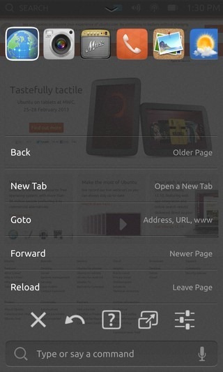
The HUD in Ubuntu Touch shows you a horizontal list of your currently running apps on top, similar to the list shown in the iOS app switcher tray on double-tapping the home button. Below that is a list of action shortcuts for your currently running app, though these aren’t functional in the preview. Then there is a horizontal list containing five buttons. We can make out the first three as close, back and help, and the last one as settings, but there’s no hint on the fourth one that features an icon similar to maximizing a window. Only the close button is functional in the preview, so we’ll have to wait for a stable release to see how the other buttons work. At the moment, it isn’t even clear if the other four buttons are system-wide, or meant for the currently active app.
You can dismiss the HUD by swiping downward from its handle near the top edge, just the way you can dismiss the notifications and system settings dropdown with an upward swipe from its handle near the bottom edge. Speaking of the notifications and system settings dropdown, the HUD acts independent of it on tablets and both can be activated at the same time, as you can see in the screenshot below.
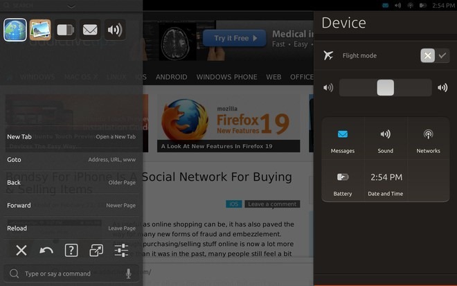
In the HUD implementation, we can see the first shortcomings of the Ubuntu Touch user interface. In order to close an app, you have to swipe upward from the bottom edge of the screen, drag your finger to the icon that shows up in the center of the screen, release your finger to bring up the HUD, and then tap the close button from the HUD to finally close the app. With every other feature of app switching so smooth and intuitive, we can’t think of any reason why Canonical opted for such a complicated procedure to close an app. And this becomes even more cumbersome if you want to close multiple apps, as the close button is active only for the app from which you have triggered the HUD; tapping on the app icons on top does show you their own options, but the close button isn’t active for them. Therefore, you have to keep switching to the running apps and repeat the above process for each of them individually to close them. Also, there is no way to switch to any of the running apps from this list directly.
One way to fix things here would be to also show a close button in addition to the HUD button when swiping upward from the bottom edge from any app, letting users close it by simply dragging their finger to that close button. Another implementation could be similar to the gesture from the left edge that first brings up the launcher, but later swipes away the app and takes you to the home screen if you continue swiping rightward. The same way, continuing an upward swipe from the bottom edge beyond the HUD icon (preferably positioned lower) could be possibly used to close the app. A similar upward swipe gesture on the app icons in the HUD’s app list could be used to close those apps quickly without having to repeat the entire process for them. Lastly, adding a way to quickly switch to any of the currently running apps from this list could also be useful.
Voice Control
While discussing the HUD, we skipped the last item on it – the command box with a mic icon. We didn’t expect the voice control part to be functional in the preview, but it turns out it is. You can either type a command directly, or tap the mic icon to activate Voice Control. Simply speak into the phone and if it recognizes what you said as a command, it’ll show it to you on the screen. Tapping on it will execute that command.
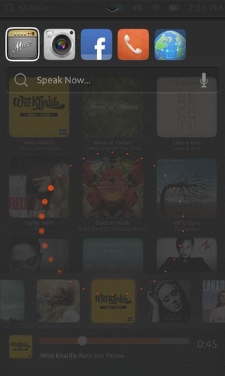
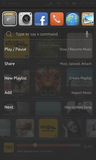
The available commands vary from app to app, and since most of the apps currently provided in the preview aren’t functional, the commands for these apps will not work either. The feature itself looks promising nevertheless and could be a real timesaver if Ubuntu manages to get it right.
The Apps
So far, we have explored every component of the Ubuntu Touch UI provided in the preview and apart from a couple of shortcomings, it has been fairly impressive. Though the UI alone doesn’t guarantee the success of a platform; availability of quality apps makes a huge difference, and can act as a deciding factor when it comes to consumer adoption or rejection, as we have seen in case of webOS and to some extent, even Windows Phone. Before we move on to the available apps in Ubuntu Touch preview right now, let’s take a look at an interesting feature that’s bound to be immensely useful to many of us.
SideStage View
In any mobile OS that caters to devices of multiple form factors such as smartphones and tablets, running apps built for phones on tablets in a practical and useful manner has been an issue for most operating systems in the past. The iPad still runs iPhone apps in a letterboxed or blown out view, while Android has lately tackled this problem by unifying app development for phones and tablets, and appropriately rendering them automatically based on the device form factor, but this requires developers to build their apps accordingly. Ubuntu tackles this issue in a different way that’s clearly inspired by Windows 8 & RT. Enter SideStage – a feature in the tablet version of Ubuntu Touch that lets users run smartphone apps side-by-side with tablet apps in a pane of their own, as you can see below.
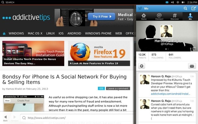
Not only does this allow you to work on multiple apps together, but it also means any apps built only for the phone form factor will work perfectly fine on tablets as well. We can already think of several use case scenarios for this feature, for instance having the calculator handy on the side while you are working on a document involving calculations in the main pane. Similarly, taking notes in the right pane while browsing websites in the main pane can be immensely useful for research. The possibilities are endless.
To use this feature, you simply have to launch or switch to a phone app while a tablet app is already running. This feature is a bit buggy in the preview, and at times apps crash when you attempt to dismiss them by swiping the vertical border rightward. Though once fully fixed in a stable release, it can very well be one of the flagship features of the OS.
Available Apps
Getting back to the apps provided with the preview, many important core apps are missing for now, and some of the included ones are mere placeholder icons or screenshots. Also, no third-party apps are available at the moment, but that’s perfectly understandable at this preview stage.
As mentioned above, there are two types of apps available for Ubuntu Touch when it comes to the form factor – phone apps, and tablet apps. Some of the built-in apps including Browser, Gallery, Camera, Gmail and Music come in both variants depending on the device, meaning launching any of them on the tablet will launch their full tablet version. Many of the other apps including Facebook, Twitter, Phone, Calculator, Notepad, Sharing and Weather only come in phone form factor for now, and launching them on a tablet will always run them in a vertical pane on the right, as we have already seen in the case of Twitter and Notepad in some of the screenshots.
Ubuntu supports both native apps and web apps. In fact some of the working apps available right now such as Twitter, Facebook and Gmail just load the web interface of the relevant service. This is a great way to give a head start to the app ecosystem, as it allows Ubuntu to launch with countless web apps already installed or available for installation, while it catches up with other competitors by working on native apps and sparking third-party developer interest.
Let’s now take a look at a few of the core apps provided in the preview, which will also highlight some features of the app design language Ubuntu has chosen for the OS.
Browser
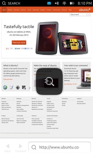
There is a functional browser included in the preview, but it doesn’t currently allow you to do much other than entering a URL to visit, and moving back and forth between pages. Tab support and other features are in the works, but haven’t been implemented yet.
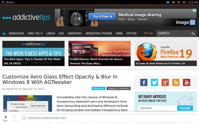
As you can notice, there are no buttons or menus here, which is part of Ubuntu Touch’s app design language. Instead, swiping upward from the bottom edge brings up an action bar similar to that found in Windows Phone and Windows 8/RT. To access more features and settings, you have to bring up the HUD by swiping further upward to the HUD icon, as mentioned earlier.
Gallery
The Gallery app is also functional, presenting you with all your photos organized by date in the Events view by default. Here, you’ll see another element of Ubuntu’s design language in action. The top bar shows the name of the current view by default, but tapping on it brings up any other panes available in the app, and tapping on the name of any of them, or simply swiping sideways takes you to that section. This seems to be inspired from Android’s Holo UI, which in itself derives from Microsoft’s Metro design language from Windows Phone and Windows 8/RT.
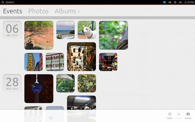
The other two sections offered by the Gallery include Photos (for viewing all photos together and the Albums view.
Phone & Messaging
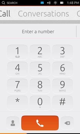
The phone app offers basic functionality in the preview to make and receive calls. In the dialer interface, you can either start dialing a number or look one up from the already saved contacts, but the latter option along with the ability to save contacts isn’t functional in the preview.
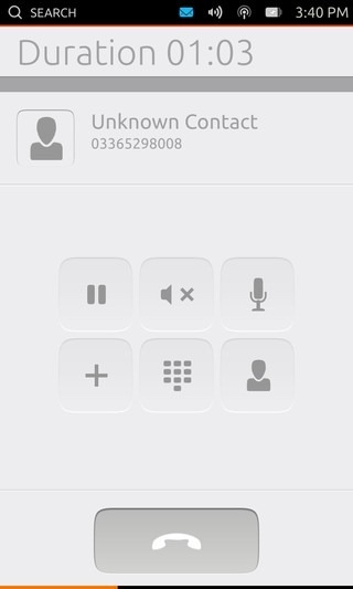
While in a call, you get buttons to put it on hold, mute your own or the other person’s sound, add someone else to the call to make it a conference call, bring up the dialpad, and access your contact list.
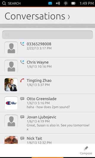
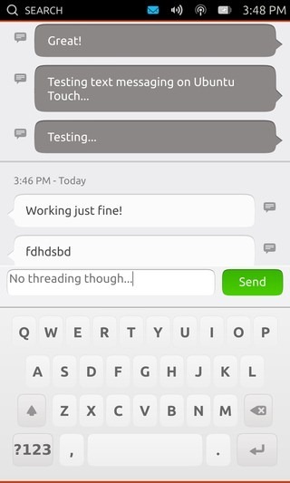
Swiping sideways from the dialer interface brings you to the Conversations view. which is a consolidated list of your call log and recent text conversations, and acts as a messaging app as well. Tapping on any conversation from this list takes you to a view of all your interactions with the selected contact, including messages and calls. Swiping upward from the bottom edge shows you the option to start composing a new message. Whenever you receive an incoming message, you get a nifty notification in the top region of the screen.
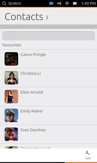
Swiping sideways further brings you to the Contacts view, which is a part of the Phone app itself rather than a separate one. This makes perfect sense, as it offers a more content-centric approach by grouping actions for similar content together. An upward swipe from the bottom edge reveals the option to add a new contact.
Notepad & Calculator
These two basic apps are functional in the preview but you can’t save notes for now, and the calculator isn’t displayed properly on the Nexus 4.
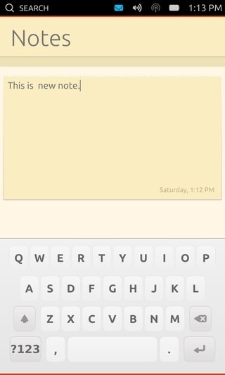
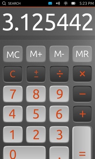
Both these apps are available on both phones and tablets in only the vertical phone view.
Gmail, Facebook & Twitter
All three of these apps are basically web apps with their own buttons provided to launch them quickly.
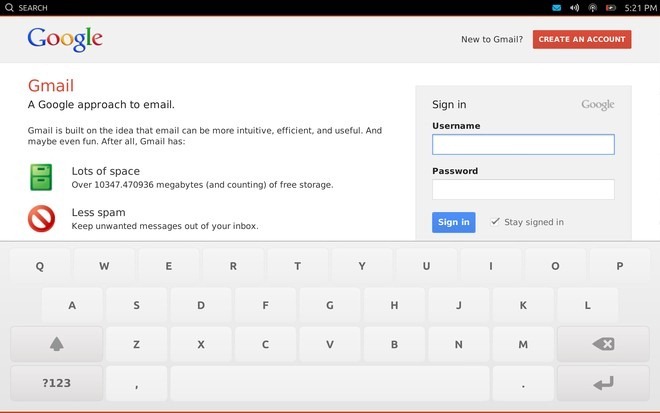
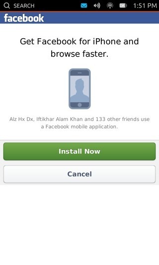
The Gmail app supports full tablet view on tablets, while the Facebook and Twitter apps are available on both phones and tablets in only the vertical phone view. The browser that’s powering these web apps seems to be identifying as an iPhone browser for now, since signing in with your account in the Facebook app brings up an offer to install Facebook for iPhone, though you can easily dismiss it by tapping the Cancel button.
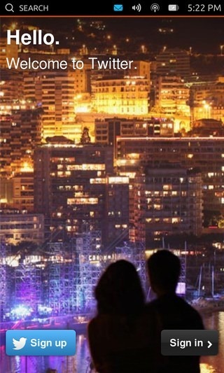
Other web apps available in the preview include Amazon and eBay, which work similarly.
Camera
The preview comes with a functional camera app that can utilize both front and back cameras of the devices. Though we’ll be reviewing the camera in detail once a stable build of Ubuntu Touch is released.
In addition to the above, you’ll also find Music, Media Player, Weather, Sharing, Ubuntu One and Ski Safari among the other native apps, but these aren’t functional at the moment and serve as placeholders.
Our Verdict
From what we’ve seen so far, Ubuntu Touch seems to be a promising contender for the smartphone industry. If Canonical manages to iron out the few shortcomings we mentioned earlier and get the app ecosystem going, it can become a major player in the industry. Though that’s easier said than done, especially the latter part. It’s a little too too early to tell how things will turn out but judging from the preview, Ubuntu Touch certainly has what it takes to become a solid operating system for smartphones & tablets.
If you want to give the OS a try yourself on your Nexus device, we’ve got you covered; just head over to our detailed Ubuntu Touch Developer Preview installation guide.
We have also made a small demo video of Ubuntu Touch Preview running on our Nexus 4 and Nexus 10, that you can check out below.

Where can i find lock screen wallpaper?
Sleek & Beautiful Interface, looking forward to try a Ubuntu phone. Excellent analysis, keep it up!
if i instaled it on my android phone
can use the google play market ?!
awesome.
can i run android apps on it ?!
No, not yet at least. In the future, perhaps, if someone else makes an Android app compatability layer for it. Ubuntu has no plans on providing any official support for Android apps.
I just recently installed Ubuntu 12.10 on my laptop and still have mixed feelings… but this phone and tablet UI looks incredibly promising. I use SMS a lot and really like the (apparent) cross platform integration of messages and notifications (responding directly from the notification shade, hell yes!) as opposed to Android whose ugly stock sms forces me to use a third party app.
I have Nexus 7, do you recommend putting Ubuntu on it as of now?
For everyday use, certainly not yet; it’s just a preview to give people a taste of things to come.
Great runthrough of the interface, shortcomings, and of course, where Ubuntu Touch is doing it well. I played with Ubuntu Touch on my N4 and was suitably impressed, though I should reserve judgement for the “stable” build release. My guess is that most of the issues I’ve seen should be fixed once it makes it out of “dev preview” status.