5 Gnome Shell Extensions To Make Your Linux Desktop Better
Gnome Shell is quickly becoming the default desktop environment for Linux. One of the key features of this desktop environment is a controversial one: extensions. Much like Chrome or Firefox, users are able to install little modifications that can change up the desktop environment. Each of these extensions are available via the extension website. Before attempting to install any of them, please follow this guide to get the browser integration tool working. Without it, extensions will not install to your Gnome Shell desktop. Here are our picks for the 5 best Gnome shell extensions that can make your desktop better.
1. Caffeine
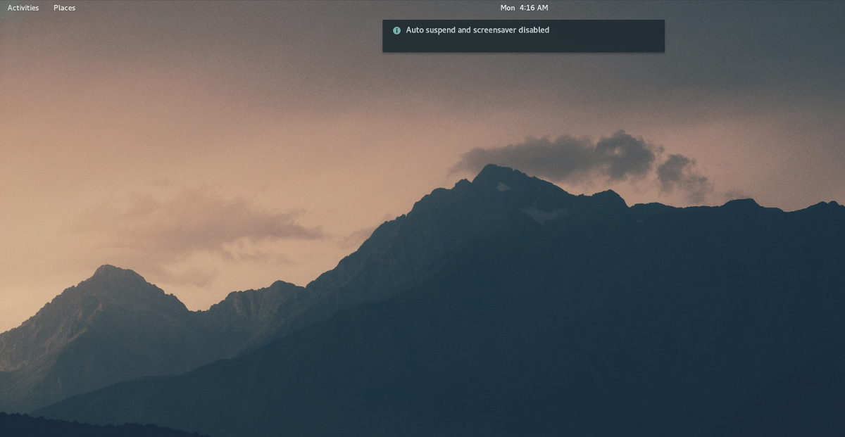
One of the most annoying things to happen when using a PC is having the screen turn off at inopportune moments. This is a real problem on Linux, and none of the desktop environments have a solid set of options that the average user can use to easily disable it. Instead, users find themselves digging around in battery settings, or display and screen settings trying to make their screen stay on longer.
If you’re a Gnome Shell user, this problem can easily be solved with Caffeine. It actively prevents the display from turning off while the extension is on. If you’re sick of having to unlock your Gnome desktop after leaving for 10 minutes, this extension is for you.
2. Native Window Placement
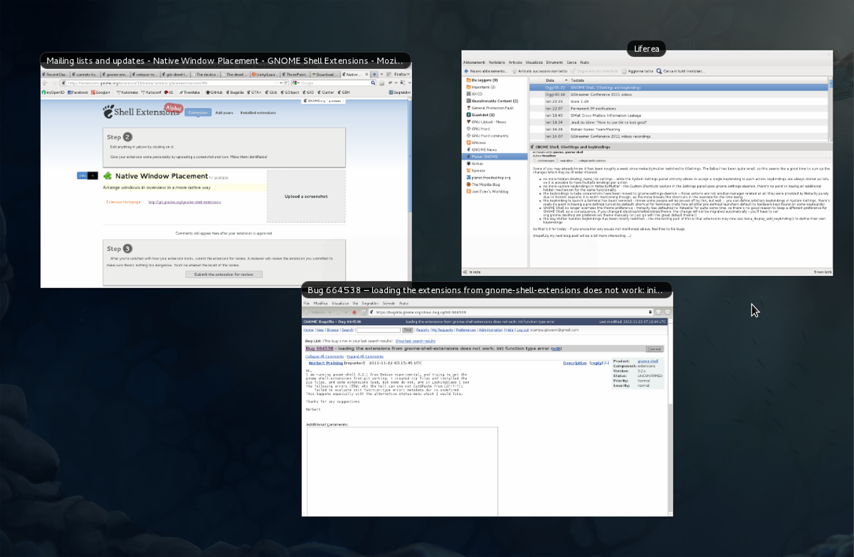
Many Gnome Shell users completely ignore the suggested way of managing programs in the activity overview. Instead, they heavily modify Gnome and rely way too much on the dock. This extension is not for those people. Instead, Native Window Placement is for those who love Gnome and prefer to navigate windows in overview mode like the developers intend.
To be clear, the stock Gnome overview of windows is decent, however, it needs work. For example: the overall sorting of windows is very symmetrically spread out. This can lead to clicking on the wrong thing, and in general is just poor use of space.
The Native Window Placement extension effectively improves on the layout of open windows in the overview mode so that open windows are compact, and the space is used more appropriately.
If you love using overview mode to browse for open windows on Gnome Shell but hate the default layouts of windows, this extension is a great addition. Learn more about Native Window Placement here.
3. Topicons Plus
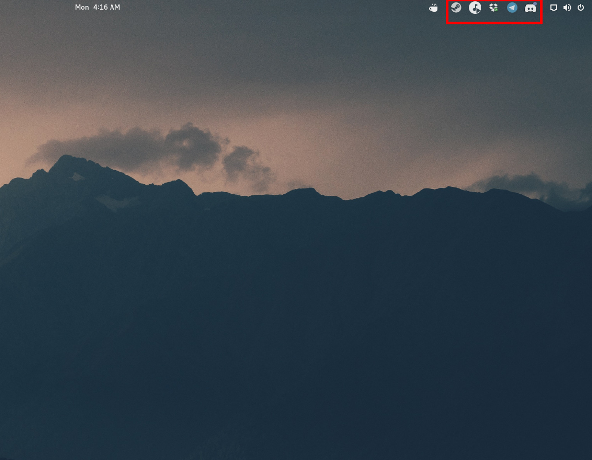
In Gnome 3, there are two different types of system tray icons: legacy and “modern”. Modern icons generally show up in the top Gnome Shell pane, and legacy ones do not. Instead, they’re put in a tray at the bottom of the screen.
Gnome 3.26 is a new release that completely does away with the “legacy” tray, effectively making it so users of popular apps like Skype, Dropbox, Discord and etc are without system tray icons. This is a pain for the average Gnome desktop user.
Luckily, Topicons Plus exists, and with it, users can gain access to their precious system tray icons again. The name is “Topicons”, because it takes all legacy system tray icons and puts them in the top panel with other system items. In fact, the Gnome project themselves recommend users use this extension because without it, legacy system tray icons can’t be accessed.
4. Tilingnome
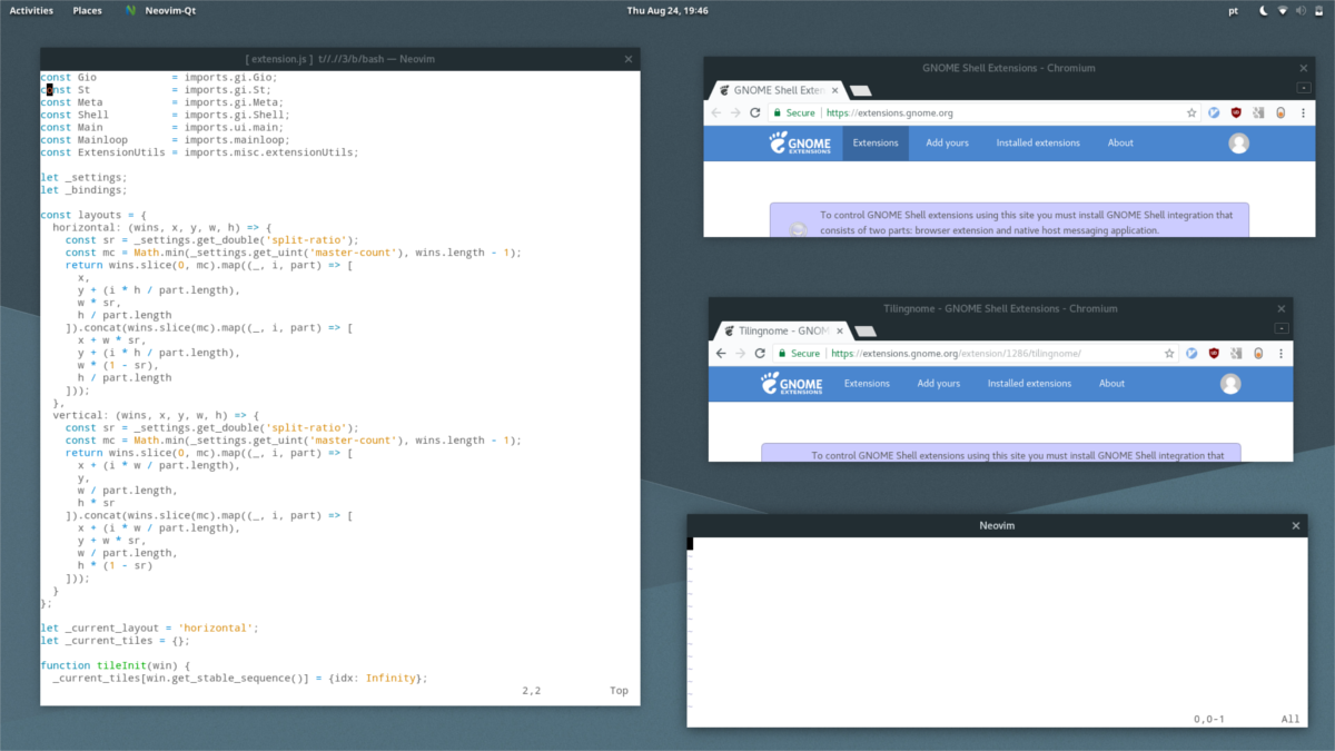
Tiling window managers are the king for productivity. With them, it’s very easy to multi-task, because everything has a place on the computer screen.
For desktop environments, windows aren’t in a tile setup. Instead, they’re all floating on top of each other. Floating windows, especially in desktop environments are great for focusing on one task at a time. However, if you’re a developer, system administrator, or someone who needs lots of apps open at one time, the default isn’t good enough.
Introducing the Tilingnome extension. With it, anyone can transform the Gnome Shell desktop environment into a tiling setup. Features include the ability to create tile windows in both horizontal and vertical styles. It also has the ability to add gaps between each tile, so that everything isn’t so close together.
If you’re a fan of tiling window managers, but also love using Gnome Shell, this may be an extension to try!
5. Dash to Dock
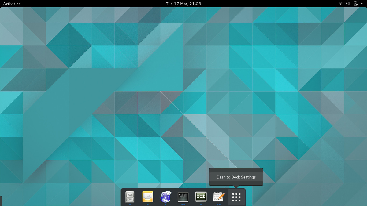
The design of Gnome Shell is very controversial. The way users navigate it (by default) is like this: click the “Activities” button in the top left, then click the app drawer icon and open a program.
Users switch programs with “overview mode”. Users get to this mode by again clicking the “Activities” button, and select an open window displayed in the overview. In addition, there’s a permanent dock in overview mode where users can save favorites.
For some users, this method is fine and there’s no need for any modifications. For others, this is the main reason they dislike using the Gnome desktop environment. They find it annoying that the dock is only accessible in overview mode, and hate having to click on windows in a layout to switch between them.
It is because of this, the Gnome extension Dash to Dock is popular. With it, the entire way users navigate through the Gnome Shell is different. The extension turns the dock present only in overview mode into an always present application dock (think MacOS). With it, users can use to switch between open programs, launch favorites and open programs.
Hate using overview mode in Gnome? Consider using Dash to Dock.
Conclusion
Gnome gets a lot of hate because they don’t add features, and instead tell users to customize their desktops with Gnome shell extensions. This is pretty much their reputation, admittedly. As a result, it’s understandable why many talk bad about Gnome 3 in the Linux community.
Hate aside, Gnome Shell extensions are actually quite brilliant, and very useful. Why? Due to extensions, users can customize their Gnome desktop and make it unique by adding, removing, or modifying features.

Yeah, they don’t add extensions, but instead they with each release take away functionality that existed before. Or, just change it. For fun. And then call everyone who gets upset for totally changing their work environment ‘the average user’, who just doesn’t get it. (Which is funny, because when you create software, you definitely have to think about the average user.)
With every (or maybe every second) Ubuntu release (and earlier this was the case with debian) I can be sure that gnome guys will f*ck with the workspace thing again. Every few release they figure out that workspaces are these weir things that just hang out in the hyperspace, have nothing to do with each-other spatially, so they order them in a row. The first time I tried linux (and that was in the past millenium) you could have a virtual desktop (they told me that was the name) of NxM size. When I had to use windows (XP was the last, fortunately), I installed an app to allow me to use it like that. Now with linux, you’d think that once you have it, you have it. But no, they just f* with you every few releases. Just for fun. As if implementing workspaces in a grid was that much different from having them in a freaking column.