What’s New In Android 4.0 Ice Cream Sandwich [Feature Review]
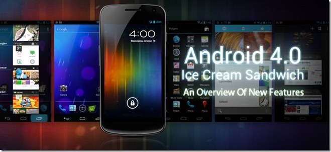
Android 4.0 Ice Cream Sandwich (ICS) was revealed by Google and Samsung at an event in Hong Kong this October and as expected, this most eagerly-anticipated update to Android brings a lot of new features as well as enhancements of existing features to the world of smartphones, in addition to merging the previously separate phone and tablet versions of Android. Personally, we would call it nothing short of groundbreaking and beyond our expectations. First announced at Google I/O 2011 keynote back in May, Ice Cream Sandwich has been long anticipated to be the most major update to Android till date and now that we have had a look at it, we completely agree with Google’s claim. Don’t agree with us? Just read on and see for yourself!
Last month, we brought you our extensive coverage of iOS 5 on the 5th, as it was revealed at Apple’s Let’s Talk iPhone event in Cupertino, California. While Apple did come up with a solid operating system with new features, most of those ‘new’ features were playing catch-up with Android, Cydia tweaks and functionality already possible with third-party apps. From what we have just seen in Ice Cream Sandwich, it seems Apple will now have a LOT more to catch up with. See for yourself in the complete video coverage of the event. Note that it is nearly an hour long video so if you just want to get down to the details, read on for our full review.
Unlike our previous operating system coverage of Windows 8 Developer Preview and iOS 5, we will keep this one in a single post as Ice Cream Sandwich isn’t available to the public yet. We’ll have to wait for the release of Google’s flagship ICS device, the upcoming Galaxy Nexus – to go hands-on with ICS and will then bring you our extensive app-by-app coverage of all that it offers.
For your reading and navigational convenience, this review will be organized as follows.
User Interface Enhancements
The first thing you’ll notice in Android 4.0 is the major interface overhaul across the entire operating system. Google has attempted to address a major shortcoming of Android: the lack of a unified look and feel of the user interface across apps and devices. With Ice Cream Sandwich, there is a consistent feel across all elements of the operating system that is both intuitive and fluid.
Magazine Style Interface
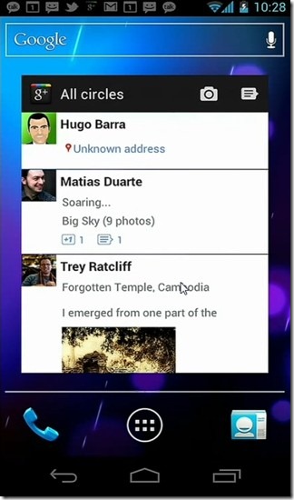
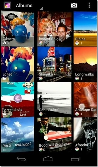
Certain content-focused elements of the user interface have a look and feel with design elements that appear to be inspired from Windows Phone 7’s Metro UI in certain ways (focus on large, readable text and tiled images of content), yet it has a distinctive feel of it’s own and doesn’t seem to be a complete Metro rip-off. Google is calling it their magazine-style interface.
Swipe Navigation
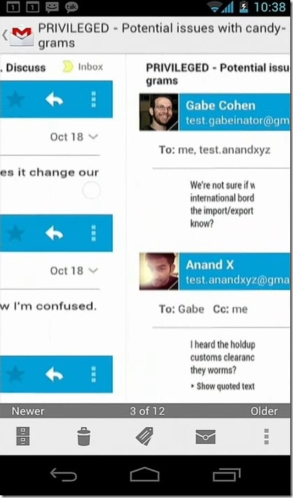
Navigation is easier with swipe gestures. If you have used the latest Market app on earlier versions of Android, you know what we are talking about. With Android 4.0, the same gestures are available across the entire operating system.
Common Actions
Common actions are now more visible throughout the OS in top or bottom action bars, unlike in previous versions where you had to press the menu button to bring them up.
Virtual Buttons
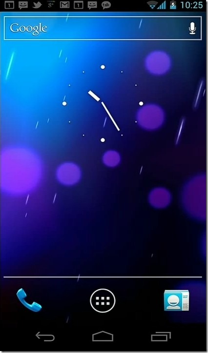
Hardware buttons have been replaced by a new System bar with virtual buttons that works across the entire Android 4.0 UI. These include Back, Home and Task Switching buttons. There isn’t any menu or search button. These virtual buttons are visible throughout most part of the OS but in certain situations, they can be disabled, such as during an incoming call or on the lock screen.
Search
A transparent Google Search box with voice actions button is visible across all home screens. This addresses the lack of a search button. Searching within apps is done through common actions bar that becomes visible when the search feature is available.
High Native Resolution
Android 4.0 Ice Cream Sandwich boasts an incredible resolution of 720 x 1280 pixels natively for all phones it’ll run on. This is a gigantic leap from the previous resolution of 480 x 800 pixels for most devices. And yes, it is a higher resolution than the iPhone 4’s Retina display, though pixel density will depend on the screen size, which varies across different Android devices. Resolution for tablets will most likely be higher, though we’ll only know for sure once a tablet running Ice Cream Sandwich is revealed.
Operating System Improvements
Android 4.0 comes with several major long awaited improvements. Since some of the new features introduced in Ice Cream Sandwich have already been possible on Android with some custom ROMs such as MIUI and CyanogenMod, Google has been playing catch-up with the custom ROM developers to finally bring them to the core Android OS. However, there are enough genuinely new and innovative additions that make ICS stand out amongst all of the currently available smartphone operating systems. And of course, it never hurts to bring some of the best features of custom ROMs to the core operating system for making them accessible to the vast majority of users who do not use custom ROMs.
Let’s take a look at the OS improvements in Android 4.0 Ice Cream Sandwich in detail.
Customizable Favorites Tray
Android 4.0’s bottom launcher bar is now called favorites tray and is customizable. Also, it supports five icons instead of the three of the previous versions. This lets you access more apps regardless of the home screen you are currently on.
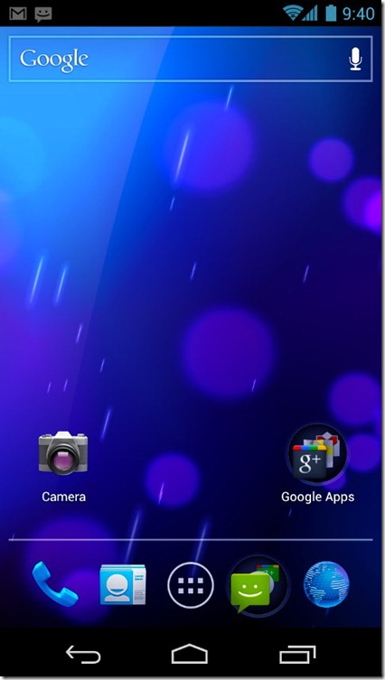
While the center icon is of the app drawer, the center-left and center-right ones can be set to any app or folder (more on these later) of your choice. (We have yet to see if the left-most or the right-most can be changed. In the demonstration, these were for the dialer and contacts apps respectively.)
Folders
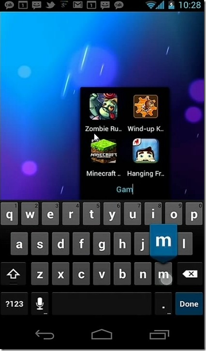
Finally, there is native support for creating folders iPhone style. Just drag an app’s home screen icon over another and you’ll have a folder. Drag more apps into it to populate it and see its circular icon update with the icons of the apps as you add them to it. You can even have folders with quick dial shortcuts for your frequently called contacts. You can also rename folders as well as organize apps within each folder by dragging and dropping.
Improved Widgets
Widgets are another core feature of Android that sets it apart from other smartphone operating systems. While manufacturer-customized versions of Android such HTC devices running Sense interface, as well as several third-party home screen replacement apps have long offered a higher degree of control over widgets, stock Android has neglected this aspect till now. With Ice Cream Sandwich, widgets are both scrollable as well as resizable, and can dynamically update the widget layout based on the current size.
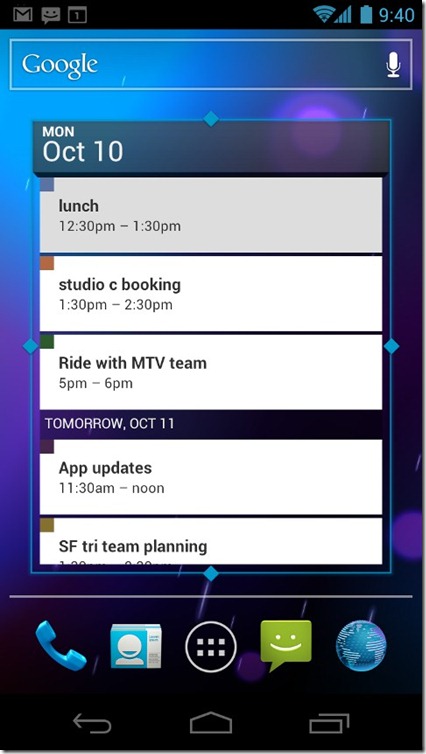
Furthermore, all the installed widgets are now available right from the app drawer in a separate ‘Widgets’ tab in the app drawer. This makes perfect sense, as widgets are essentially apps or components of apps that you can interact with independently. So no more long-pressing the home screen and then scrolling through the long list of widgets. Simply go to the widgets tab of your app drawer and drag the desired widget to your home screen of choice. To add to the convenience, you see actual previews of widgets in the widgets section of the app drawer rather than mere icons or names, 
A new feature added to the widgets is stacks which shows you a stack of content such as photos or videos. You can swipe down the top-most picture or video to reveal the one below it, with beautiful animation effects. Apart from being cosmetic, this can help you quickly browse through your camera photos right from your home screen without even launching the gallery app, and tapping on the photo or video to open it up in full size, once you have found the one you were looking for.
Rich Notifications
Android has always had an edge over its competitors when it came to its notification system. With Ice Cream Sandwich, notifications have been improved even further by giving you more information as well as control than just text, right from the notification bar.
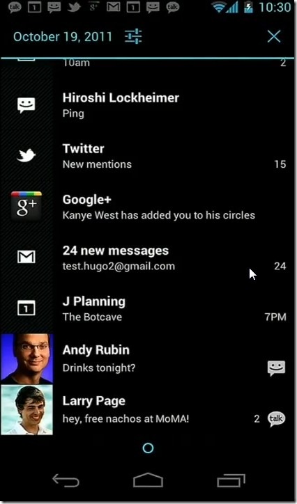
Notifications can now include rich and dynamic content, images as well as control elements. You can pause playback without switching to the media player app, just by tapping on the pause button in the ‘now playing’ notification of your media player, or respond to an event in an app directly from the notification of the event, rather than tapping on the notification to bring up the app and then taking action in the app itself. This means less disruptions in what you are currently doing, without having to ignore important notifications from other apps.
Dismissing notifications has also been made easier. Now you can simply dismiss individual notifications by flicking them off the screen with a swipe gesture without effecting other notifications. This is a very welcome change, as in the previous versions of Android, there was only the option of clearing all notifications together and not individually.
Improved Task Switching
While true multitasking support has been one of the primary selling points of Android from its very first version, switching between tasks hasn’t exactly been intuitive so far in any of the previous versions of the OS. Google addressed this issue in Android 3.0 Honeycomb but being solely tablet-specific, that version was never made available for smartphones. In Ice Cream Sandwich, there is a dedicated task switching button on the System bar that brings you a scrollable list of large thumbnail previews of the currently running or recently launched apps, with the ability to switch between them with a single tap.
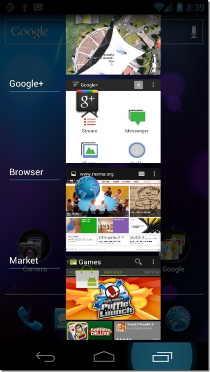
You can even close or dismiss the apps right from the task switching interface by flicking them off the screen with a swipe gesture. This can help you focus on just a few apps without having other apps coming in your way.
Application Management
Installed applications can now be managed more easily. You can long-press an app’s icon to get more information about it or uninstall it. In case of a system app that you can’t uninstall, you can choose to disable it in case you don’t want it to run in the background. It can be easily re-enabled in the same way whenever you choose.
Lock Screen Actions
Android’s lock screen has also evolved with Ice Cream Sandwich, becoming more than a clock and a locking/unlocking slider. You can now jump directly from the lock screen to camera to capture those precious moments instantly. You can also view notifications and unlock right into their respective apps, right from the lock screen.
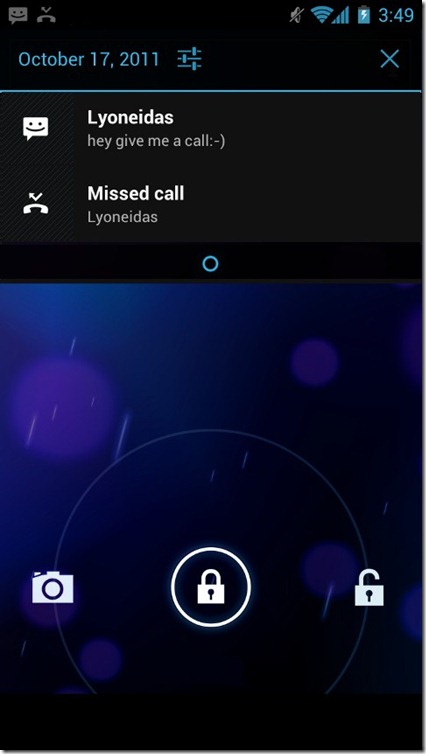
If you are listening to music and your phone’s screen times out or you turn it off yourself, you don’t have to unlock the phone each time you want to change the song, as media controls are available right on the lock screen during music playback, along with album art for the currently playing track in the background.
Screenshot Support
iPhone has had it for quite a while, MIUI has had it for long, CyanogenMod recently added it and now Google has followed suit by allowing you to natively capture screenshots of your device by using Power and Volume Down buttons.
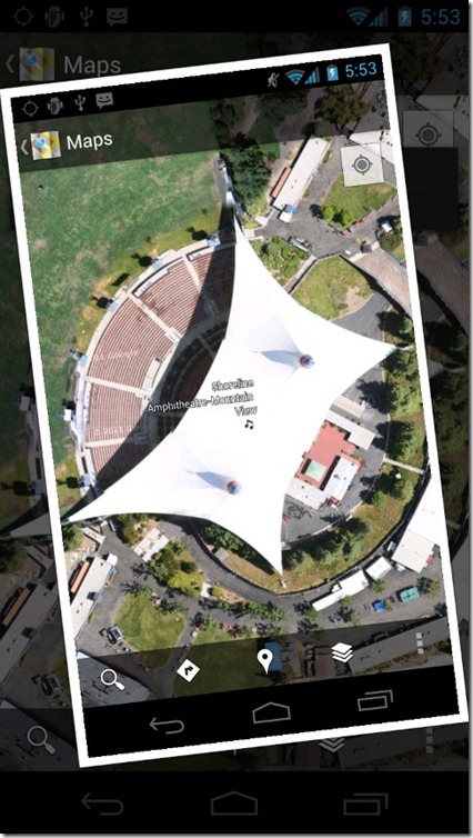
You are shown a nice Polaroid animation and viola, your screenshot gets saved to your gallery, ready to be uploaded, shared or saved for future blackmailing.
Face Unlock
Who doesn’t think facial recognition is cool? Just the thought that your device recognizes your face and unlocks itself for you, while denying access to others, gives you a secure feeling. The feeling of being the hero of a Sci-Fi flick comes as a bonus. Ice Cream Sandwich has support for unlocking your Android device with face recognition.

The phone even gives a cool “Sorry, don’t recognize you” message when someone else tries to unlock your phone using this feature. Beware though, as you might get the same results at times too, as Google’s Matias Duarte experienced during the presentation. Luckily, you can still unlock using your PIN or pattern if Face Unlock fails for you for some reason.
Input Methods
Modern computer devices are thousands of times faster than us at processing and output but when it comes to taking input from us, they can be just as fast and as efficient as the input they are getting from us. That’s why input method efficiency is of the utmost importance to make the user experience enjoyable on any device. This is especially important for smartphones as due to their small form factor and frequent use, the quickly and more accurately we can input data into them, the better the user experience. Ice Cream Sandwich comes with improvements to both its core input methods – Keyboard and Voice.
Keyboard: The on-screen keyboard in ICS has been improved to offer better autocorrect and word suggestions with new and improved default dictionaries, resulting in better detection of skipped, double-typed and omitted letters and spaces. You can even tap on a correctly spelt word to get suggestions for replacement words. Support for third-party spell-checkers and dictionaries has been added as well.
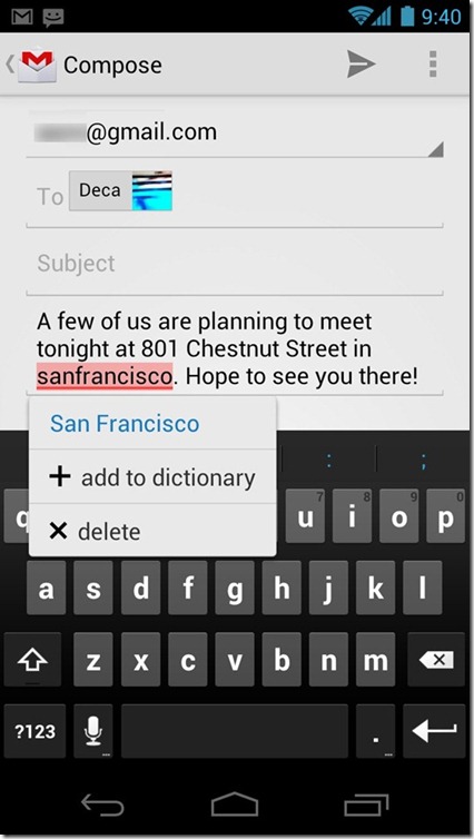
Voice: Android 4.0 comes with a better voice input engine with continuous voice recognition. You no longer need to speak into your phone in phrases, pausing to get one word or phrase recognized before proceeding to the next, as the new voice recognition system works in a continuous stream, recognizing words as you speak, for as long as you want. Pausing will not make the OS recognize what you say after the pause as a different chunk of input.
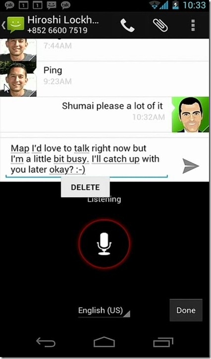
In addition to mere words and sentences, you can now dictate punctuation as well. Any errors that the voice input engine encounters are underlined automatically. Tapping on them shows you a list of suggestions, from which you can quickly fix the mistakes. With Apple’s Siri already making headlines out there, Android’s newer voice engine is definitely more of a need of the operating system to be able to compete in the market against iOS 5.
Accessibility
Android 4.0 includes many new features for enabling the blind or visually impaired to use their Android devices more efficiently. There is a new ‘explore-by-touch’ mode that allows users to navigate their devices with audible feedback. A single touch makes the phone speak out the component that has been touched and a second touch on the component activates it, eliminating the need to see the screen.
Core Android apps have also been updated for accessibility, with the browser including a screen reader that reads out web content for users and even helps them navigate websites. The default font size across the entire Android UI can also be changed, which effects all apps rather than just the home screen and default apps.
Accessibility features are of no use if the blind or visually impaired user can’t enable them in the first place, so Android 4.0 lets them enable them right at the phone’s first setup using a touch gesture of a clockwise square made on the screen from the top-left corner. It also launches a setup tutorial to guide users with the rest of the setup process.
Core Apps
In today’s world, an operating system is just as good as the number and quality of apps available for it, as we spend most of the time using apps rather than the core features of our smartphones. Android 4.0 comes with updated core apps that bring several improvements over the previous versions of these apps. Let’s now take a look at some of the major core apps in details and see what new features they offer in Ice Cream Sandwich.
People
A major change in Ice Cream Sandwich is the People app. It is basically the Contacts app not just renamed but rather redefined. Sporting the magazine style, People app brings all the information of your contacts together – not just phone numbers and email addresses but also instant messaging accounts, social media accounts and online services profiles. All the information about your contacts is pulled directly from their social media accounts, which means if they update their twitter or LinkedIn profile, their contact information updates on your phone as well. Any network or service can add support for this feature, which means interaction possibilities are endless.
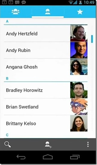

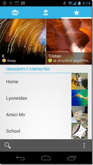
While in the People app, swiping to the left takes you to the favorite contacts for quick access in a beautiful, magazine style interface. Opening any user’s People entry shows a high-res photo with common actions such as calling, texting, emailing, IM or contacting via other online services, right from one screen. Swipe to the left and you’ll be presented with a stream of content shared by them over the connected online services.
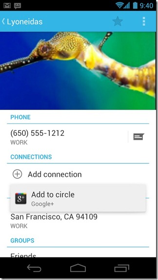
Furthermore, tapping on a contact photo in any app – be it email, texting, Whatsapp, Twitter – brings up a quick contact card that offers quick access to all possible interactions with that person, not just in that particular app but even using other apps. This means you can receive an @mention on twitter and seamlessly continue the conversation over email or GTalk. Last but not the least, you can add people shortcuts to your home screen and even group them together in a folder.
There is also a ‘Me’ profile that is basically your contact card that keeps together and identifies all your contact information and social media, instant messaging and web services profiles. You can then quickly share your information with anyone as easily as handing over your business card.
Phone Dialer
Just like the People app, the dialer has also received some enhancements. You can swipe to the left in the dialer to access direct dial shortcuts to your favorite contacts in the same magazine style layout similar to that in the People app. When in a phone call, large high-res images of contacts are shown across the screen.
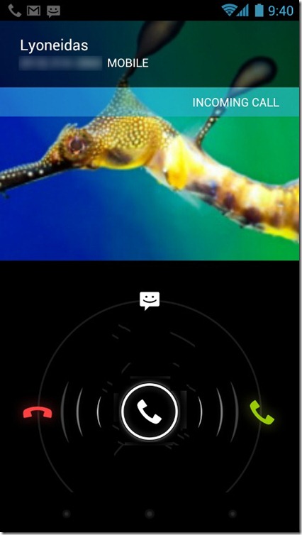
How many times have you received a call but weren’t in the position to attend it right away and had to either blatantly reject it or press the volume-down key to silence the phone’s ringing and let the other person deduce you were busy or away from the phone? Ever wished you had a way to automatically send a text message to the caller, letting them know you are busy and will be responding later when free? You can now do that with Ice Cream Sandwich Phone Dialer.
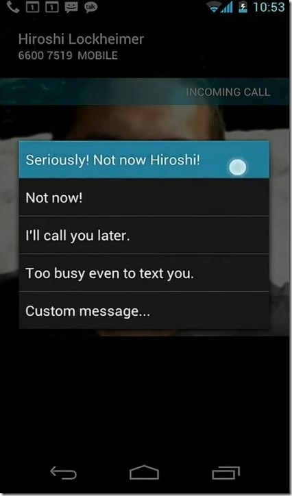
This update to the Dialer app lets you swipe up during an incoming call to reject it and automatically send the caller one of several pre-configured canned responses. You can edit the responses to suit different callers as well as different scenarios. This is a very convenient addition to the dialer app.
Unfortunately, there was no word on smart dialing support but who knows? We’ll just have to wait for the first Ice Cream Sandwich devices to roll out to see if Google has included that much-requested feature as a surprise or neglected it as before.
Visual Voicemail
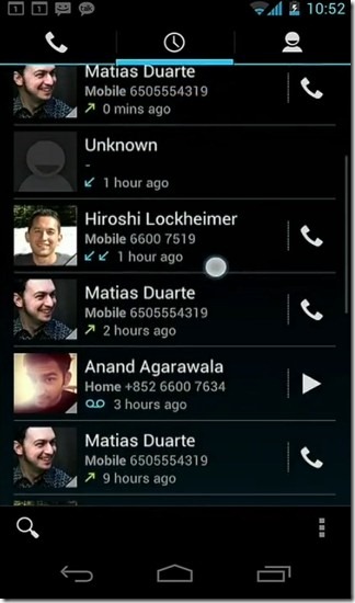
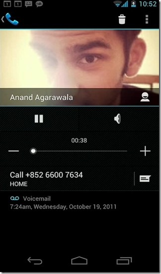
Tired of using a separate interface for your voicemails? Since voicemails are basically missed calls with just a voice message added, it makes sense to integrate them with the call log, and that’s exactly what Google did in Ice Cream Sandwich. Now, your voicemails and call logs are integrated together in the phone app, as Visual Voicemail. You can not only playback voicemails right from the list but also manage the playback speed of voicemail. Voice transcriptions, Google Voice text messages and audio files transferred through compatible third-party apps are also integrated into Visual Voicemail.
Calendar
The updated Calendar app sports a cleaner, color-coded and more easily readable interface with unified work, personal, educational and social agendas all in one interface. Swiping and pinching gestures mean you can easily get to the exact time slot or event you are looking for.
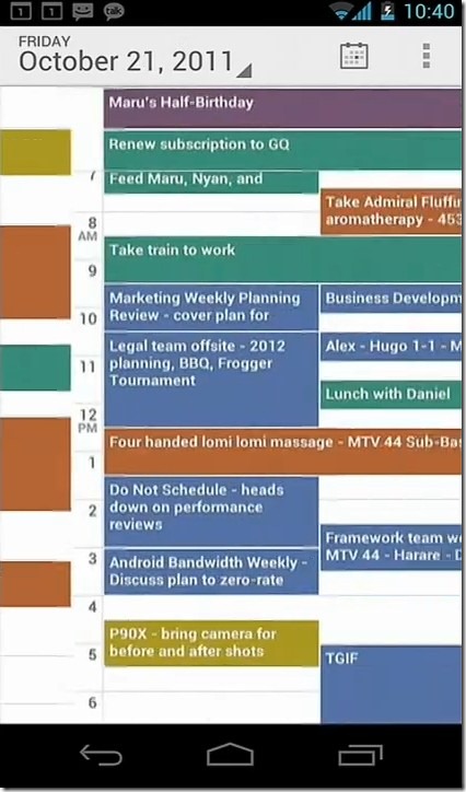
Other apps can now contribute to Calendar event with user permission, letting them update your information across other services based on your calendar schedule or update your calendar based on your actions in other apps.
Gmail
The Ice Cream Sandwich Gmail app features several interface and functionality enhancements including 2-line previews of all your email messages to get a better idea of their contents, as well as an action bar at the bottom of the screen with one-tap access to compose, search, labels and refresh actions. Multiple message selection has also been added and upon selecting multiple messages, the action bar changes to offer the applicable interactions. Once a message is opened – the action bar lets you archive, label or delete it with a single tap.
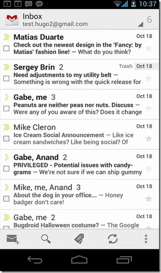
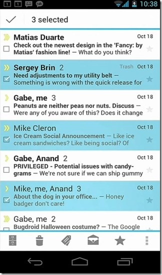
Threaded view has been greatly enhanced with the same magazine style look featuring bold colors and large contact photos. Navigating to the next and previous emails can be done by horizontal swipes. Auto completion has been enhanced to add graphical eye candy. Furthermore, there is focus on people rather than email addresses. When composing, contacts are shown as chips with photos. Tapping on a chip lets you switch email addresses or remove the person from the To, CC or BCC field.
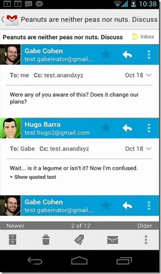
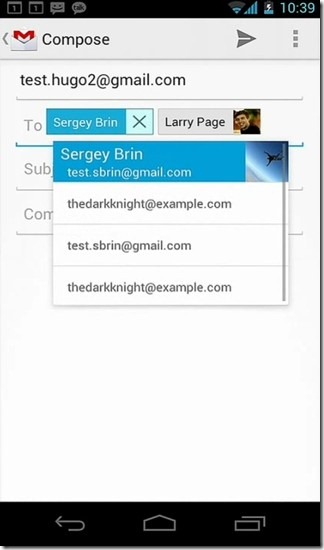
Offline search has finally (and thankfully) been added. By default, you can search for emails from the past 30 days but this can easily be changed to a duration of your choice. Other improvements to Gmail include quick responses support, toggling reply-all and forward, integrated accounts and recent labels menu, nested subfolders, EAS v14 for enterprises, administrative options and last but not the least: a resizable email widget for your home screen!
Browser
As smartphones have matured over the past few years, web browsing from phones has increased exponentially. That’s why Google has worked significantly on improving the Browser app.
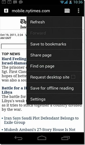
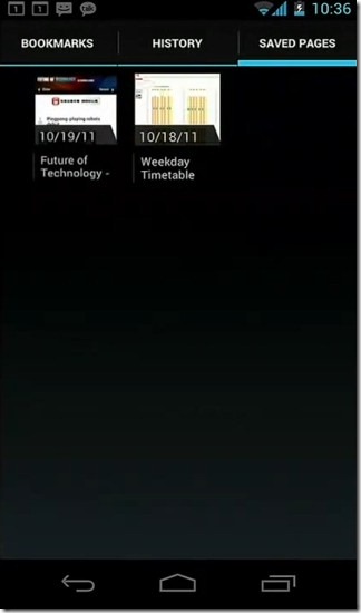
Perhaps the most significant new Browser feature is the ability to save pages for offline viewing later. This is indispensible on mobile browsers as you can just save a lot of pages before going somewhere you won’t have internet access, and then then read them offline in peace, without having to incur any data charges for it. Saved pages are accessible in a visual list that makes it easy to pick the right one quickly. Your browsing history and bookmarks are also presented in the same interface. Speaking of bookmarks, you finally have the ability to sync Google Chrome bookmarks with your Android browser. It was entirely beyond us why Google didn’t add this capability before but better late than never.
You can now have 16 tabs open at a time and tab switching has been revamped to be just like the new task switching, with a scrollable list of large tab thumbnail previews and the ability to close the tabs by flicking them off the list with swipe gestures. The tab switching interface can be launched by tapping on its icon in the options bar on top.
Other changes to Browser include incognito browsing, a list of most visited pages, custom text size and zoom levels, faster rendering and separate preferences for each browser tab. There is also a full desktop mode for browsing sites just the way you would on a computer browser.
Data Usage
Over the past couple of years, most – if not all – telecom providers have enforced download caps over mobile data plans. Once you have reached the limit, you either have to pay prohibitively high charges for further data use, or get crawling slow throttled speeds that remind you of the 28.8kbps dialup days. That’s why being careful about your data use can never be a bad thing. Ice Cream Sandwich addresses this issue by introducing a brand new app called Data Usage.
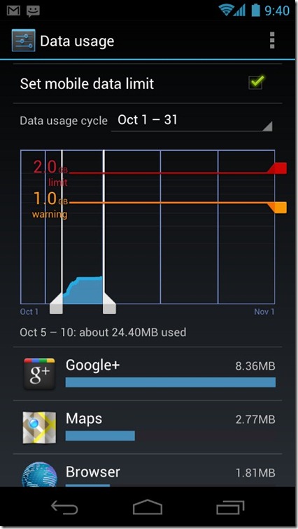
Data Usage shows you a graphical presentation of the data usage on your phone over a billing cycle. It also shows you your projected data usage in the remaining days of the cycle, based on your past data usage in the cycle. You can specify warning limits or upper caps to get alerts or cut off background data.
That’s not all – below the graph is a list of all the apps that have been using the data, sorted by the amount of data used.The app lets you zoom in on particular time slots in the cycle where there are spikes and close in on the app responsible for high data usage in that time slot. Once you’ve spotted the culprit app, you can tap on it to see its individual data usage graph and even set a limit on or entirely cut off its background data access.
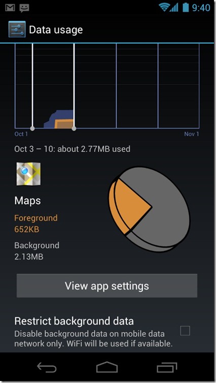
Unless you are one of the lucky few who still have an unlimited data plan or don’t use mobile data at all, Data Usage will at one time or another prove to be the most handy feature of Android 4.0 for you.
Camera
Mobile phone cameras have improved greatly over time but in the end, what good is a camera when you can’t instantly use it to snap the right moment without having to fiddle through unlocking your device and looking for the camera app? With Ice Cream Sandwich, you can launch camera right from the lock screen by dragging the unlock ring over to the camera icon. Though compared to the rest of the improvements in the Ice Cream Sandwich camera, this one would seem like peanuts.

The updated camera app has boasts zero shutter lag and very low shot-to-shot lag, so no more missing out on the right moment due to the interval between you tapping on the capture button and the camera actually capturing the moment – that interval is gone. Consecutive shots taken in quick succession come nearly instant as well, letting you capture as many images of the right moment as you want, to be able to choose the best one later. Other improvements include continuous focus, auto set exposure, stabilized image zoom with on-screen slider, face detection with focus and tap-to-focus.
That’s not all – there is also a new single-motion panorama mode, letting you capture wide panorama images by simply moving your camera in a slow, horizontal motion. The app then automatically stitches the images together to give you one complete panorama image, with impressive results.
Once you have taken a photo, you can share it through any installed supported services by just tapping on the image and selecting the service of your choice. It takes only two taps to share or upload your photography masterpiece.
Video capabilities have also been improved. Ice Cream Sandwich camera now natively supports full HD video recording at 1080p, though this feature is obviously hardware-dependent and may or may not work on all devices running Ice Cream Sandwich. (Nexus S is one example of devices it won’t work on, as its camera doesn’t even support 720p video recording at the hardware level.)
While recording a video, you can tap the screen at any time to take an instant photo of the current frame. Support for continuous focus, time lapse video recording and zooming while recording are amongst some of the other new Camera app features.

Last but not the least is Live Effects – a video camera feature that allows you to add several effects like changing background or making faces funny, all in real time. Even if you are in a video call with someone on GTalk or Skype, the other person will see these effects live. This can come handy for removing that awkward messy dorm room background or just to give your friends some laughs.
Gallery
Like the Camera app, the Gallery app also comes with many updates. As with the rest of Ice Cream Sandwich UI, it features a magazine-style interface for easy previewing, managing, showing and sharing your photos and videos. You can see more albums on each screen, select multiple albums, scroll with swipe gestures and tag photos. Photos can be organized by albums, locations (using geo-location data), time, tags or even people in the images that you have tagged, à la Picasa.
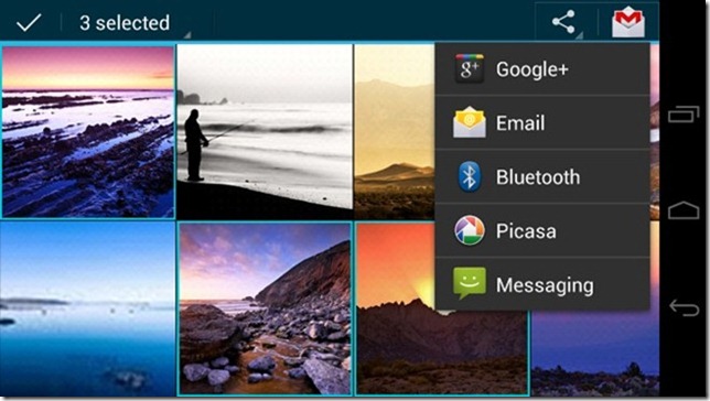
There is a new picture gallery widget as well that supports single image, album, image shuffling and image stacks. In fact it is a great example of the new stacks style of widgets, and can be seen in the section on widgets above.
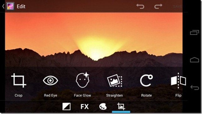
A totally new feature in Gallery is photo editing. You can crop images, add cool filters, adjust shot angle, remove red eye, and the list continues. All edits are saved as copies so your original file stays as it as and once you are done with editing, you can select the final result that looks best.
Communication
NFC Beam
NFC stands for Near Field Communication and it basically allows you to perform a vast range of interactions such as data transfers, payments, authentication etc. simply by touching another NFC-enabled device with it. In the Google I/O event earlier this year, Google announced enhanced NFC support for future versions of its operating systems and with Ice Cream Sandwich, it’s a reality!
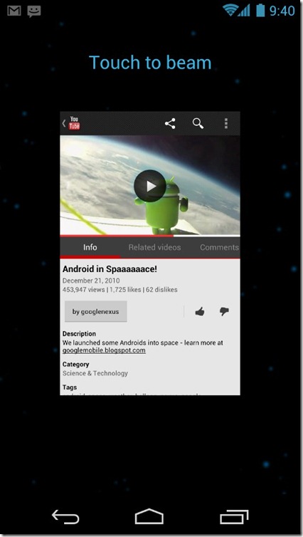
NFC Beam lets you share apps, contacts, music, videos and much more with another NFC-enabled phone by simply touching it with yours. Once you do this, you’ll see a preview of the item to be shared, with a ‘Touch to Beam’ message on top. Just tap the screen and the item will be shared with the other phone – it really is that simple.
Reading an interesting article and want your friends to read it on their phones? NFC beam will directly launch the article in the browser on their phone. Want to initiate a supported multi-player game with them? Just touch, tap and go! Came across a nice app and want them to try it out? NFC beam will open Market on their phone and load that app’s Market page. Maps, YouTube videos, People cards, you name it, you got it. An endless number of apps can add support for NFC beam to make sharing this easy, so expect a lot more in the future from this technology.
If you want to learn more about NFC, check out this guide I wrote a few months back on what is NFC, how it works and what are its practical applications.
Wi-Fi Direct
Ice Cream Sandwich also comes with Wi-Fi Direct – a peer-to-peer Wi-Fi connectivity method that lets you directly connect two Wi-Fi devices together just the way you would pair two Bluetooth devices, without the need for a Wi-Fi router or access point. Once connected, the devices can share the date connection of one with the other, transfer files at high speeds, stream audio or video between devices or print using a Wi-Fi Direct compatible printer. These interactions limited only by the apps and devices that support them. Any app can add Wi-Fi direct capability using its open APIs just like NFC, so expect a lot more from it in the future that will greatly improve the way we exchange information with each other.
Interestingly but not surprisingly, a Wi-Fi Direct pairing connection can be initiated via NFC.
Bluetooth Enhancements
Android 4.0 brings some additional features to its Bluetooth stack including Bluetooth Hands Free Profile (HFP) 1.6 that offers high quality audio connection with compatible Bluetooth handsfree devices.
There is also built-in support for Bluetooth Health Device Profile (HDP) that enables connecting to Bluetooth enabled medical devices for monitoring health statistics directly on your Android device.
Whoa, that was quite a ride. Now that we have seen a lot of what Android 4.0 Ice Cream Sandwich has to offer, all that remains is to wait for the first ICS devices to hit the market and take it on a spin. We will then bring you in-depth app-by-app coverage of Google’s latest offering in the Android franchise. So till then, stay tuned.
Did Ice Cream Sandwich come up to your expectations? Did it exceed them or came short of them? Share your views with us in the comments.

I have down loaded it, but honestly found a lot missing
1. When you see call log the phone dial screen appears and needs a command to get rid of it. Its irritating
2. I could not figure out how to get into wifi , blue tooth, flight mode by single touch, earlier version had it.
3. The key pad still doesnt have right left up down keys for navigation
4. The option to not use auto word correct could not be figured out. This irritates while typing special words
5. There is no facility to auto call reject for numbers other than in the contacts.
These are simple basics which a phone OS must have since its needed daily basis. Hope they do something on it
Naaa…. Every feature showed is already present n much more neatly integrated in WP7.5
I am a regular user of internet calling feature.I have been usung HTC Magic, Hero etc (rooted hadsets).
Both had core features like keep alive feature where I set a figure of 120. This way it saved a hell lot of battery. Both handset running CM7.
I have bought a HTC Sensation XE and find that under internet calling settings ,this vital feature of “Keep Alive” is missing resulting in heavy battery usage.
Can anybosy advise what can be done to bring that feature? I am aware of sip softwares available from market but I would like to use native sip ability.
Thanks.
Android 4.0 update now available in Philippines as of March 19, 2012
using Kies. I have my Samsung Galaxy S2 phone updated to Android 4.0 . Mabuhay! 🙂
I’ve uploaded my Samsung Galaxy S2 yesterday to Android 4.0.3 and it doesn’t look anything like this. Why is that?
That is because Samsung modifies the Android operating system for its devices, adding its own user interface called TouchWiz. That TouchWiz UI differs from the stock Android experience in several ways.
will wifi direct work on every phone?
LOL! Google is shameful. Not only did they blatantly rip off Windows Phone’s Metro styling, they also blatantly ripped off Windows Phone’s People Hub.
What a pathetic company.
They ripped off wp7 metro style???? How by having square block buttons?
Jan.17 the OTA ICS made it to my wifi Xoom in Tampa,Fla. I like it.
can ics work with galaxy s2 skyrocket??
i wonder how the ICS with HTC Sense will look like, Already, Sense is the best custom made skin out there. They say Sense 4.0 is going to be a revolutionary update, can’t wait.
where can i find the wallpaper used in the review?
this wierd blue and lot of dazzle just not 4 me….
is it windows phone 7 … 😛
its ossom…………………………………….;
iPhone sucks… Android is the real deal!!
This is a great review for the ics. Waiting for ics tablets!!
android sucks… iPhone is the real deal!!
den u r a chutiya ….
IPhone Is Gone, the past, bye bye and is for people that are dumb and know nothing about tech
So this being said you know nothing about tech and do not understand android therefore you are dumb
Go fanboy! Go somewhere else. You ignorants have no place in Android. IPhones may be the real(costly)deal but Android have real customization. And, hey have you tried any top droids.
Go iFuck a dog
Come on now, it doesn’t suck. It’s pretty good, it’s a derivative of iOS as is WebOS.
Yes the iPhone has the best software/hardware integration and is just more polished but to say Android and their phones sucks is ridiculous. But there are a ton of mediocre Android phones, I give you that much, but the top tier is great.
Very thorough review – thank you.
I wonder if the soft buttons (Back, Home, Task List) can be turned off for older phones that have these hard-wired?
if not, im sure that the cm team or some o the other developers will be working on that, or some how incorporate them
Yes, I think so too. I quite like my hardware buttons 🙂 (I”m sure I’ll change my mind when I get a shiny new phone without them!)
Detailed info. Android 4.0 will take the Mobile world by storm.
Waiting to get one smartphone with 4.0 .
Well said
waiting to get ICS 4.0 on my phone .. 😛
What about security stuff, that they add
Great post. Thanks for the thorough run-down.
I wish they have had added theming capability just like MIUI
Nice article, thanks
amazing post. thanks!
amazing post. thanks!
Very nice article! Cannot wait for ICS 🙂
android is now just trying to be a copy of iOS+WP7. shame… and i have an android phone!
android is now just trying to be a copy of iOS+WP7. shame… and i have an android phone!
You dont have an android phone. ios is a copy of everything. and just because a few “tiles” show up in the people app dont mean it’s a wp7 copy. Android was created in 2003 and bought by Google in 2005. Everything is a copy of Android. Go cry over your iPhone 4s epic fail some place else. A lot of these features are in Galaxy S2/Touch Wiz 4.0. text on incoming calls, media controls on lock screen and notification pull down, wifi direct, magazine style/resizable widgets, photo editor, single-motion panorama mode, screenshots. This looks awesome. I cant wait. If touch wiz lags out my phone I can just flash a pure rom and not miss out on features. HURRY UP AND GET HERE!!!!!!!! Woooooooooohooooooooooooooo
some of these features were already in Galaxy S1 Touchwiz 3.0:
text on incoming calls, photo editor, media controls on lock screen, single-motion panorama mode,
Sorry, I’m loving my Galaxy s2 but I gotta give credit where credit is due. Android and WebOS (Palm Pre) were both brought to their respective companies from non other than former Apple employees in their mobile division. Google went a bit too far, Eric Schmidt sat on Apple’s board, hired away key mobile developers and then resigned, lol. So everything is ripped off of iOS. Everybody wants a piece of the pie. Microsoft interestingly enough has been developing their own, that’s why it’s taking them forever to get something decent out, kudos to them for at least “copying” the OS in-house. Now, when I get my hands on the Nokia Lumina my little collection will be complete.
Sorry to bust your little bubble, but I have to educate those that are ignorant.
I can’t wait to see what the custom ROM developers do with this
That’s a weird thing to say…
That’s like saying I can’t wait to see how this baby’s grandchildren will turn out to be
Well seeing that we can flash an ICS rom in a month or two and not have to buy a new phone or wait untill spring for the official update I cant wait for the Dev’s to get this as well. Final roms are better than stock. Thats why Samsung hired cyanogenmod lead developer.
Custom roms is where the magic really happens !