Koalcat’s Clear Is A Clear For iPhone Look-Alike To-Do List App For Android
When it comes to finding easy-to-use and aesthetically rich to-do list managers for Android, rest assured that you’d be presented with more than adequate options in the Google Play Store. Previously reviewed to-do task management apps, such as Any.DO, Forget Me Not and Klick Todo, are just a few fine examples that instantly come to mind. While most of these apps are currently exclusively available in the Google Play Store, there are a few potential candidates present in Google’s nemesis, the iTunes App Store, too, that the users would love to get their hands on, like Clear for iPhone – a multi-gesture-based to-do list manager that lets users add, prioritize and mange their routine tasks via a visually appealing ‘heat map’ interface. If you (like me) are an admirer of said app and wish to get a taste of it on your Android device, then Koalcat’s Clear is probably your best bet, especially considering that the we have no word as to whether an official Android client of the Clear (for iPhone) app will ever be rolled. Whatever the case, one thing is for sure that with Koalcat’s Clear, you aren’t going to miss too many features that Clear for iPhone has to offer to iOS users.
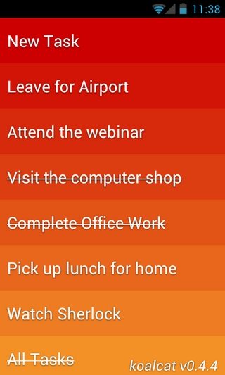
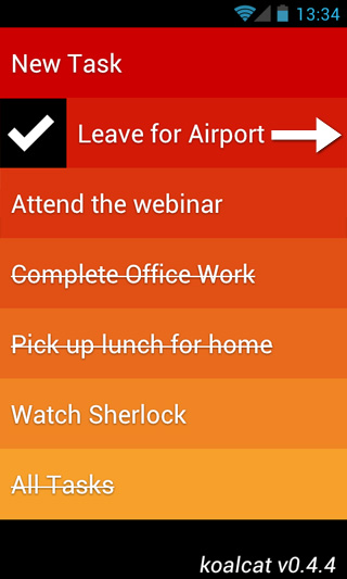
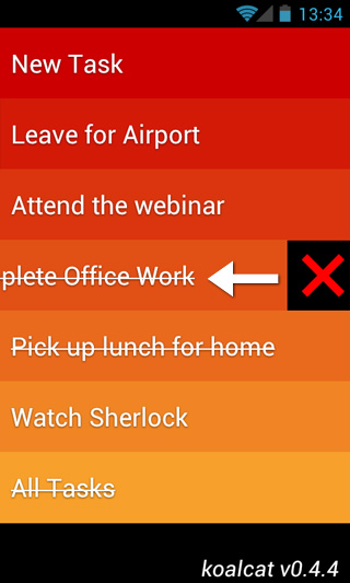
With Koalcat’s Clear, you get a solitary homescreen interface that lets you add your to-do tasks one-by-one. The app’s homescreen is designed in a way that it lists all the tasks by their relevant priority (from top to bottom), following the theme of a heat map. Various color-coded tiles constitute the entire homescreen interface, and each individual tile represents a separate task. The most important (or the hottest) task gets displayed at the very top of the screen on a dark red tile. As you keep adding new tasks, the list keeps growing vertically, and the color of each subsequent tile becomes milder, thereby representing a comparatively low priority task.
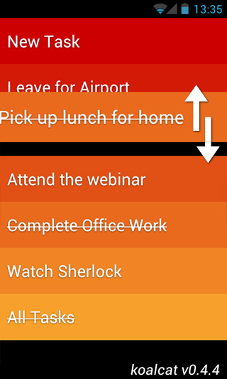
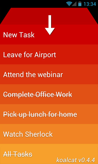
Just like Clear for iPhone, Koalcat’s Clear also sports no buttons and menus whatsoever. In fact, the app follows the simplicity theme so stringently, that there is no option even to add any schedule times or dates along with your tasks. Instead, all you can do is create your routine tasks, and use various gestures to manage and manipulate them on the screen based on priority. For instance, to add a new task, swipe downwards on the screen, specify your task, and press enter to confirm. To rearrange a task on the list, long press on the tile of that particular task and drag it all the way to the desired position.
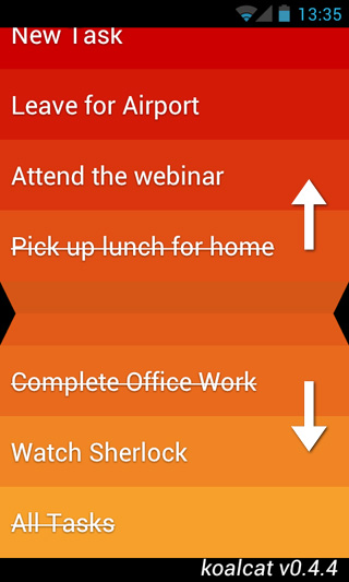
To create a new task in between any two existing tasks, place your fingers on the tiles of both tasks in question, and use the pinch/pull-to-expand gesture, much like you’d do for zooming into a picture. Swiping a tile towards the right marks the corresponding task as ‘Done’, whereas the reverse of it removes that particular task from the list. To edit an existing task, double tap its tile.
Now, to the best part of the entire deal; if you think that the iPhone’s ‘original’ Clear app is worth the $2 price tag that it carries, then rejoice, for you won’t have to pay a single penny to get your hands on the unofficial Android variant of the app.
Download Koalcat’s Clear for Android

Well there is a free version, but you are invited to make an in app purchase for a more feature rich version. Press the middle of the screen and drag down. I haven’t decided to do it yet.
Domino Case is batter than clear.
This is a brilliant app, use it all the time
this is awesome!