Excel 2010: Pictograph (Graph With Pictures)
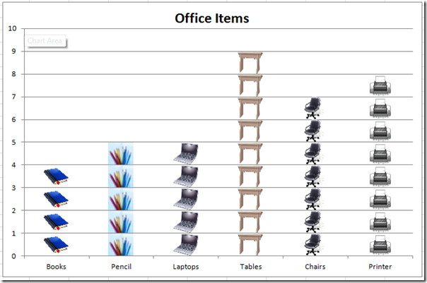
Excel Chart provides a way to represent data visually, but by customizing chart we can convert it in to pictograph (graph with pictures). It is an ideogram which convey its meaning through depicting images which resembles real-world objects, eventually making chart self-explanatory. Enhancing the chart would be very useful, it makes your audience comprehend the table data, without even looking at it. In this post we will be creating a simple pictograph.
Launch Excel 2010, and open datasheet for which you want to create pictograph.
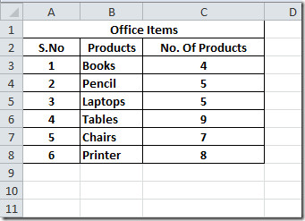
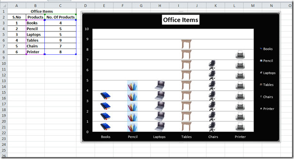
For instance, we have included Office Items datasheet containing, Products, and No. Of Products, as shown in the screenshot below.
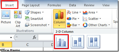
To start off with, first we need to include a simple column graph for the table Office Items. For this, select the column for which you want to create a chart, navigate to Insert tab, and from Column, select the basic 2-D Chart, as shown in the screenshot below.
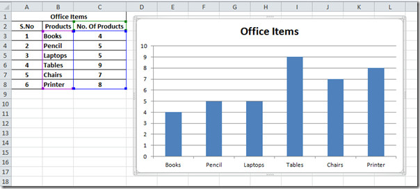
Upon click, it will automatically create the chart for you, showing Products in x-axis, and No. Of Products in y-axis. Give it an appropriate name at the top of the chart.
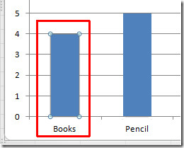
Now we will create Pictograph by adding picture instead of bars in the graph. For this select the first bar in the chart, click the bar two times (not double-click), to select it exclusively, as shown in the screenshot below.
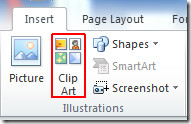
Now head over to Insert tab, and click ClipArt.
From ClipArt Pane, we will search for book clipart, right click the clip art you want to include, and click Copy.
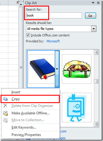
Make sure that book bar is selected in the chart, now paste this image by pressing Ctrl + V. You will see stretched book image instead of bar, as shown in the screen shot below.
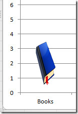
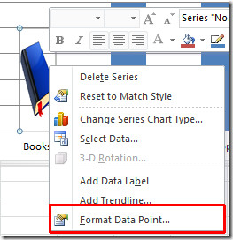
We want to show the number of books in the graph, by depicting same number of book images. Right-click the stretched image and click Format Data Point.
Upon click, Format Data Point dialog will appear, from Fill, enable Stack and Scale with option. Hit Close to apply.
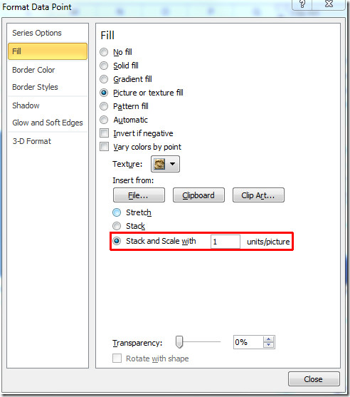
Number of book images as defined in table which will be shown in the chart.
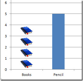
Now repeat the procedure for the other bars to place suitable images.
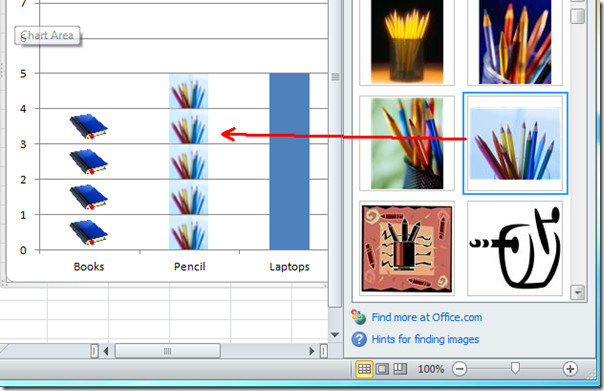
As you can see in the screenshot below that we have replace bars with images.
Now we will change the style and design to make the items more prominent. For this, select the chart, you we will notice three new tabs will appear. Choose suitable style, color, design, layout, chart type, gridlines, etc by accessing different groups from these tabs.

You can also check out previously reviewed guides on Scatter & Trendlines In Excel 2010 & Insert Slicer In Chart Excel 2010 (New Feature).

excellent trick
really nice – why i missed , thanks a lot
Very helpful… info.. 🙂
this sucks thats a bar graph with pictures not a pictograph
thank you very much :)) :bd this help me a lot