How To Customize The Chart Legend In MS Office
MS Word, PowerPoint, and Excel all come with a library of charts and graphs. With Excel, they’re much easier to insert. You can select the data you want to plot on the axis of a graph, and Excel will take care of the rest. These charts can be copied and pasted to other MS Office files. In Excel, they’re pretty intelligent; if you, for example, update the value of one of the plotted points, the chart will update automatically. The preset charts include certain elements e.g. how the title will look and where it will be placed, where the data labels will appear, where the axis titles will go, what the legend will look like, among other things. For each chart, there’s a pre-decided legend however, you can change the chart legend in MS Office to any other one that you prefer.
Customize Chart Legend
This works in all MS Office apps that you can create a chart/graph in. For apps that you cannot create charts in but can paste them in e.g. Outlook, this option will not be available.
Open the file with the chart you want to change the legend for, or insert a chart in a document. Make sure it’s editable. Charts that you copy and paste between MS Office apps are generally editable so you won’t have any trouble.
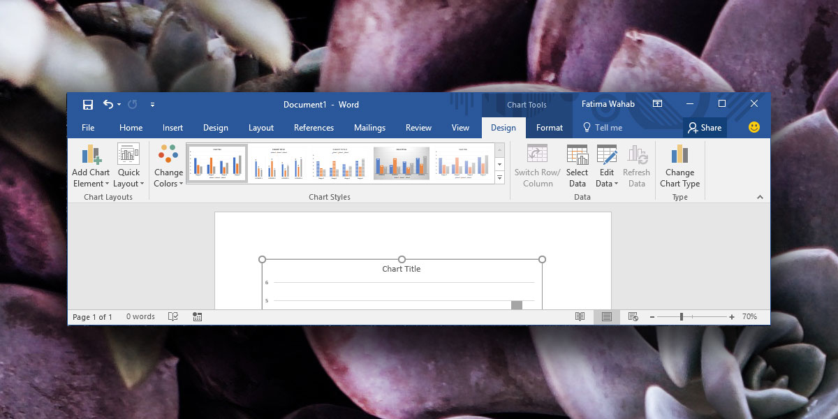
Select the chart you want to change the legend for. When a chart is selected, the Chart Tools tab becomes active. Go to the Design tab on the Chart Tools tab.

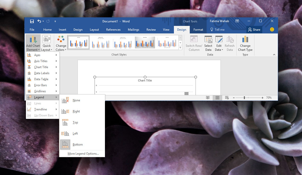
At the very left, you will see a button ‘Add Chart Element’. Click it and from the menu, select Legends. It will show you the different legend layouts that are supported by charts in MS Office. You can select any one of them to replace the current one. Based on the amount of space you have, you can replace the default legend with whichever one is easier to read and fits in your document.

You can drag the legend to position it anywhere within the chart however, if you want to position it automatically, select the ‘More legend Options’ option from the same menu. A sidebar will open where you can customize the color and the layout of the legend.
Other Chart Elements
This works for other chart elements too. They’re all listed under the ‘Add chart element’ button’s options and have sub-options of their own. MS Word suggests the chart elements that are best for a particular chart type but it doesn’t take into account the layout of your document or if the elements are easy to read or not.
