Customize Outlook 2010 Navigation Pane
Navigation pane (present at the left side of Outlook main window) provides centralized navigation to easily access the Outlook items’ bundled in different categories such as; Mail, Calendar, Notes and Tasks. On adding multiple accounts, it becomes untidy, eventually makes navigation a bit difficult. In Outlook 2010, you can easily customize it to keep only frequently used categories. In this post we will be focusing on customizing navigation pane.
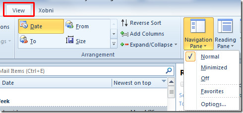
To begin, launch Outlook 2010, head over to View tab and from Layout group, click Navigation Pane. If you need to keep it minimized, click Minimized and to remove it from Outlook 2010 window, click Off. For advance customization click Options.

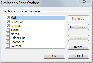
It will bring up Navigation Pane Options, here you can enable/disable listed categories, i.e, Mail, Calendar, Tasks, Contacts, etc. For changing their order, select the folder name and use Move Up and Move Down button. Now click Font to change the font size, style and font family.

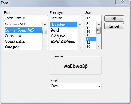
Under Font, select font family, from style, select desired font style and under size, specify the font size. Once done, click OK.

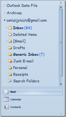
Save the changes made in Navigation Pane options by clicking OK. Below you can see the customized navigation pane.

You can also check out previously reviewed guides on How to create & use Email Templates in Outlook 2010 & How to change Default Email Font settings in Outlook 2010

Yes, you can get rit of the terrible gray navigation pane!
In the Personalization menu choose the theme “High contrast”. It has lots of white in it.
Use the Color menu to change other colours if the whole theme looks to white and your back in busines with a clear white Navigation pane!
Good luck.
This was very helpful. I’ve been told for years by our IT department that only the email columns/rows could have the font changed and that there was nothing that could be done about increasing the font on the folders. THANK YOU! This worked great for me!
Help, I usually can figure things like this out but now when i click on new….it opens a full screen for the new email, rather than a smaller box which it has always done. Any ideas?
I have four email accounts so my navigation menu is too busy, and not tall enough for me to see all 4 inboxes at the same time. If there’s a solution to this, please tell me. Otherwise, is there a way that I can determine the display order of email accounts?
Outlook 2010 needs an option for a White color scheme. Silver washes out the colors, drop-down icons and text. White would give more contrast.
Perfect solution Usman thank you so much.