How to Add a Secondary Axis in Excel: 2 Best Methods
It’s truly easy to visualize data in Microsoft Excel using various charts and graphs. But, when your input data table contains two series of Y-axis values on different scales, visualizing that table is not so easy. Here comes the secondary axis of Excel.
Continue reading to find out how to add a secondary axis in Excel by using automatic and manual methods.

How to Add a Secondary Axis in Excel in a Single Click
- Gather your data in a tabular format in an Excel workbook.
- Make sure that the X-axis data is always on the left side of the Y-axis data.
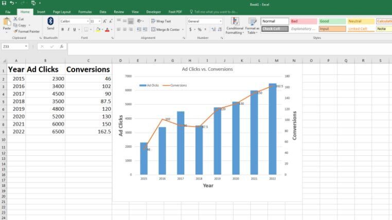
- In this tutorial, we’re plotting an imaginary Ad Clicks (Y-axis) and Conversions (Y-axis) data on Year (X-axis).
- You can put any data provided there is a large gap between the scaling of the data points.
- For example, the Conversions numbers are almost 50 times fewer than the Ad Clicks figures.
- Now, if you’re using Excel 2013, 2019, Office 365, or 2016 versions, you can add a secondary axis with a single click.
- Select the entire data along with its column headers.
- Click on the Insert tab of the Excel ribbon menu.
- Now, select the Recommended Charts in the Charts section.
- Choose the Clustered Column Chart, the first recommendation.
- Select the Conversions data series, and right-click, and then hover the mouse over Add Data Levels.
- Now, select Add Data Labels to show Conversions data points on the graph.
- You can also add Axis Titles by going to Design > Add Chart Elements > Axis Titles.
How to Add a Secondary Axis in Excel Manually
If you don’t see an appropriate Recommended Charts with the secondary axis in Excel, try these steps to add another Y-axis manually:
- Select all the cell ranges and then click on Insert.
- Now, navigate to the Charts section on the Excel ribbon and then click on Recommended Charts.
- Insert the first Line Chart that you see.
- Select the Conversions data series, and right-click on it, and choose Format Data Series.
- The Format Data Series navigation pane will open on the right side of the workbook.
- Choose Secondary Axis and close the navigation pane.
- Now, Excel plots the graph in two Y-axis and one X-axis. The X-axis refers to the years of collected data.
- The left-side Y-axis visualizes the Ad Clicks, and the right-side Y-axis visualizes the Conversions data.
- Though Conversions values are much smaller than the Ad Clicks data, still you can see them clearly.
- You can drag and drop the legends inside the chart area to increase the readability of X-axis values.
- Also, apply the previously mentioned chart modifications to make it look more professional.
- For example, you can visualize the data labels of each data series by making a right-click and selecting the Add Data Labels option.
Final Words
So far, you’ve found out how to add a secondary axis in Excel. Now, you can also showcase complex data tables in a visual way that your audience will understand effortlessly. Moreover, you’ve also learned how to modify the primary and secondary axis to make them look better.
If you’re passionate about Excel and want to learn more secret tips and tricks, also read how to add leading zeros in Excel.