OS X Mavericks: Hands-On With New Features & Changes [Review]
This has been a very busy time of the year for Apple. They have released the next generation of Mac OS X, 10.9 Mavericks, and it is available for free. With an overhaul of iWorks and iLife also announced, the news of the iPad Air and new iPad mini with Retina Display turned this into Apple’s week. We certainly have been waiting for the final, public release of OS X Mavericks for quite some time, and now that we’ve had a couple days playing around with its new features and changes, let’s get to what we think of the OS.

Pre-requisites
Owners of an iMac (Mid-2007) or a Macbook (Late 2008) and all future Macs are eligible for the upgrade. If you are running Mountain Lion, then you should be able to run Mavericks just fine.

Pricing
Given that this is an Apple product, it is quite perplexing to see something with this much attention being given away for free. Fortunately, Apple has a very good reason: unification. Apple wants to create an ecosystem where all users are on the same platform, be it iOS or OS X and that plan seems to be coming along very nicely. iOS 7 will soon be installed on over 90% of the supported devices and the same is anticipated for OS X Mavericks. This unified ecosystem will help developers create content that reaches out to larger audiences.
Interface Changes
Mavericks is virtually a clone of Lion when it comes to the interface. The icons look the same (only the maps icon is new), the dock looks the same, and so does the Launchpad.
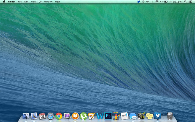
Mission control looks the same as well, but can now be moved around and doesn’t always have to be on the left-hand side.

The level of heavy visual modification as seen in iOS 7 is absent in OS X Mavericks except for a handful of incidents, such as Calendar, Notes and Contacts, that are similar to their iOS counterparts. One other small change is that when an app is newly installed, it has an nice sparkle effect around it.

Also, Apple has abandoned the grey linen texture that dominated the OS in favor a shade of slate grey, which is a purely aesthetic, but an interesting enhancement nonetheless.

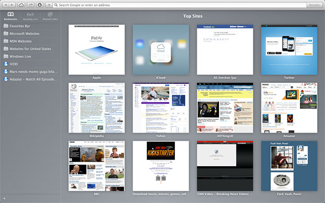
Safari’s “Top Sites” window has gone through a visual overhaul as well. Looking much closer to the iOS version, otherwise feels the same as the previous version. There are a few performance upgrades, but that’s a discussion for another time, as they aren’t exactly Mavericks upgrades.
Quick-Reply, Notification Center Changes
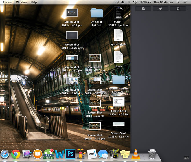
The notification center is mostly unchanged, except for the added Messages and LinkedIn widgets, and the aforementioned change in background.
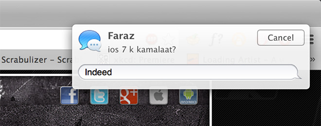
A handy addition to notification system is the option to respond to alerts (such as incoming iMessages) directly from within notification banners.
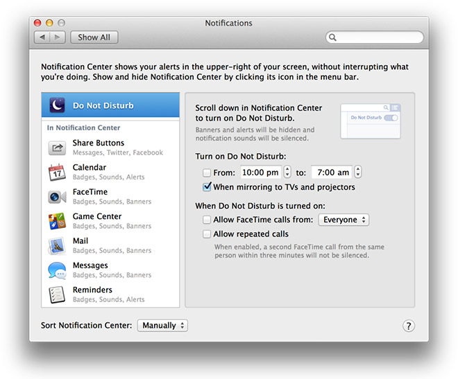
The rather archaic on/off switch at the top of the Notification Center has been rebranded as “Do Not Disturb”, and the feature doesn’t just share a name with its iOS counterpart now; it is also just as flexible. You can now schedule the feature to turn itself on and off at a set time of day. You’ll find the Do Not Disturb toggle by scrolling down the Notification Center.
Additions to Finder
We’ve grown accustomed to our storage browsing experience remaining rather unchanged through most updates. Even though the Finder has been tweaked every now and then, this time around they have made a few much needed and major modifications. It is still no overhaul, but a step towards a slow and steady change.
Tabbed Browsing
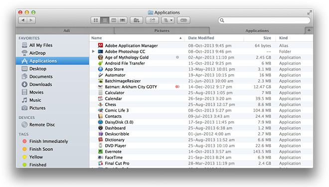
The most important of the lot is tabbed browsing. No need to make a mess with multiple windows when the pleasure of tabbed browsing is just a turn away. I’m surprised they didn’t do it sooner. Hit ⌘ + T in the Finder, and you get another tab within the same Finder window to improve your browsing experience.
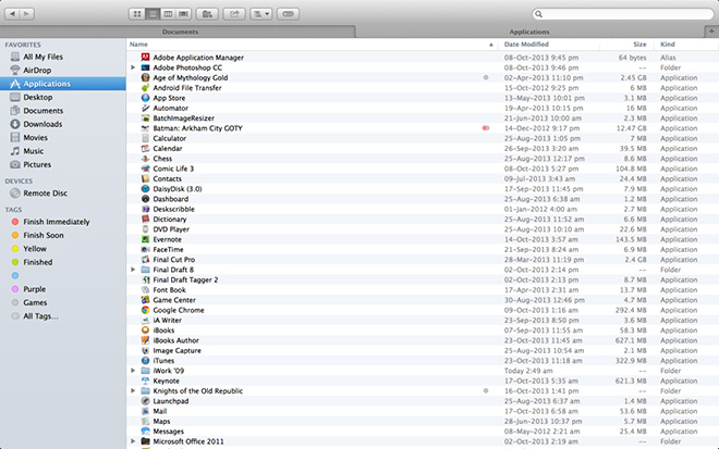
If that’s not enough, you can now switch Finder to full-screen mode.
Finder Tags
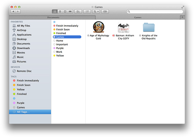
Speaking of improved experience, we now have the luxury of tags. In Mountain Lion, you had the option to color-code files, which proved to be very handy when it came to sorting documents. With Mavericks, Apple has reached the next logical step and turned those color-codes into tags (accessible from Right-Click > Rename). You can give each item multiple tags. All of this will help you locate files instantly without having to sift through lengthy search results.
Dual Display Improvements
Until now, the secondary display on Mac was either used to clone the primary display onto another screen or it was being used as an extension of the desktop space with no real identity of its own. Now, the Launchpad will appear on whichever desktop you are working on, be it the primary or the secondary display, and you can run apps in full-screen on either display, leaving the other free for regular use.
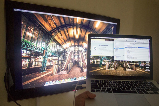
The latter feature isn’t exactly perfect. When running a full-screen app on a secondary screen, you cannot transfer a new window to the display without first either exiting full-screen mode or switching desktops (default four finger swipe) and then switching the app. This is a minor detail; it took me less than two minutes to figure it out, so this shouldn’t be cause for concern.
iCloud Keychain
If you are a devout Apple follower, then you must remember the now-defunct MobileMe. It’s best feature was a centralized login credential management system (Keychain synchronization), one that never reached any level of significance but was appreciated nonetheless and was mourned when MobileMe was replaced with iCloud in 2011. iCloud did not offer any replacements up until the release of Macericks, and with it, iCloud Keychain for Safari.
After a sludge of security questions and verifications, all the login credentials saved using Safari are synced with all your other Keychain-enabled devices for AutoFill. This feature applies only to OS X and iOS, so if support on other platforms is a concern, you are better off using third-party management tools such as the built-in sync feature in Chrome and Firefox.
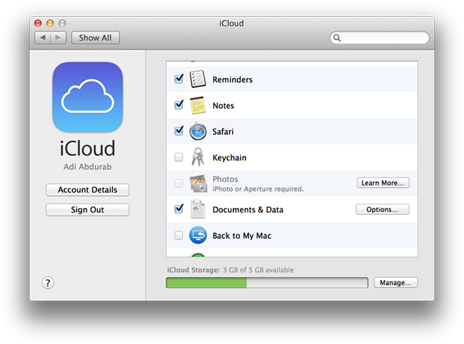
Check out our article on how to set up iCloud Keychain on iOS.
iBooks
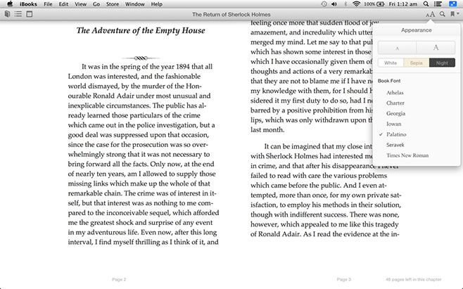
Have you used iBooks on iOS? If so, then your experience with the new desktop version on Mavericks will be nearly identical (minus the page-turning animation), more so if you are using Retina Display.

You can even read DRM-free EPUB books using iBooks in case you you have purchased your book elsewhere. Any minor differences in visuals are easily overlooked a few words into the reading.
Maps
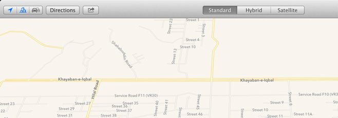
Apple’s Maps app has had a tumultuous journey since its separation from Google Maps. Mavericks comes with a desktop variant of the Maps app that looks almost exactly like the iOS 6 version of the mobile app.
One great feature is that it can share locations and directions with your own iOS devices over iCloud or with others through email, iMessage, AirDrop, Twitter or Facebook. Emails deliver the information in the form of a PDF attachment, a far cry from the simplicity of visiting maps.google.com. As far as the inaccuracy of plotted routes is concerned, not much seems to have changed.
Energy-Saving Through ‘App Nap’
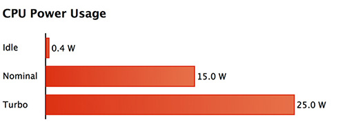
The image shared by Apple at the WWDC (on a Haswell processor) indicates promising energy saving measures. I was mostly plugged in to AC power while testing Mavericks, but the few hours I did spend on battery showed slower consumption than what I was accustomed to on Mountain Lion. This seems to be the case with everyone on Mavericks.
Of course, there is no way of giving an exact percentage of the power you can save; we can only give you a broad spectrum. There are too many varying usage scenarios to say anything conclusively other than, yes, Mavericks has reduced power consumption. They have accomplished this using a feature called “App Nap”. When an app is in the background, the OS automatically reduces its I/O and CPU priority, in turn, reducing the total work done.


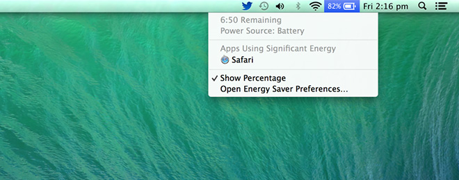
Mavericks also notifies you when an app is taking too much power.
Better RAM Management & OpenCL Improvements
When the system runs out of RAM (which is a common theme in Macs since they ship with bare minimum RAM), it automatically starts storing to the disk. If a memory segment is needed, it is recollected from the disk, which is why more RAM is important for smooth functionality. Systems low on RAM are usually busy ferrying between disk and RAM, slowing down your browsing experience.
Mavericks has found a very clever method of sorting this out, it finds the least used segment of memory and compresses it, instantly creating more space without having to switch between disk and RAM. It seems to be actively avoiding swap space, which is great for optimum efficiency, energy conservation and performance.

Modern Macs with integrated GPUs get some nice improvements in Mavericks. Any Mac with Intel’s HD4000 graphics or better can now run OpenCL on the integrated GPU in addition to the CPU and any discrete GPU.
Other Changes & New Features
Shared Links
This new Safari-exclusive feature finds links from your Twitter and LinkedIn feeds and displays them on the left hand side of the browser window. This can help speed up your social media experience by eliminating the need to switch between windows to sift through links.

Auto-Updates for Apps
Like in iOS 7, apps will now be updated automatically. This can be disabled from System Preferences > App Store. I personally feel like auto-update should have been there all along. One less thing to worry about.
Notification Center on Lock Screen
If you have locked your system, your notifications will continue to pour in, this can be both good and bad based on how frequently you prefer being updated.
Offline Dictation
Before Mavericks, if you wanted to use the dictation feature, you had to be online. This wasn’t a big problem outside of a few scenarios, but has still been mitigated with “Offline Dictation”. When activated, the feature will download around 700MB of data, enabling you to use dictation offline.
Parental Control
The parental control setting, which could already manage App access, Timing, Web and People before, has now been expanded to allow limiting the webcam.
Conclusion
This is a seriously impressive upgrade to the OS X product line. Everything has been improved but not drastically modified. Touch response is smoother and faster while scrolling, Parental Controls are a great idea, Offline Dictation was a good move, you get a new cast of special characters for input, and so many minor changes that we are sure will keep popping up as time goes on.
Apple created computing utopia with the iPad (if you ignore the lack of a keyboard) and are now steadily reaching a point where Macs will be able to achieve that level of success in their market, and Mavericks is a big step in that direction. What are your thoughts on the update? What do you think Apple should add in the allegedly in-production OS X 10.10? Let us know in the comments section below!
Be sure to check out our post on lesser-known new features in OS X Mavericks.

WOW,, NEW SOFTWARE, I LIKE IT
full indir thanks very thanks…
had to roll back from yosemite.. couldn’t get coldfusion running
I’ve used color coded tags extensively in list view since they first became available on MacOS. Going from a line tag to a dot that cannot be moved is either an oversight by Apple or impossible to find on my part, probably the former. There should be an option to revert to a familiar appearance.
Please explain in more detail for us uninitated into the OSX world ?