How To Turn Off App Store Autoplay Videos In iOS 11
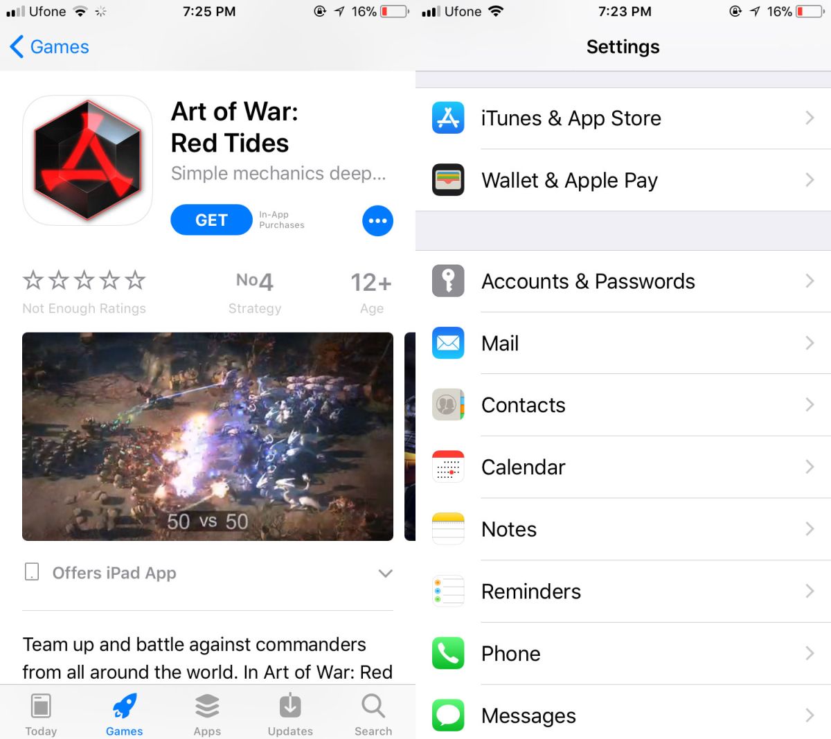
The App Store has a brand new look in iOS 11. Games now have a dedicated tab of their own and there’s a ‘Today’ tab that highlights games and other apps for the day. The featured categories include app of the day and game app of the day. The today tab features a lot of neat app-related content including a Meet the Developer segment. Unfortunately, Apple decided to hop on to the ‘autoplay videos’ bandwagon which Facebook, Google and LinkedIn are all guilty of. These videos aren’t new content. The App Store has always allowed developers to include game trailers or demos on their respective app pages alongside game screenshots. It’s just now they’ll play automatically. Fun times. Here’s how to turn off App Store autoplay videos in iOS 11.
Turn Off App Store Autoplay Videos
Open the Settings app, scroll down, and tap iTunes & App Store.

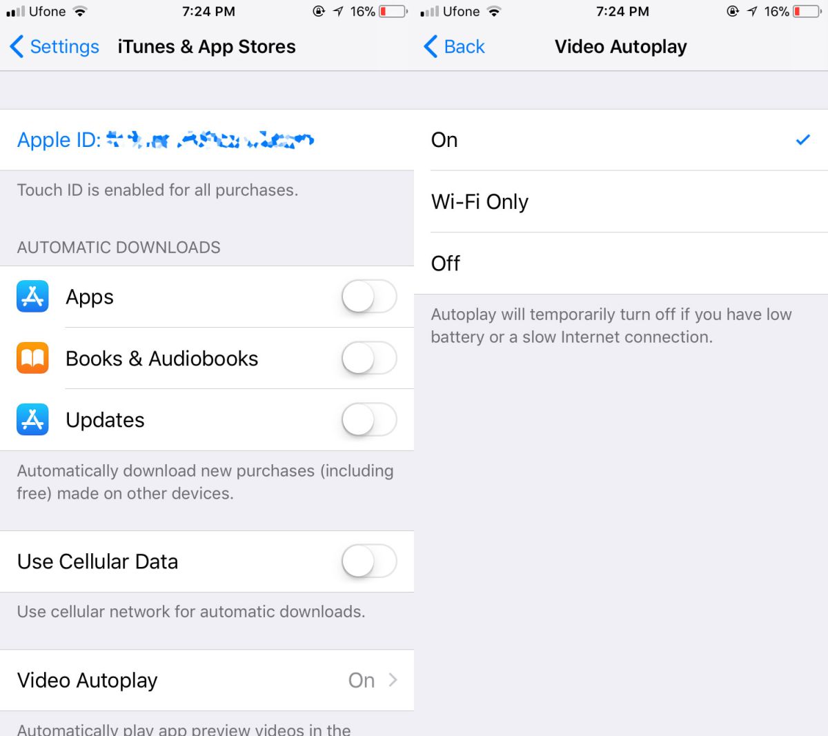
On the iTunes & App Stores screen, tap Video Autoplay. On the Video Autoplay screen, either turn the option off, or enable it on Wi-Fi only.

App pages aren’t the only place you will see this autoplaying videos though that’s where you’re most likely to come across them. Other tabs feature videos too just not as often. For example, the Apps tap will also show and autoplay videos uploaded by an app if said app has been featured there.
iOS 11 Inconsistencies
The changes made to the App Store aren’t bad. In fact, Apple now highlights several different types of apps every day which, for app developers, is great. It’s just baffling that the company has added something like this.
This seems to be a problem with iOS 11; the new features are great but throughout the OS there are odd little inconsistencies and some poor decision making. What they show is something no one expects of Apple; a lack of attention to detail. It’s perhaps this kind of oversight that might have resulted in Apple thinking enabling video autoplay by default is a good idea. It’s never a good idea especially if for the longest time, you’ve done things differently.
If you’re wondering what other inconsistencies there are in iOS 11, they’re more to do with the UI and less to do with functionality. One example of a functional difference that shouldn’t be there is the alert screen for alarms and timers. The position of the off button for timers and alarms is not the same. The alarm’s alert screen has two buttons, snooze and stop. The stop button is at the bottom of the screen when your alarm goes off. The timer alert screen has two buttons; Stop, and Repeat. The repeat button is at the bottom of the screen instead of the stop button.
