iOS 6: Lesser Known Features & UI Changes
With new versions of an existing operating system – be it in smartphones or desktop computers – the number of new features is what sets it apart from not only its predecessors, but also the competitors. While bug fixes and performance improvements are perhaps more important than how most people might give them credit for, the fact remains that a casual user is more interested in what additions have been made to the feature set. Apple’s latest iOS 6 is no exception, and the Cupertino giant is already touting over 200 new features in their latest smartphone/tablet OS. We have covered all the major ones extensively in our thorough guide to iOS 6, but in all honesty, that list only comprises about 13 different articles, and one might question (read: wonder), where are the remaining ones? The truth is, not all features are either equally-big or enough known, and in this post, we’ll take a look at some of the more important but lesser known features of iOS 6, along with user interface changes, that you might’ve missed.

We’ll start with the features and enhancements, and then move on to UI changes.
Lost Mode In Find My iPhone
One of the new introductions in iOS 6 was an improved Lost My iPhone app, which now comes with a Lost Mode. Not only will your device stay logged into Find My iPhone on iOS 6, but also display the charge remaining once it has been located. Furthermore, using the aforementioned Lost Mode, you can remotely track and lock your lost device and display a message on-screen, which will (hopefully) help the finder in returning it to its rightful owner.
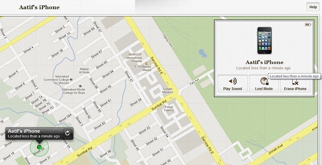
Invoking the lost mode requires you to have Find My iPhone installed on your iDevice and iCloud configured to use it. With these requirements satisfied (and a lost device, of course), log into iCloud web interface and start Find My iPhone. Once your device is located (we’ll come back to what happens when it isn’t located in a while), use the panel to put it in Lost Mode. You’ll be asked to enter a passcode if there isn’t one on the iPhone already, after which you may optionally provide a number and message on the screen to indicate to the finder where to contact.
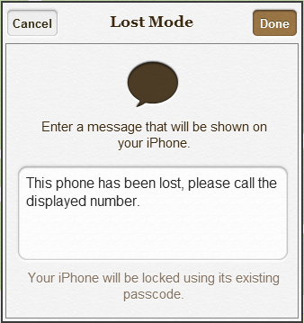
An iPhone/iPad in lost mode will continue to display remaining battery juice as well, alerting you to how much longer will your phone sustain.
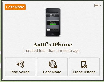
In Lost Mode, your phone’s screen will display the relevant message, along with the optional phone number.

It may be noted that if a device isn’t located immediately (because it wasn’t connected to the internet), it will be put in pending mode, whereby the lost mode will kick in as soon as iCloud is able to poll it after restoration of connectivity. Lost Mode may also be initiated from the Find My iPhone app on the device itself, although I fail to understand why someone would choose to do that.
Find My Friends In iOS 6 – Get Alerted When Someone Reaches A Location
Find My Friends itself is nothing new, but the improvement that it has received with iOS 6 surely is. The app was aimed at keeping track of the whereabouts of your loved ones through active tracking, but Apple has now added a passive side to the story, complementing it with notifications. Using the latest version of the app, you can set alerts for people when they arrive at, or leave, a predefined geo-location. Thanks to iOS 6’s geofencing location service, this feature works really well, and if you’d already been using Find My Friends, you’ll find this a welcome addition.


Game Center Challenges
Game Center has been around for a couple of years, but iOS 6 spices it up further with Challenges. Earned an achievement in a game that you’re proud of? Want to show off to your friends who’ve been trailing in the same game? Challenge them from within the iOS 6 Game Center to beat your score and track their progress as they struggle to catch up, or kick the living lights out of you with ease.

You may want to check out this beginner how-to on Challenges for iOS 6 Game Center as well, if you’re having trouble with figuring them out. Took us a while, for sure.
Set Any Song As Alarm Tone On Your iPhone
Personally, I’ve always found my iPhone loud enough to be used as a reliable Alarm clock. One caveat, however, has been the restriction of using only the default tunes for alarm sound. With iOS 6, Apple has lifted this restriction, and now you can set any song from your music library as your iPhone’s alarm sound. So, the next time you want to wake up to your favorite tunes, simply set the track as your alarm sound and let your iPhone say goodbye to those sweet dreams every morning!


iOS 6 Saves Your Personal Dictionary To iCloud
Keyboard shortcuts have been a great introduction in iOS 5 to make typing easier. One problem, however, that I usually came across, was the fact that I’d set up some shortcuts on my iPhone and attempt to use them on my iPad, forgetting that I hadn’t set those up on the latter. With iOS 6, your personal keyboard dictionary is backed up to iCloud and synced across all your devices, meaning that you don’t have to set anything up on both (or more) of them separately. That’s what typing freedom is, really!
iOS 6 Brings A Welcome Addition To The iPhone’s Emoji Keyboard
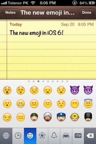
If I think about it, there’s hardly been anything in iOS 5 that I’ve used as much as the Emoji keyboard. The cute little pictures have always been a fun and interactive way of adding emotion to your texts, not to mention telling entire stories. iOS 6 improves on the native Emoji keyboard, adding more expressions, graphics, symbols, and almost something in every category. Try them out, you’ll fall in love immediately!
Purchase Music & Apps Directly From Within Third Party Offerings
You would’ve noticed this in earlier iterations of iOS if you’d been a fan of purchasing content for your apps – any purchase would direct you to either the App Store or iTunes and force you to leave the one you initiated the purchase from. In iOS 6, you can make purchases directly from within the app. Say, you wanted to purchase a new track for I am T-Pain, now you won’t have to quit it at all to make the transaction. Instead, everything will be handled from within, charging your iTunes account as always. A handy feature, perhaps, but not one that a lot of people would be using.
iOS 6 Safari Allows Uploading Images From The Photos App, Where Required
Had you ever tried to share an image from your iPhone using an online file sharing service? Up until iOS 5, that was an impossibility, because Safari didn’t allow uploading anything through web-based uploads. However, iOS 6’s Safari improvements also include the ability to grab photos or videos from your iDevice’s Photos app and upload them wherever supported. Indeed, we tested with Jumpshare, and it worked like a charm.

Unified iMessage Threads
iOS is now smart enough to combine your iMessage threads in one unified view, irrespective of the address they were sent to. If the same sender had initiated an iMessage conversation through your phone number, and another one through your Apple ID, instead of appearing as two separate threads in the stock Messages app, they’ll be treated as one. A minor change, but definitely convenient, in my opinion.

FaceTime Over Cellular (3G/4G LTE) – Finally!
Yes, it’s finally here! One feature that iOS users had been craving for, and one that was many people’s reason to jailbreak. iOS users can now make and receive FaceTime calls over their mobile data connection, as opposed to previous limitation of WiFi-only. Be advised as you enjoy the freedom, though; FaceTime can (and will) eat up data bandwidth in a hurry! Make sure you employ some sort of data usage monitoring if you don’t have an unlimited plan.
Developer API Changes: Camera Focus & Exposure Control, Reminders & Game Groups
Not all iOS 6 new features deal directly with users; some are there for developers to take advantage of to make even better apps. On that front, Camera API has received a major uplift, allowing better control over stock camera focus and exposure to be embellished to third-party apps. Taking that into account, we can hope to see some big players jumping gun at it pretty soon, brining forth better camera replacements, scanner apps, video recorders and the like. Moreover, video stabilization algorithm has been improved in iOS 6, and we can see the improvements in the HD samples captured on our iPhone 4S.
Likewise, the Reminders API now allows app developers to better interlink their creations with the Stock reminders app, and consequently take advantage of the elusive Siri, since Apple’s personal assistant blends well with the Stock reminders. Game Center has received Game Groups, which allow better multiplayer game management and let you share achievements across iOS and OS X versions of the same game/app.
That’s about it for noteworthy but little-known features of iOS 6. Hereon, we delve into the operating system’s UI changes, which improve (or not) upon whatever meager aesthetics that Apple’s smartphone OS holds.
User Interface Changes In iOS 6
New Sharing Menu
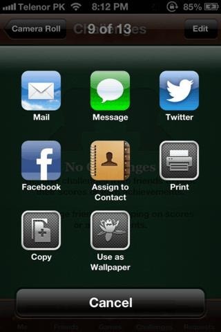
It’s refreshing to see Apple finally letting go of the button-based sharing menu in favor of an 3×3 icon-grid layout. Not only does that house more options than before, but also looks pleasing and better managed. Icons are changed based on available sharing options.
The “New” Ribbon On Freshly-Installed Apps
Any new app installations on your iPhone, iPod touch or iPad running iOS 6, will now have a ‘New’ ribbon on its Springboard icon, indicating that this app has never been used. Helpful if you’re in the habit of downloading multiple apps but not put them to work immediately.

I personally have an issue with this, however. The New ribbon appears only on apps that have been downloaded directly on your iDevice. I have a habit of downloading tons of apps through iTunes and then sync them to my iPhone or iPad later. For all those that are transferred this way, there is no ribbon, consequently leaving me clueless as to what I have yet to test and what’s old. It’s not like I’m missing on something that was previously there – it was always this way for me, until iOS 5.1.1 – but if Apple has introduced something that could benefit, it should work in all scenarios, and not just for one aspect of it.
Remodeled iTunes App
iOS 6 also features a revamped iTunes app, getting rid of the one that has been around on the platform since almost forever. The new app adheres more in looks to the new App Store style, and features sliding galleries with decent thumbnails of the offered content. Functionality-wise, there are no noticeable changes.


Revamped iBooks Store
It seems Apple has gone on a spree of revamping interfaces for all its stores, and iBooks store is no exception. Apple’s point of sale for literary masterpieces has also undergone a facelift, trading in the old familiarity for convenience and more data displayed in one screen. We like it, do you?


Extra Options In Reminders
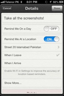
On the face of it, the Reminders app hasn’t changed at all. However, owing to the new developer API, there had to be some enhancements, and indeed, they’re there. The button on top left of the app’s interface lets you access Reminders Lists, which include those shared with you, those that you’ve created, and any that will sync across iCloud. A planner bar is also available at the bottom of this screen, while reminders themselves have now been endowed with geofencing as well, bringing location-based reminders to the mix.


Weather App Loses The Gradient, Looks Better In iOS 6
A purely aesthetic change, but the color tone of the stock Weather app in iOS 6 is more uniform and looks better. See the comparison below – the left image is from the Weather app in iOS 5.1.1, while the right one is from 6.0.


Phone Dialer Is Better – Though Still Lacking Smart Dial
The Phone dialer in iOS 6 has definitely improved on looks, although only the dialer part. All other tabs have remained absolutely unchanged. We’d have loved to see it finally getting Smart Dial/T9, but alas! Perhaps Apple deems that unnecessary, albeit wrongly.

iPhone/iPod Touch Music App UI Overhaul
Another facelift, without any functional changes. The whitish-gray tone is definitely aesthetically pleasing, but that’s as far as it goes. One interesting thing, though. Notice the glow on the volume slider in Now Playing? Rotate the device, and the glow actually shifts position, depicting an actual light-reflecting-from-metal scenario. Cool, huh?


Status Bar & App Header Color
For as long back as I can remember, iOS status bar featured only two colors: a plain black for Springboard and other areas, and a silvery-gray for other areas. In iOS 6, for the most part, the status bar adopts the color of the content header on screen. Check out the screenshots below.


Notice how the Status Bar has changed its color tone to blue and gray, to blend well with the content header? The traditional blacks are still there, but this certainly gives more uniformity to the content on display than previous versions. This chromatic scheme, however, does not work with all applications, so don’t grill us if you find the old blacks still hanging around somewhere in the OS.
This concludes our compilation of lesser-known but noteworthy features in iOS 6, as well as all the prominent interface changes that you may encounter. Do you think we missed anything? Stumbled across something that slipped under our radar? Drop us a comment below and let us know.
This article is a part of our guide to new features in iOS 6, which covers the following topics:
- Panorama Camera Mode
- Facebook Integration
- Shared Photo Streams
- Brand New Maps App
- Passbook
- New Native iPad Clock App
- Phone App Improvements & Do Not Disturb
- Privacy Control
- Siri Improvements
- Remodeled App Store
- Safari Improvements
- Mail App Improvements & VIP Inbox
- New Accessibility Features
- List Of Other Lesser Known Features & UI Changes (Currently viewing)

Great thanks
Tnx for a good article! as usual=)
iOS 6 is amazing, except Android still kicks ass.
Excellent article. Sharing this on Twitter.