Could Interface Get In The Way Of An App Submission Being Approved By Apple? [Case Study]
When it comes to what apps make their way into the iTunes App Store, Apple’s policies are rather ambiguous, at best. Developer forums across the internet are riddled with complaints of app rejections, despite a lot of otherwise-similar submissions making it past the Cupertino giant’s scrutiny. There have been fiascos like the infamous I Am Rich app, an insanely-expensive and ridiculous app that just splashed a fancy icon on your device’s screen, telling the world that you’re rich (the app was priced at a mind-boggling $1,000!), and had no other function or use whatsoever. Then, a simply Google search for App Store rejections would provide you enough tips on what to do and what not, to get your app past Apple’s strict and inconsistent regulations. This article, however, is neither aimed at making you an app submission champion, nor will it point out the flaws in Apple’s policies. This here is a case study into a certain variety of apps that got approved after several rejections, which our friends over at Sparkling Apps were kind enough to share with us, and anyone who’d benefit from this knowledge.
Should you be unaware, Sparkling Apps are the developers behind Voice Answers (any many other apps for iOS, Android and Windows Phone), the Siri-like chat bot & voice search engine that we reviewed back in April this year. The same team also takes credit for the development of Voice Ask [iTunes Download Link], a rather similar app that got rejected by Apple several times over the last five months (and that became the basis for the focused case study). Apple’s reason for rejection was almost always the same – an uncanny likeness to Siri. Granted, the app does perform a lot of functions that Siri boasts, but that’s actually the point. Siri – Apple’s highly-acclaimed virtual personal assistant – is restricted to iPhone 4S only (and has been one of the greatest selling points of the latest iPhone, too), and it’s apps like Voice Answer and Voice Ask that allow users of older iPhones, iPod touches and iPads to enjoy a similar experience. It had to be similar, and if you’ve been into iOS development even a little bit, you’d know that the SDK won’t ever allow you to replicate exactly what the stock version has on offer. Then, on June 26, 2012, Voice Ask update was finally approved!
After the initial excitement over getting past this hurdle subsided, the developers went on to analyze what they’d changed to finally make it into Apple’s good books. Turns out, it was nothing more than a graphical objection – you can see better for yourself in the screenshots below. The left image is when the app was rejected, while right one depicts what the approved version looked like.
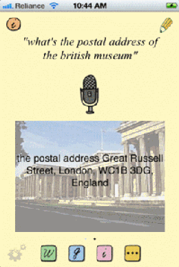
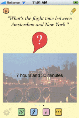
As you might have noticed, what’s basically changed is the microphone icon. Since Apple’s Siri employs a circular mic as its graphical representation, Voice Ask’s icon was deemed a copy that was “confusingly similar”, and as soon as that was replaced, the latter went through.
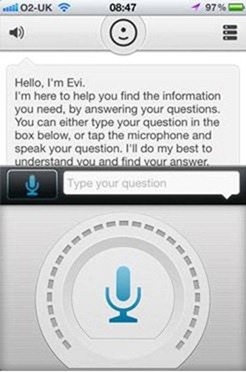
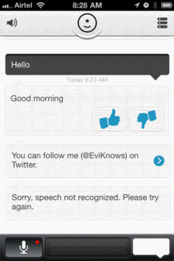
This could’ve been a rare, one-off incident, so Sparkling Apps decided to investigate. Turns out, they weren’t the only ones. The rather popular app, Evi, courtesy of True Knowledge, had also faced similar rejections as long as they continued to use a microphone icon for their artificial intelligence system. They changed that, and they, too, got right in. Check out the screenshots below (same order as above).
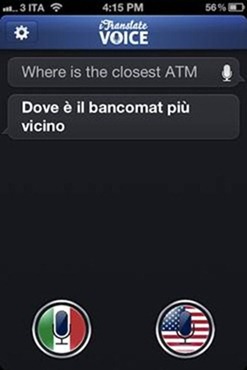
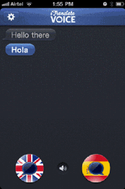
Another very famous case that follows suit was Sonico GmbH’s iTranslate Voice, a highly useful voice translator that instantly converts your speech to another language. They very-well-received candidate faced a fate much akin to Voice Ask as long as it continued to use a microphone icon, changing which resulted in immediate acceptance. However, in this case, the app also changed its iTunes App Store icon to resemble a message bubble, rather than the mic one (which, in my humble opinion, is again similar to the stock Messages icon, but hey, we already said Apple was inconsistent).
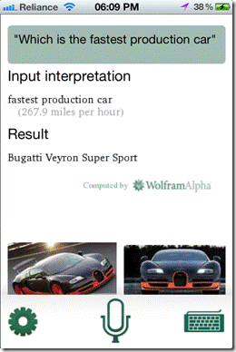
To sum up the case study, Sparkling App’s own Voice Answer rings the closing bell. Before they introduced the new robotic representation of Eve, they, too, relied on the microphone symbol, and guess what, Voice Answer continued to get rejected until it went away. Check out the screenshots below (left one shows the rejected version).

Apple’s guidelines are pretty thorough when it comes to what they approve and what goes in the waste bin, but as anyone who’s ever made an App Store submission will tell you, the process is vague and rather frustrating. There are, of course, certain basics that you should always get right – sticking to the Human Interface Guidelines (HIG), matching app icons with the iTunes one, precise descriptions in App Store submissions et al – but if adherence to them all is still not getting you past the strict rulings of the tech mammoth, you may want to pay attention to these little details. It may be that you’re missing that tiny action button that is not yielding a really useful “action menu,” or, as was the case here, an icon that mimics one of Apple’s own. Either way, we hope you find enough insight through this post to get you past those barbed wires that Apple’s regulatory process puts around the iTunes App Store.
Our big thanks to Sparkling Apps for sharing this info with us, as well as for the screenshots for the case study.
