25+ Best Free Android Launchers For Home Screen Replacement
What makes Android different from many of its competitors is the degree of customization it offers its users, which goes to the extent of even letting users choose what is essentially the primary user interface of any operating system – the home screen Launcher! With Android, you can choose from a plethora of available launchers offering a diverse user experience range, and it’s just as simple as installing the launcher like any other app. In what follows, we will take you on a feature tour of some of the best Android launchers available, to help you choose the one that’s right for you.
This guide is a part of our series on customizing the looks of your Android device. Other guides in this series include:
- Introduction to Android customization
- Make & Flash your own Android Splash Screen with Splash Screen Creator
- How to Change, Customize & Create Android Boot Animation
- How To Replace and Customize Android Lock Screen
- The Ultimate Guide to Android Wallpapers
- Replace and Personalize your Home Screen with the Best Android Launchers (Currently Viewing)
Note that there may be changes in this layout as we proceed, and we will be updating the links as we keep publishing the parts.
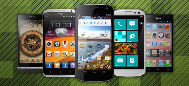
An Introduction to Android Launchers
A launcher is essentially the home screen interface that you see upon unlocking your device or pressing the home button. It houses your widgets and lets you interact with them, gives you access to your apps and lets you launch them, and provides you with an interface to pretty much everything else that resides on your device.
While most operating systems have their home screen interface setup as an integral part of the operating system that is usually very difficult and often near-impossible to replace, Android has a totally different and rather unorthodox take on this concept. With Android, launchers are treated just like any other apps, with only one difference – the ability to run automatically upon device reboot and on the press of the home button. In every other manner, they are treated by the Android system as regular apps, which means you can install them like regular apps from the Market, uninstall the ones you dislike and even keep multiple ones installed, switching between them at your pleasure! Though before we move on to those, let’s ask ourselves an important question.
Why Use A Different Launcher?
Before we proceed any further, let’s consider why should one go for a custom launcher in the first place. The reasons could be numerous:
- Your device shipped with the stock Android launcher and you don’t find it customizable enough for your needs;
- Your device shipped with a manufacturer-built custom interface (HTC Sense, Samsung TouchWiz, MOTOBLUR etc.) and you want the barebones stock experience or a more full-featured launcher;
- You want your phone’s user interface to mimic that of another operating system such as the iPhone’s iOS or Microsoft Windows Phone 7;
- You want something altogether different – a unique interface that isn’t like that of any major mobile operating system or even like Android’s conventional user interface.
Whatever be your reason, there are countless launchers available in the Market – some heavy duty, some lightweight; some with a focus on eye candy, some built for speed and performance; some conventional, some rather unique and unorthodox; some original, some replicas of other operating systems. In short, there are enough launchers to suit the taste of every Android user, and their grandmother! Though with all these available options, making your choice can be hard. That’s why we have gone through the trouble of trying out nearly all the launchers we could find, to bring you only the best. So without any further ado, let’s take a look at the best replacement launchers for Android, beginning with the basics.
UPDATE: The following list has been updated on the 11th of December, 2013, with a few older launchers taken out, some notable newer ones added, and some information on a few (but not all) of the existing entries updated.
Aviate Launcher
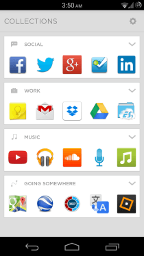
How do we really start to describe this one… simply put, it’s as good a launcher experience on Android as it gets. It’s a mobile device’s home screen done just right. It’s gorgeous, minimal, extremely user-friendly, intelligent AND completely free. Aviate doesn’t offer all the advanced customization options available in many other launchers included in this list, but that’s the point of it; it’s designed to show you the right information when you need it without requiring you to set it up and navigate between different screens manually to look for it. In fact it only comes with one home screen with limited space for widgets and app shortcuts. Though just because it has only one home screen doesn’t mean you’re limited to that; pressing the Home button or swiping down while on the home screen reveals information that’s custom-tailored to your current location or time of the day, including a set of apps and widgets for that type of location or time setting.
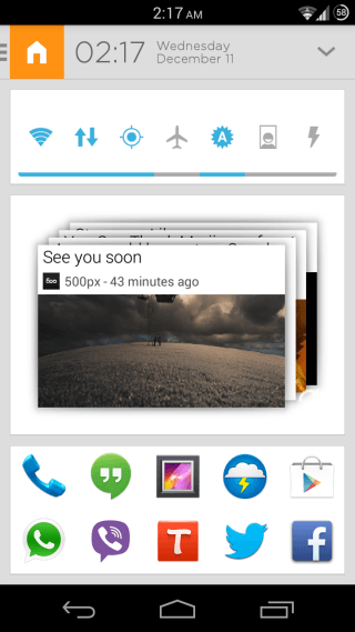
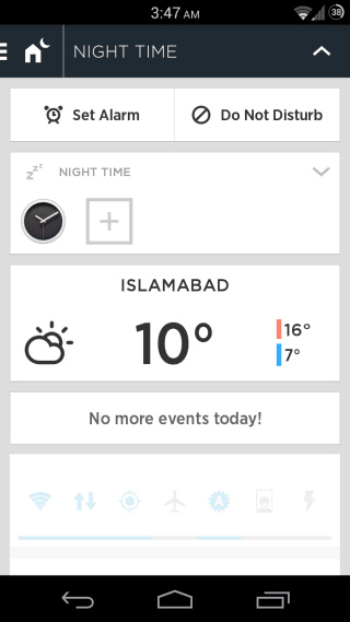
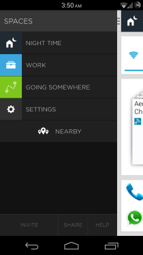
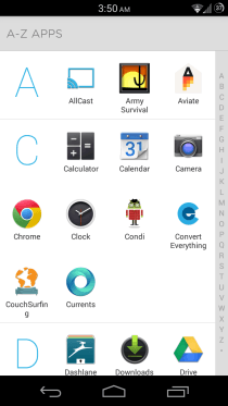
Swiping rightwards while on the home screen brings up a navigation drawer for manually selecting a location, while swiping towards the left takes you to a Collections screen that works like pre-organized folders for different types of apps that you have installed, and when you expand a collection, the launcher even gives you suggestions for apps in that category to help you discover more useful apps. One more swipe towards the left lands you on the alphabetically organized App drawer, which is minimal yet very functional, like the rest of the launcher.
At a Glance
- Type: Innovative | Unique | Minimal
- Tablet-optimized: No
- Dock Bar: Up to 10 icons of your choice
- Home Screens: 1
- Widgets: Scrollable
- Wallpapers: No static or Live wallpaper support
- Themes: No theming support
- Shortcuts: Not customizable
- Folders: Collections instead of conventional folders
- Animations: Standard and not customizable
- Custom Gesture Actions: No
- Screen Grid: Fixed
- App Drawer: Alphabetically organized, with quick alphabetical scrolling
- Landscape mode: No
While Aviate really is so good that I have been using it as my primary launcher since I first came across it, it does have a few shortcomings such as no option to create a new collection of your own or rename an existing one, and a very limited widget area on the home screen that adds all widgets in full width, and is prone to getting messed up when adding multiple widgets of varying sizes. Though these should be mere minor inconveniences for most users (including me), and the launcher works extremely well in every other aspect.
Pros
- Reasonably fast and stable
- Impressively context-aware intelligence
- Social integration for locations with Foursquare, Twitter, Yelp etc. to show you useful information and let you perform useful actions directly from the home screen
- No need for extensive customization, as its focus is to free you up from having to configure your home screen
- Excellent collection support and great app suggestions for each collection
Cons
- Very few customization options
- No custom gestures
- Widget support needs much improvement
- No options to change app icons
- No options to create or rename collections
Our Verdict
If you don’t want to have to customize your home screen in order to make it functional, but instead want it to work for you, giving you quick access to the right information based on where you are and what time of the day it is, Aviate is simply the very best option out there for you.
We highly recommend that you check out our detailed review of Aviate to learn more about this excellent launcher. It’s currently in invite-only private beta, but you can request an invite code after installing it, or ask someone who already have it installed to send you one.
Themer By MyColorScreen
MyColorScreen has made its name for being the home of some of the most stunning Android themes and home screen customizations out there. Though there was one problem with all those themes – you had to manually configure them using different apps used by those who uploaded them, and that process wasn’t always too straightforward, resulting in many users being unable to duplicate those themes on their devices. To address this, the team behind MyColorScreen had a brilliant idea: why not just build a launcher of their own, complete with a robust multipurpose widget that can be used together to duplicate the stunning themes available on the service with one tap? And result is Themer.
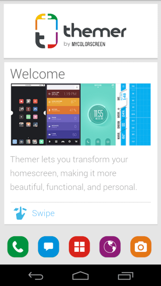
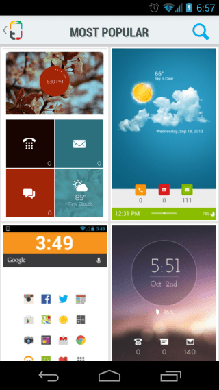
Unlike Aviate that’s all about not having you worry about customizing your home screen and just having it work for you, Themer is all about customizing it. You can use the app to browse through the collection of gorgeous themes available on the service, and install them on your device with a simple tap – no manual customization necessary. However, if you want to further tweak a theme or build something that exactly suits your needs, there’s support for tweaking pretty much every aspect of any theme manually. That said, the way most available themes look, most users won’t need to do any manual tweaking. Here, take a look:
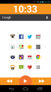
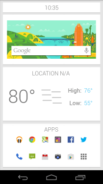
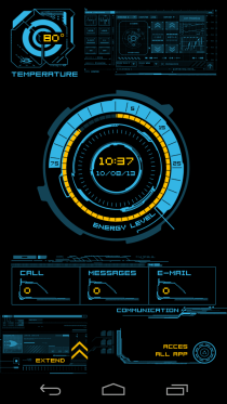
At a Glance
- Type: Innovative | Unique | Theme & Customization-focused
- Tablet-optimized: No
- Dock Bar: Varies with theme
- Home Screens: Vary with theme
- Widgets: Vary with theme
- Live Wallpapers: No
- Themes: At the core of the app
- Shortcuts: Vary with theme
- Folders: Vary with theme
- Animations: Vary with theme
- Custom Gesture Actions: Vary with theme
- Screen Grid: Varies with theme
- App Drawer: Varies with theme
- Landscape mode: No
While the themes are stunning for sure, the app isn’t without its imperfections. First and foremost, it can end up feeling slow, especially so on older devices. Secondly, while applying the available themes yourself takes practically no skills, tweaking and customizing them further can be a bit daunting in the beginning. Though the app is still in beta and the developers are working fast on improving it.
Pros
- Reasonably stable despite in beta
- Amazing collection of gorgeous themes that can be applied with one click
- Extensive customization options
- Most themes feature offer a great combination of aesthetics and useful features
Cons
- Rather slow, especially on older hardware
- Customizing themes can seem a bit overwhelming
Our Verdict
If you are a theming freak and want your Android home screen to always look pretty, fresh, different from most other Android devices, and quite functional, you absolutely must at least try Themer once, and chances are you’ll stick with it. Though if you aren’t into theming much and just want a launcher that focuses on functionality primarily, other options in this list will suit you better.
Do check out our detailed review of Themer to find out more about this gorgeous, theme-focused launcher. After being in closed beta for a while, Themer is now available as an open beta, and you can install it from Google Play.
Stock AOSP Android Launcher
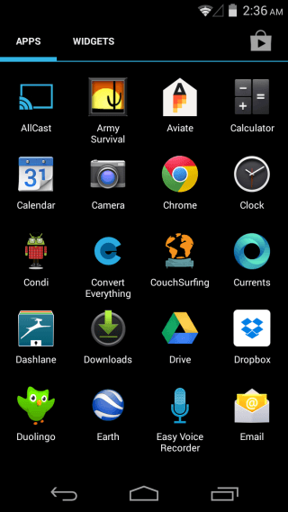
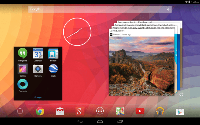
One of the most significantly improved parts of Android since the jump from 2.x to 4.x is the stock launcher. Despite still not giving us any customization options, Google finally decided to add support for scrollable and resizable widgets, up to five dock icons (four of which are customizable) and much better folders. While not exactly being the power user’s dream-come-true, these features have finally made it a worthwhile option for most users to stick with the stock launcher, and for those with devices that ship with manufacturer-specific skins (Sense, TouchWiz etc.) to want to install it as a much lighter and faster alternative.
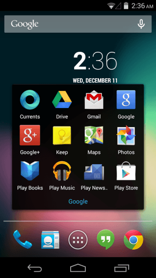
At a Glance
- Type: Featured | Conventional
- Tablet-optimized: Yes
- Dock Bar: Up to 5 icons | 4 icons customizable
- Home Screens: 5
- Widgets: Scrollable | Resizable (some)
- Live Wallpapers: Yes
- Themes: No theming support
- Shortcuts: Not customizable
- Folders: Drag-and-drop folder support
- Animations: Standard and not customizable
- Custom Gesture Actions: No
- Screen Grid: Fixed at 4×4 or 4×5 per screen on phones, 6×5 on 7” tablets, & 8×7 on 10” tablets
- App Drawer: Basic, with section for widgets
- Landscape mode: Tablets only
Pros
- Extremely fast
- Very stable
- Just the right feature set for most users
Cons
- No customization options
- No custom gestures
- Persistent search bar can’t be hidden
- Not all widgets are resizable
- No options to change app or folder icons
Our Verdict
If you aren’t a customization freak, don’t mind the persistent search bar, and want nothing more from your launcher than the ability to launch apps and show you widgets, this is definitely the launcher for you for its beautiful stock looks, great speed and stability.
Download Latest Stock AOSP Android Launcher
Note: If installing it as a regular app doesn’t work, you might need to install it as a system app.
Nexus 5 Android 4.4 KitKat Google Experience Launcher
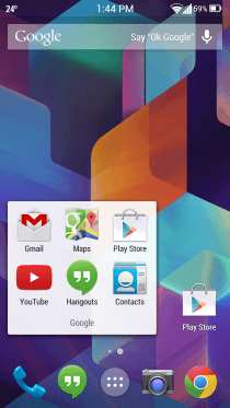
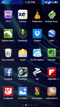
That’s quite a mouthful for a heading, but we couldn’t come up with a shorter one. Here’s why: So far, Google has always shipped all new Nexus devices with the latest version of the stock AOSP Android launcher, and included the exact same launcher in updates to all qualifying existing Nexus devices to the latest version of Android. With the Nexus 5, however, this changed. Instead of updating the stock AOSP launcher in Android 4.4 KitKat for shipping it with the Nexus 5 and later including the same updated one in the KitKat update for Nexus 4, 7 and 10, Google decided to create a new one from scratch and ship it only on Nexus 5, excluding it from AOSP and other Nexus devices even in the latest KitKat update. So that’s why the Google Experience launcher is also the stock Android 4.4 KitKat launcher on the Nexus 5, but not the stock Android 4.4 KitKat launcher for any other device, and not considered a part of pure stock Android. However, that doesn’t mean it can’t be installed on any other Android devices; you can manually install it on any device running Jelly Bean or KitKat.
Coming to its features, Google Experience basically acts as an extension to Google Now itself, and can’t even function without it. The integration is so deep that swiping rightward slides in Google New itself. This version also revamps folders visually, and eliminates widgets from the App drawer, instead making them accessible upon long-tapping the home screen, along with a new wallpaper chooser and Google Now’s settings.
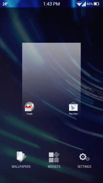
At a Glance
- Type: Hybrid of Launcher & Google Now
- Tablet-optimized: Yes
- Dock Bar: Up to 5 icons | 4 icons customizable
- Home Screens: 5
- Widgets: Scrollable | Resizable (some)
- Live Wallpapers: Yes
- Themes: No theming support
- Shortcuts: Not customizable
- Folders: Drag-and-drop folder support
- Animations: Standard and not customizable
- Custom Gesture Actions: No
- Screen Grid: Fixed at 4×4 per screen on phones, 6×5 on 7” tablets, & 8×7 on 10” tablets
- App Drawer: Basic
- Landscape mode: Tablets only
One of the interesting features of Google Experience launchers is the ability to trigger voice search in Google Now by simply saying OK Google while on any of your home screens, without even needing to touch the phone.
Pros
- Quite fast
- Very stable
- Excellent Google Now integration
- Just the right feature set for most users
Cons
- No advanced customization options
- No custom gestures
- Persistent search bar can’t be hidden
- Not all widgets are resizable
- No options to change app or folder icons
Our Verdict
This one should be the launcher for you if you aren’t really into a lot of customization, don’t mind the persistent search bar, and aren’t really looking for anything more than the ability to launch apps, view widgets, and access Google Now super-fast.
For more information, download link and installation instruction, proceed to our coverage of the Google Experience Launcher.
Apex Launcher
While the above three options should be enough for most users, if you want to have way more control over your device’s home screen while at the same time sticking with the exact same excellent look and feel of stock Android, you have quite a few options available, with Apex Launcher being among the very best of the lot.
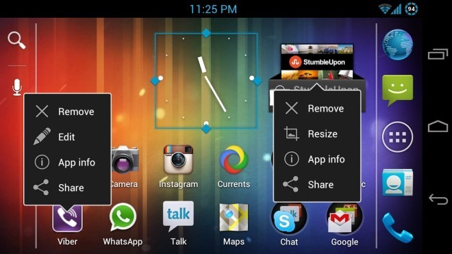
In terms of looks, you probably won’t feel any difference from the stock AOSP launcher. However, above, you can see some of the features of Apex launcher in action. including landscape mode support for phones, custom icon grids (4 x 6 in this case), custom folder icons (square in this case), context menus for apps and widgets and their options, and the ability to resize any widget (demonstrated by the clock widget in resize mode, which isn’t resizable under the stock launcher).
Note: The above image is a mashup of three images to show two context menus and a widget being resized, all in one image. It is not actually possible to actually do this all at once, as bringing up another menu will hide the previously visible one.
At a Glance
- Type: Full-featured | Conventional
- Tablet-optimized: Yes
- Dock Bar: Up to 35 icons | Scrollable | All customizable
- Home Screens: Up to 9
- Widgets: Scrollable | Resizable (all)
- Live Wallpapers: Yes
- Themes: No theming support
- Shortcuts: Customizable
- Folders: Drag-and-drop folders with custom icons support
- Animations: Customizable with many options available
- Custom Gesture Actions: Yes
- Screen Grid: Customizable up to 7 x 7 on phones; up to 10 x 10 on tablets
- App Drawer: Robust, with many customization options like transparency, vertical mode & more
- Landscape mode: Both phones and tablets
If we get into detailing every single option Apex offers, this post will probably end up being all about Apex. This nifty launcher has almost everything one can want from a conventional-style Android launcher. Up to 9 home screens with customizable grid sizes, customizable folders, eye-catching transition effects, fully customizable app drawer with a separate tab for your downloaded apps, custom gestures for double-tapping, swiping upwards or downwards, double-tapping, tapping and holding or even tapping the home button…and the list just goes on and on. The dock is scrollable, with support for up to 7 icons per dock page and a maximum of 5 dock pages, giving you a maximum of 35 icons in the dock alone. And you get to have control over the display of all the cosmetic effects like the horizontal line above the dock icons, the home screen and dock scrolling indicators etc..
A great benefit of tapping gestures on devices lacking hardware buttons (like Galaxy Nexus) is being able to double-tap in the empty area on any home screen to get the conventional launcher menu for instant access to settings and other useful shortcuts. And yes, even that menu is fully customizable.
And surprisingly, despite all these options, configuring it is a breeze, unlike some other launchers like ADW.Launcher that intimidate many users with the plethora of options they provide.
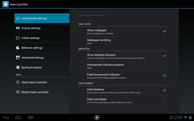
Once you are done customizing it, you can save your settings as well as home screen layouts to SD card so that if you end up messing around with more options than you wanted to, getting back to your perfect layout and settings would always be just a few taps away.
White it doesn’t have any shortcomings we would consider too serious, Apex could get even better if a few features that have been overlooked could be added. Folder support for the app drawer (similar to GO Launcher EX’s) would be really awesome; we haven’t yet seen it in any stock-based launcher. Also, while it does support pinch-to-preview home screen gesture, one can’t really change the order of the home screens or add/remove them from there. So if you decide that your second home screen should now be the third one, you’ll have to manually transfer all its contents to the third one.
Furthermore, there is an option to show or hide the status bar using a swipe gesture, but no such option is available to show or hide the dock bar using a similar gesture. Considering the dock bar can still be hidden from the settings, adding gesture support shouldn’t be difficult. Lastly, a theming engine like Go Launcher’s can turn this launcher from great to the ultimate. While we are perfectly happy with stock looks, we can’t neglect that Android is all about customization and themes are amongst the most sought-after features by a majority of users.
These don’t seem to be much of shortcomings when you consider how the other few stock-based alternative launchers don’t offer most of these features either (except for Nova – also reviewed below – that has support for rearranging, adding and deleting home screens in preview mode). Considering how Apex still offers considerably more customization options than such competitors, it remains our st launcher of choice, and that’s not even considering everything the recently released pro version offers in addition to the aforementioned features.
Pros
- Very fast and stable
- Frequently updated
- Immensely customizable
Cons
- No theming engine
- No folders in app drawer
- No option to add / remove / reorganize home screens from preview mode
- Lack of a few minor options in gesture actions
Our Verdict
Due to their immense similarities and the tough competition between them, we’ll give our verdict on both Apex and Nova together, after we take a look at the latter first.
Nova Launcher
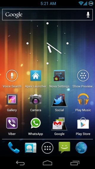
Another one based on the stock AOSP Launcher, Nova is the main competitor to Apex in this class, offering plenty of customization options while staying true to the look and feel of stock launcher. There is a free version as well as a paid one, and as always, we will be featuring only the free version here. Like other stock-based launchers, in terms of looks, Nova also seems identical to the stock launcher, with enhancements added on top. It’s the settings that really matter.
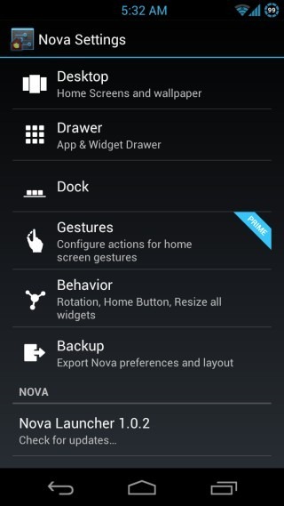
At a Glance
- Type: Full-featured | Conventional
- Tablet-optimized: Yes
- Dock Bar: Up to 21 icons | Scrollable | All customizable
- Home Screens: Up to 7
- Widgets: Scrollable | Resizable (all)
- Live Wallpapers: Yes
- Themes: No theming support
- Shortcuts: Customizable
- Folders: Drag-and-drop folders with custom icons support
- Animations: Customizable with a few decent options available
- Custom Gesture Actions: Not available in free version
- Screen Grid: Customizable up to 7 x 7 on phones; up to 10 x 10 on tablets
- App Drawer: Very basic in free version
- Landscape mode: Both phones and tablets
While Apex definitely has more customization options available in total compared to those offered by Nova’s free version, there are a few pretty handy features offered by Nova that Apex lacks, like the ability to choose the margin spaces around the home screen grid and bottom dock, a preview screen that lets you add, remove and reorganize home screens, and a pretty cool platform background for folders. Lastly, while it isn’t exactly slow even with the animations turned on, turning them off makes it mind-blowingly fast, even on older devices.
There are some shortcomings as well; the context menus for home screen app shortcuts and widgets don’t have all the options found in Apex, and the free version completely lacks any gesture support, to the extent that you can’t even pinch to get the home screen preview mode.
Pros
- Blazing fast even on low-end devices with all the animations disabled; stable
- Frequently updated
- Several great customization options including custom grid margins for better screen space utilization
Cons
- No gesture support in free version
- A bit laggy on some older devices
- Context menus could use more options
- Extremely basic app drawer in free version
Our Verdict on Apex & Nova
It can be extremely hard to choose between Apex and Nova, as both offer a vastly similar feature set, with subtle differences here and there. A few really handy features such as gesture support are available for free in Apex, while they require the paid variant when it comes to Nova. On the other hand, Nova offers the ability to add, remove or organize home screens from the preview mode. Also, for those who don’t care for animations and just want a blazing fast experience, Nova seems to be snappier than Apex with all the animations turned off. We suggest you try out both of these and see for yourself which suits you best.
Trebuchet Launcher (aka CyanogenMod Launcher)
Everyone’s favorite custom Android ROM CyanogenMod has a launcher of its own, which is also based on the stock AOSP launcher and thus, has the same look-and-feel as the other similar launchers covered above. When it comes to customization options, it falls somewhere between the stock AOSP launcher and Apex/Nova.
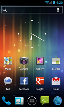
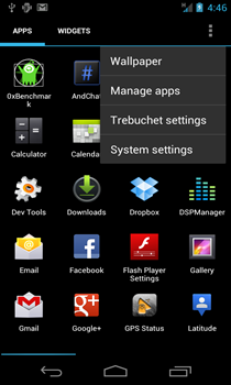
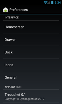
We have already taken the preview version of Trebuchet for a ride and written about it, so don’t forget to check out our coverage here.
GO Launcher EX
If you are looking for an Android launcher based on the conventional concept of side-scrolling screens and widgets but with tons of customization options added, you simply can’t go wrong with GO Launcher EX. Despite being a relatively newer entrant in the launcher scene compared to ADW.Launcher and LauncherPro, GO Launcher EX has evolved over time to emerge on top of all the competitors in its category, and for good reason. It is completely free and boasts a feature set that rivals the paid versions of LauncherPro and ADW.Launcher.
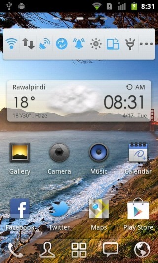
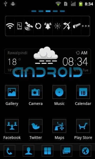
At A Glance
- Type: Full-Featured | Conventional
- Tablet-optimized: No (Separate GO Launcher HD version available exclusively for tablets)
- Dock Bar: 5, 10 or 15 icons | Scrollable | Customizable
- Home Screens: Unlimited
- Widgets: Unlimited | Scrollable | Resizable | Additional GO Widgets
- Live Wallpaper: Yes
- Themes: Very powerful theming engine | Hundreds of themes available
- Shortcuts: Customizable
- Folders: Drag-and-drop folder support for home screens and app drawer
- Animations: Dozens of eye-catching transitions and animations
- Custom Gesture Actions: Yes
- Screen Grid: Up to 10 by 10 for home screens and app drawer
- App Drawer: Highly robust with built-in recent apps list and task manager
- Landscape mode: Yes
- Limitations: None
Before GO Launcher EX was released, the Android launcher scene was dominated by ADW.Launcher and LauncherPro, each of which had their paid versions that added additional features to the free ones. While they did have several common features, there were still many features unique to each that set them apart from each other. GO Launcher EX appears to have been built with one purpose – bringing the best features of the full, paid versions of both of these launchers under one app, enhancing them even further, adding a lot of polish to it, and giving it to us for free!
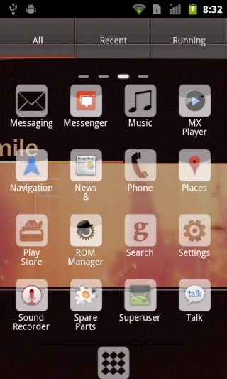
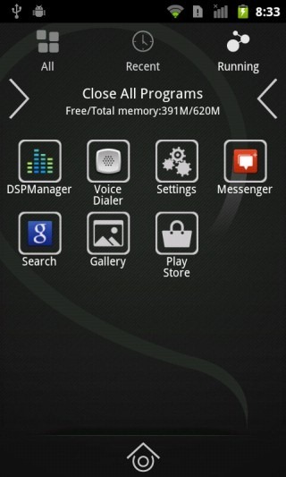
With GO Launcher EX, you can customize your dock with up to 15 apps, five of which are shown at a time and more can be revealed by swiping left or right on the dock. The theming engine is the most complete that we have seen in any Android launcher, essentially theming the entire look and feel of the home screen and the app drawer, rather than merely the dock and icons on it. Dozens of theme packs – complete with wallpapers, icons, dock background and even screen indicators – are available in the Market but to ease things even further for you, there is a built-in GO Store that categorizes everything published by the developers, so you don’t even have to search through other Market apps to find them.
Custom home screen gestures and home key actions, killer landscape support, great app and widget management, and theme-supporting GO Widgets for a range of apps and services are just a few of GO Launcher EX features that make it a great option, especially for Gingerbread devices that don’t support Apex and Nova. Though can be used without any issue at all on devices running ICS, Jelly Bean or KitKat as well.
Trying to cover all the features of GO Launcher EX in detail in this article will leave little room in it for many of the other Launchers that we have queued up for you, so just install it, dive into its settings and customize your home screens like there’s no tomorrow.
Pros
- Quite fast even on most mid-end devices
- Great looks
- Very stable
- Extensive customization options
- Great landscape mode support even on Gingerbread phones
- Animations and effects can be disabled for low-end devices
- Very frequently updated
- Great themes, widgets and companion apps available for free.
Cons
- May become slow on low-end devices with the animation effects enabled
- Some may find the extensive customization options a little overwhelming
Our Verdict
GO Launcher EX is as good as any conventional style Android launcher can get, and should be the launcher of choice for most users running Gingerbread or earlier. Unless you’ve got a terribly low-end device or you want a user experience altogether different from the conventional Android style launchers (like Windows Phone 7 or iOS lookalike home screens, or something unique and unlike other mobile operating systems), GO Launcher EX should offer you all you’d ever want from your Android launcher.
You might also want to check out our compilation of 10 awesome GO Launcher EX themes.
GO Launcher HD
GO Launcher HD is to tablets as GO Launcher EX is to phones. Brought to you by the same developers (as obvious from the name), the tablet version of GO Launcher aims to be what GO Launcher EX has become for phones, and judging from the initial releases, that stage might not be too far.
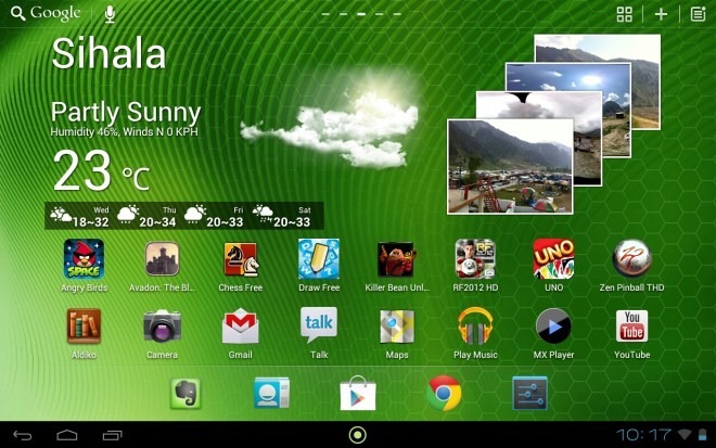
At A Glance
- Type: Full-Featured
- Tablet-optimized: Yes (tablet-exclusive)
- Dock Bar: Up to 10 icons | Customizable
- Home Screens: Up to 9
- Widgets: Unlimited | Scrollable | Resizable | Additional GO Widgets
- Live Wallpaper: Yes
- Themes: Coming soon
- Shortcuts: Not customizable
- Folders: Drag-and-drop folder support for home screens and app drawer
- Animations: Basic; more coming soon
- Custom Gesture Actions: Yes
- Screen Grid: Up to 7 by 10 for home screens and app drawer
- App Drawer: Highly robust with built-in recent apps list and task manager
- Landscape mode: Yes
- Limitations: Tablets-only
Rather than writing a long story about its features, we’ll just show you a screenshot of the interface for adding apps, widgets, shortcuts, folders or wallpapers to the home screen:
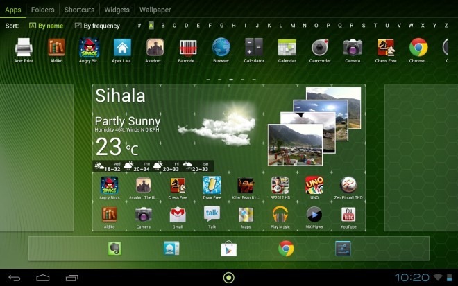
If that doesn’t speak volumes, here’s the app drawer, with icons on top-right for menu, adding folders, and managing hidden apps.
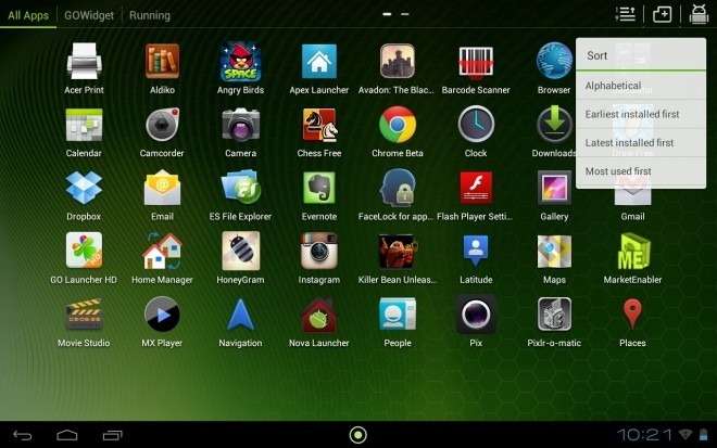
That said, it isn’t a fully finished project yet. Several key features of GO Launcher EX are currently under development for GO Launcher HD, including theming support, shortcut context menus and some more advanced customization options. Judging from the development pace of the GO Dev Team, these features shouldn’t take long.
Pros
- Fast and stable
- Killer looks
- Frequently updated
- Great widgets and companion apps available for free
Cons
- No themes yet
- Not a lot of customization options yet
Our Verdict
A very promising tablet launcher that’s bound to become a hit as the developers keep on adding new features.
FTL Launcher Lite
Apart from the stock AOSP launcher and perhaps Nova with all its animations turned off, most other launchers we have seen above have one drawback – on older and low-end devices, none of them exactly runs buttery smooth. When it comes to the stock Gingerbread launcher, while it runs smooth as silk on even older and low-end hardware, it has absolutely zero customization options. FTL Launcher Lite fills the middle ground.
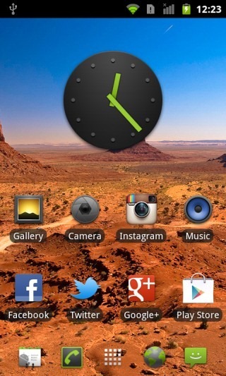
At A Glance
- Type: Minimal | conventional
- Tablet-optimized: No
- Dock Bar: 3 or 5 icons; dark, light or transparent background
- Home Screens: Up to 9; endless looping supported
- Widgets: Yes; scrollable; not resizable in free version
- Live Wallpaper: Yes
- Themes: No theming support in free version
- Shortcuts: Not customizable
- Folders: Extremely basic
- Animations: Basic; customizable speed; bounce effect toggle
- Custom Gesture Actions: Only swipe-up in free version
- Screen Grid: 4, 5 or 6 rows; columns fixed at 4 in free version
- App Drawer: Gingerbread’s 3D waterfall or 2D app drawer
- Landscape mode: Yes
- Limitations: Theming, resizable widgets and some other features not available in lite version
Based on the source code of the Android 2.3 Gingerbread launcher, FTL Launcher lite adds several customization options to the hardware-accelerated, super-fast and super-smooth Gingerbread launcher. As you can see above, it has just the right set of features that are available in many full-featured launchers, without getting everything but the kitchen sink crammed into it. This results in a more-or-less full-featured launcher with virtually no lag, even on low-end devices.
Pros
- Super fast, even on low-end devices
- Ultra smooth with GPU acceleration
- Several customization options not found in other lightweight launchers
Cons
- Somehow lacking in looks, theming options not being available in free version
- Lack of folder support
Our Verdict
If you are on Gingerbread, want the main selling features of most heavyweight conventional-style launchers and don’t wanna give up on the speed and performance of the stock Gingerbread launcher, FTL should be the launcher for you.
Hi Launcher & Mobo Launcher
You must be wondering why we are reviewing two launchers together as one. The reason is that these two are essentially the same, developed by the same team but released under different names and for different markets in the Play Store. They take the conventional concept of side-scrolling home screens with apps and widgets and add a twist, by splitting the interface into two panes stacked one above the other. The upper pane holds your widgets, while the lower one provides you access to all your apps in a tabbed view for easy organization.
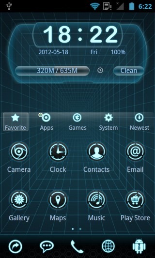
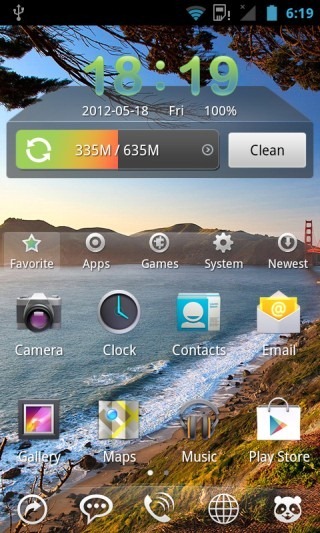
At A Glance
- Type: Similar to conventional but with a unique split pane view
- Tablet-optimized: No
- Dock Bar: Up to 15 icons | Up to 10 Customizable
- Home Screens: Up to 9
- Widgets: Unlimited | Resizable | Not scrollable | Special Hi/Mobo Launcher widgets
- Live Wallpaper: Yes
- Themes: Very powerful theming engine | Tons of themes available
- Shortcuts: Customizable
- Folders: Extremely basic
- Animations: Several eye-catching animations and transition effects
- Custom Gesture Actions: Only shake-it-up gesture for switching themes
- Screen Grid: 4 x 4
- App Drawer: Very robust categorized app interface integrated into home screens
- Landscape mode: No
- Limitations: None
If you have widgets that require more than half the screen, worry not, as the layout will expand when you add a large widget, and you scan scroll to another screen to view the apps pane. The theming support is one of the best features, and there is an option to shake your phone to randomly select a new look.
We recently wrote about Mobo Launcher in detail, and that review should apply to both these launchers. Before you decide to install them though, there are a few things you should know. Hi Launcher is directly maintained by the developer and updated more often, while Mobo Launcher seems to be contracted work, though we have learned from the Mobo team that it’s going to see an update soon with some unique features. Currently though, Hi Launcher should be the one to go for.
Pros
- The most awesome categorized app drawer implementation integrated into home screen we’ve seen
- Great theming engine and themes collection
- Killer animations and transition effects
- Built-in useful quick shortcuts for dock bar (like torch, show/hide app drawer/status bar, lock etc.)
Cons
- No drag-and-drop folder support
- Widgets not scrollable
Our Verdict
These two are definitely amongst the best of the entire lot, especially with that app drawer we can’t praise enough. One of the must-try launchers for everyone before you decide which one to stick to.
Install Hi Launcher | Install Mobo Launcher
[SSKIN] Butterfly+ launcher
If looks could kill, Butterfly+ would be a most-wanted assassin. This launcher has been designed with attention to detail, despite there being little-to-no attention to customization options. From the bold and brilliant color scheme to the design of the bundled widgets to the default squared icons to the theming engine, it’s all about making an impression with the looks.
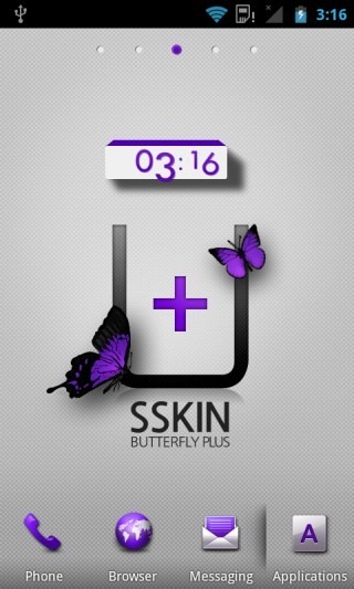
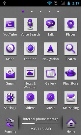
At A Glance
- Type: Featured | Conventional
- Tablet-optimized: No
- Dock Bar: 10 icons | Scrollable | 9 icons customizable
- Home Screens: Up to 9
- Widgets: Unlimited | Not scrollable | Not resizable
- Live Wallpaper: No
- Themes: Very powerful theming engine | Several gorgeous designer themes available
- Shortcuts: Not customizable
- Folders: Extremely basic
- Animations: Several killer animations built into the themes
- Custom Gesture Actions: No
- Screen Grid: 4 x 4
- App Drawer: Contains running apps list, search support and awesome pinch-to-preview function
- Landscape mode: No
- Limitations: None
What sets Butterfly+ apart from other launchers in the same category is its powerful theming framework and awesome list of designer themes available for it in its own SSKIN Theme Shop. While most of the available themes are paid, there are a few excellent free ones around too. Many themes come with live backgrounds that are a bit like Live wallpapers, with their own cool animation effects. Some themes also have moving wallpapers that change when you switch from one screen to the next, like a golfer’s position and golf shirt changing as you scroll along your home screens.
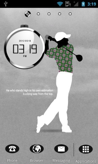
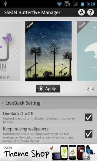
Apart from the themes, there are barely any customization options offered by [SSKIN] Butterfly+, but the themes alone make it worth checking out for any Android launcher enthusiast.
Pros
- Fast, smooth and stable
- Pinch-to-preview in app drawer can come extremely handy for those with a lot of apps installed
- Awesome SSKIN themes
Cons
- Widgets neither scrollable nor resizable
- Negligible customization options
- No option to choose custom app or folder icons
Our Verdict
If sheer designer looks are your thing and you don’t care much about customization options, you’re gonna love Butterfly+. Even if you use another launcher for regular use, having it installed for the times you want a designer home screen isn’t gonna hurt.
Install [SSKIN] Butterfly+ Launcher
Nemus Launcher
While being your regular side-scrolling conventional launcher in most aspects, Nemus has unique feature that sets it apart from the rest of the bunch: resizable folder widgets for the home screen that can be displayed as 1 x 1 folders or up to 4 x 1 or 1 x 4 vertical or horizontal frames. If you have used Fences on Windows to organize your icons, you’ll feel at home with these. In addition, it is one of the only two launchers (along with Butterfly+) in this list that has a pinch-to-preview feature for the app drawer.
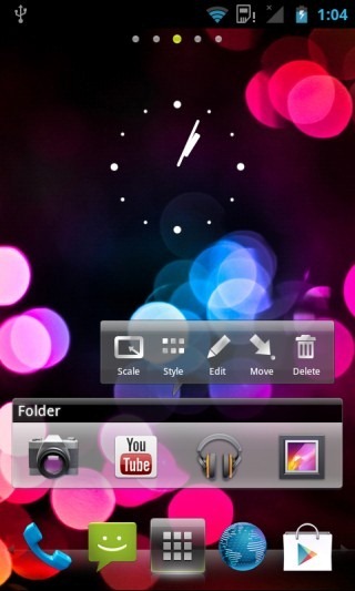
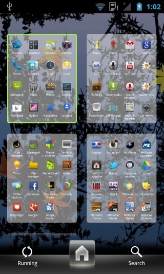
At A Glance
- Type: Featured | Conventional
- Tablet-optimized: Sort of, when using a large screen grid layout
- Dock Bar: Up to 13 icons | Scrollable | 12 icons customizable
- Home Screens: Up to 9
- Widgets: Unlimited | Scrollable | Resizable
- Live Wallpaper: Yes
- Themes: Support for SSKIN themes available on Play Store via SSKIN Shop app
- Shortcuts: Not customizable
- Folders: Drag-and-drop folder support with resizable folder frames on home screens
- Animations: Basic transition effects in the interface, with killer animations in themes
- Custom Gesture Actions: For hiding status bar only
- Screen Grid: up to 8 x 8
- App Drawer: Contains running apps list, search support and awesome pinch-to-preview function
- Landscape mode: Yes
- Limitations: None
A great feature of Nemus Launcher is support for the uber-cool SSKIN themes of the [SSKIN] Butterfly+ Launcher featured above. Just install the SSKIN Shop app from Play Store. Once it’s installed, any themes that you install through it will be available to Nemus Launcher just the way they work with [SSKIN] Butterfly+ Launcher. The themes can be found and applied from the Themes section of Nemus settings.

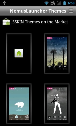
Like several other launchers in this list, we have reviewed Nemus in the past too. Don’t forget to check it out for more info.
Pros
- Quite fast, smooth and stable
- Great folder implementation
- Pinch-to-preview in app drawer can come extremely handy for those with a lot of apps installed
- Awesome SSKIN themes support
- Scrollable and resizable widgets
Cons
- Only one custom gesture supported
- No option to choose custom app or folder icons
Our Verdict
If you like Fences on Windows and want the same functionality on your home screen along with SSKIN’s theming support and/or a pinch-to-zoom enabled app drawer for a quick glance at all your apps, Nemus just might be the Android launcher for you!
Regina 3D Launcher
A product from the developers of Nemus launcher, Regina 3D Launcher takes the classic Android launcher concept and adds cool 3D home screen switching, a bunch of awesome widgets and a secret workspace and the ability to scroll the home screens or app drawer by dragging the dock to the right or left. The end result is a launcher that sticks to the basics while adding a lot in the eye-candy department.
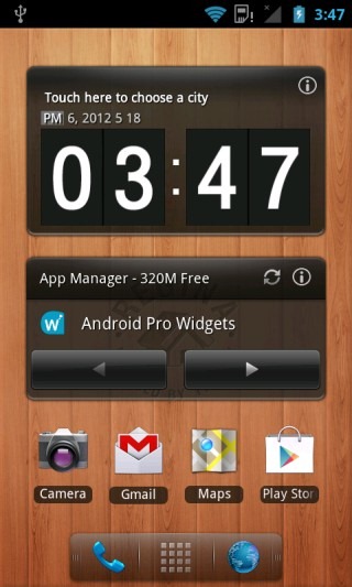
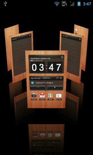
At A Glance
- Type: 3D | Conventional with a twist
- Tablet-optimized: No
- Dock Bar: 3 icons | Not customizable | Usable as scrollbar for home screen & app drawer
- Home Screens: 5
- Widgets: Unlimited | Scrollable | Not resizable
- Live Wallpaper: No
- Themes: No
- Shortcuts: Not customizable
- Folders: Extremely basic, with folders-within-folders support added
- Animations: Several killer 3D animation and transition effects for most actions
- Custom Gesture Actions: No
- Screen Grid: 4 x 4
- App Drawer: 3D with awesome scrolling animation effects
- Landscape mode: No
- Limitations: Maximum 5 folders allowed in free version
Regina comes loaded with several distinctive features that require a post of its own to be explored in-depth, and we have already done that for you. Head on to our coverage where you can learn all about its settings, widgets, advanced features and a unique secret workspace that can come really handy!
Pros
- Quite snappy on even mid-end devices, despite the 3D effects
- Great transitions and animations
- Very handy and totally unique secret workspace
Cons
- Few customization options
- No custom gestures
- No live wallpaper support
- No option to choose custom app or folder icons
Our Verdict
For cool 3D effects, Regina is definitely a great choice. Also, if you care about having a secretly accessible workspace nobody else could get to (for whatever ‘special’ stuff you want on it), Regina is probably your only option. Apart from these two features though, it doesn’t have much to offer.
Full Screen Launcher
Full Screen Launcher is a rather unique launcher that’s a bit hard to describe in words. It basically gives you infinitely scrollable 3D home screens and app drawer with some nifty transition effects upon scrolling, and the ability to zoom into or out of the home screen layout while still keeping it functional (unlike the preview mode in other launchers).
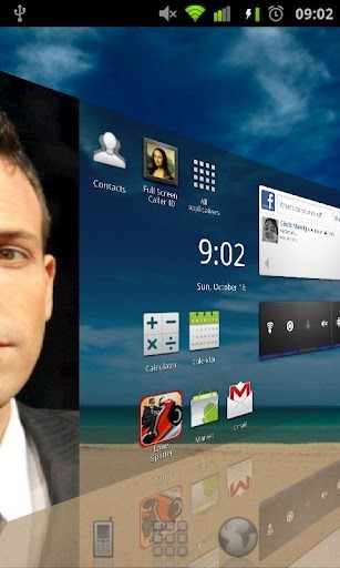
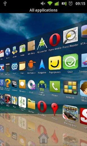
At A Glance
- Type: Unique | 3D
- Tablet-optimized: Yes
- Dock Bar: Up to 7
- Home Screens: Infinite
- Widgets: Unlimited | Not scrollable | Not resizable
- Live Wallpaper: No
- Themes: No
- Shortcuts: Unlimited | Not customizable
- Folders: Very robust folder support with awesome rotating 3D cube effect
- Animations: Great 3D animations rendered using OpenGL
- Custom Gesture Actions: No
- Screen Grid: Up to 10 x 15
- App Drawer: Continuous 3D app drawer with great animation effects
- Landscape mode: Yes
- Limitations: Some features (like icon customization options) limited in free version
For a complete coverage, check out our detailed review of Full Screen Launcher.
Pros
- A very unique and fluid, infinite user interface
- Great support for all types of shortcuts
- Excellent folder implementation, where folders can contain anything, including other folders
Cons
- Quite confusing upon first use
- Steep learning curve
- Shortcut customization restricted in free version
- Rather dull when it comes to the looks of the default dock icons
- No live wallpapers
- A translucent layer over much of the wallpaper gives a dull look
Our Verdict
First of all, this launcher isn’t for everyone. It has a steep learning curve and can get to be quite confusing for many to figure out at first. That said, if you get used to its unique look and features, it can be hard to switch back to another one. Give it a try and see for yourself if you can acquire a taste for it.
MXHome Launcher
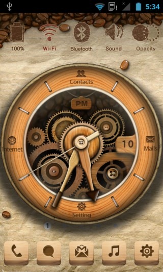
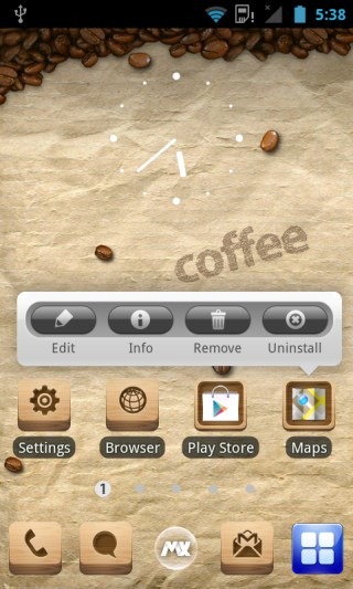
MXHome can be categorized as a hybrid between a conventional style 2D launcher and an unorthodox 3D launcher. It basically has a special themed home screen with cool 3D effects and pre-configured launch actions, in addition to a standard side-scrollable multiple home screen view for all your shortcuts and widgets. Let’s take a look:
At A Glance
- Type: Unconventional + conventional hybrid | 3D
- Tablet-optimized: No
- Dock Bar: 5, 10, 15 or 20 icons | Scrollable | Up to 17 icons customizable
- Home Screens: 6 (1 special + 5 conventional)
- Widgets: Yes | Not scrollable | Resizable
- Live Wallpaper: Yes
- Themes: Very powerful theming system with radically different styles of 3D interfaces
- Shortcuts: Customizable
- Folders: Extremely basic
- Animations: Several eye-catching transitions and animations
- Custom Gesture Actions: No
- Screen Grid: 4 x 4
- App Drawer: Highly robust | Extensively customizable | Several display and sorting options
- Landscape mode: No
- Limitations: None
What truly stands out in MXHome is its 3D style home screen. It can’t really be described as anything in particular since every theme has its own unique one. The default one featured above is a coffee-themed 3D clock that features realistic animations, 3D UI effects based on the accelerometer and four customizable shortcuts on the clock. If you tap-and-hold on a shortcut, you see a cool animation of the clock opening up to give you options to switch to another app for that shortcut. Apart from the default theme, several other free and paid themes are available too, some of which you can see in the screenshots below. You have to try them all out to see their UI effects.
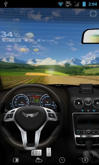
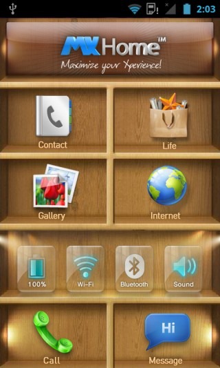
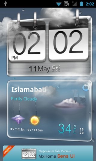

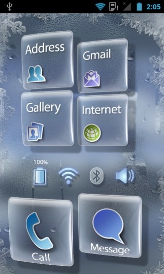
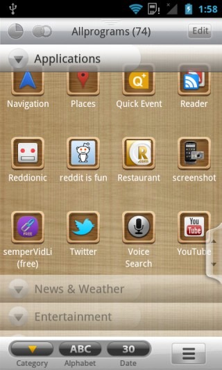
Another main selling point of MXHome is its extremely robust app drawer. You can organize apps by categories, view them in a standard tiled view or a WP7-like list view, manage and edit categories, sort them alphabetically or by install date, and even change the transparency and background settings.
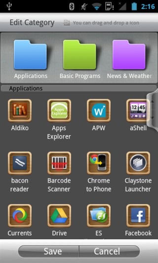
There are some other decent features in MXHome too, like a built-in task manager and a recent apps list. We have covered MXHome in the past too, so head over to our review if you want to learn more.
Pros
- Radically different styles of themed home screens
- Killer 3D effects and looks
- Supercharged app drawer
Cons
- Lack of some basic features like scrollable widgets, drag-and-drop folders and landscape mode
- Rather heavy and a bit slow on older devices
Our Verdict
If 3D eye candy is your thing, you’ll have your device really standing out in the looks department with MXHome. If you don’t care for fancy 3D effects though, there are better options out there.
ssLauncher
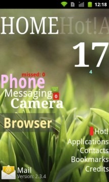
ssLauncher is a Magazine style interface for your Android device that takes inspiration from Windows Phone’s Metro UI, while not entirely replicating it. Let’s take a look…
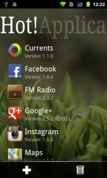
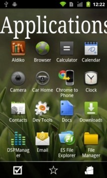
At A Glance
- Type: Unique
- Tablet-optimized: No
- Dock Bar: N/A
- Home Screens: Virtually unlimited
- Widgets: No
- Live Wallpaper: No
- Themes: Very powerful theming system
- Shortcuts: Customizable magazine-style shortcuts for the main home screen
- Folders: N/A
- Animations: Plenty of eye-catchy animations that vary by theme
- Custom Gesture Actions: Yes
- Screen Grid: N/A
- App Drawer: Basic
- Landscape mode: Yes
- Limitations: None
It’s quite simple and elegant, really. The list of hot application is basically like your home screen shortcuts that you add for quick access, while the Applications list is your app drawer. Swiping further to the right shows us similar panes for our contacts and browser bookmarks. The shortcuts on the home page can be customized from the options brought up by pressing menu while on the home screen. That’s where you can also add or remove screens, choose themes and change other interface options. Speaking of themes, there are several themes available, some of which are strikingly unique. Here’s one…k
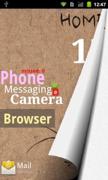
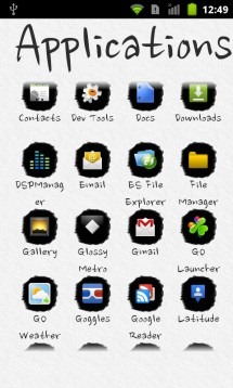
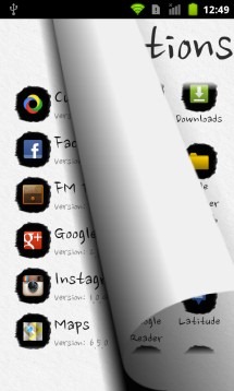
Pretty much every theme has a unique twist – some emulate pages that you can turn, other take form of old blocks of wood, and then there’s a Metro-like tiled theme, a neon theme, a plasma theme, and the list continues. There is also landscape support and the customization options are quite extensive.
To learn more about it, check out our prior coverage of ssLauncher.
Pros
- Pretty awesome in the looks department
- Plenty of themes with their own animations and effects
- Quite intuitive to use
Cons
- Rather heavy on slow hardware
- Not meant for everyone
- Some themes can seem a bit childish (though that isn’t always a bad thing)
Our Verdict
Whether it can or can’t be used as a daily driver would depend entirely upon the user but for a change, ssLauncher definitely brings something different to the table. Give it a shot…who knows, you might end up keeping it.
DXHome
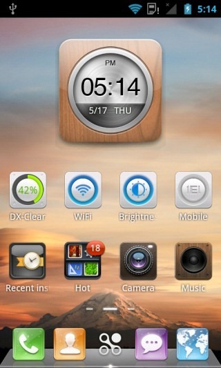
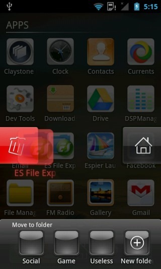
At first glance, DXHome might look like just another conventional style home screen launcher with a fancy theme, but it packs quite a punch when it comes to certain small refinements. Boasting its own theme store, clock & weather widget, 3D screen switching and a pretty decent home screen editor, it carries the right combination of looks and functionality to make it to this list.
At A Glance
- Type: Full-featured | Conventional | 3D
- Tablet-optimized: No
- Dock Bar: 5 icons | 4 customizable
- Home Screens: Up to 9
- Widgets: Unlimited | Scrollable | Resizable | Zoomable | Several special themed DX Widgets
- Live Wallpaper: Yes
- Themes: Very powerful theming engine | Plenty of great-looking themes available
- Shortcuts: Not customizable
- Folders: iOS-like drag-and-drop folder support for home screens | Folders in app drawer
- Animations: Several eye-catching transitions and animations
- Custom Gesture Actions: No
- Screen Grid: 4 x 4
- App Drawer: Robust, with easy organization features and recently installed apps list
- Landscape mode: No
- Limitations: None
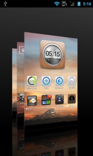
A really nifty feature is the really smooth 3D home screen switcher interface that appears when you tap-and-hold on the middle (app drawer) icon in the dock. Another great feature is the built-in theme store.
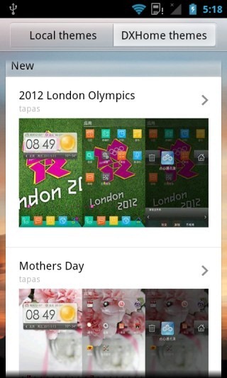
The overall look and feel may seem similar to MIUI for those of you who have used it. Though the app drawer and some other cool effects that we have mentioned add even more value to it. We have already taken it for a spin earlier on, so you can head over to our review for more details. Note that there may be some new features added since our last review, so make sure to explore it yourself to see all it’s got.
Pros
- Very fast and smooth
- Stands tall in the looks department
- Adequately customizable
- Great theming support
- Killer themed widgets included
- Great lock-screen management feature built-in
Cons
- Lack of custom gestures (having those would have made it rival GO Launcher EX)
- No option to choose custom app or folder icons
Our Verdict
It’s hard to find flaws in this launcher, really. If only it weren’t for the lack of custom gesture actions, it would have been a great rival to GO Launcher EX for the top spot. Definitely worth a shot before deciding whether to stick with it or not.
Download DXHome (Play Store link down, so direct APK download link added instead. You will have to install it directly from the APK.)
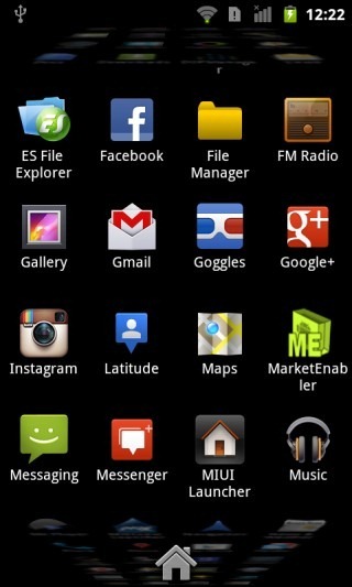
MIUI 4 Launcher
The MIUI ROM is one of the most famous Android custom ROMs in the world and here at AddictiveTips, it is amongst our most favorite, along with CyanogenMod and AOKP. If you want to have the look of the MIUI 4 home screen without having to install the MIUI ROM, there is a fully functional MIUI 4 Launcher port available for the very purpose.
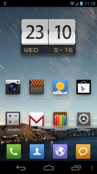
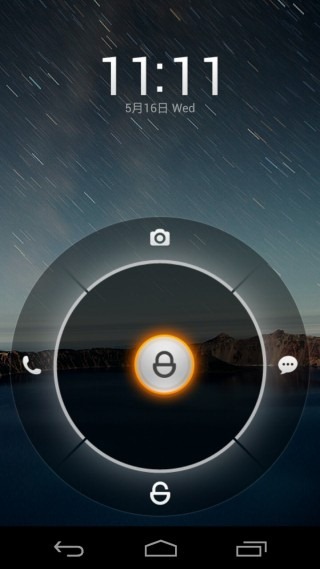
As you can see above, you get the authentic MIUI experience, including the cool MIUI lock screen that comes with the launcher. In addition, there is an MIUISettings app that allows you to configure some options. Not all the options shown in that app are actually implemented at the time of writing but the most important one i.e. the ability to add an app drawer is working nevertheless. We have already reviewed MIUI 4 Launcher, so to learn more, check out our complete coverage.
At A Glance
- Type: Conventional | MIUI 4 clone
- Tablet-optimized: No
- Dock Bar: Up to 6 icons | Customizable
- Home Screens: Unlimited
- Widgets: Unlimited | Scrollable | Resizable (some)
- Live Wallpaper: Yes
- Themes: Very powerful theming engine | Countless themes available
- Shortcuts: Not customizable
- Folders: iOS-like drag-and-drop folder support
- Animations: Several eye-catching transitions and animations
- Custom Gesture Actions: No
- Screen Grid: 4 x 4
- App Drawer: Optional using MIUIsettings app
- Landscape mode: No
- Limitations: ICS or later only (Gingerbread version featured below)
Pros
- Quite fast and stable
- Killer looks
- Awesome animation effects
- Great collection of themes available
Cons
- App drawer requires MIUIsettings app and can be confusing to bring up (didn’t work for us)
- No custom gestures
- Not enough customization options
- Not all widgets are resizable
- No options to choose app or folder icons
Our Verdict
If you are a fan of MIUI 4’s killer looks and awesome themes, give MIUI 4 Launcher a shot and you might not want to look any further. If endless customization is your thing though, it probably won’t be your thing.
Download MIUI 4 Launcher and MIUISettings
MIUI Launcher (Gingerbread)
The MIUI 4 launcher featured above is meant only for devices running Android 4.0 or later, and will not work on Gingerbread. Fret not though; if you’re still running Gingerbread on your phone and want MIUI’s looks, you can have ‘em with the Gingerbread-based MIUI launcher.
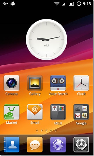
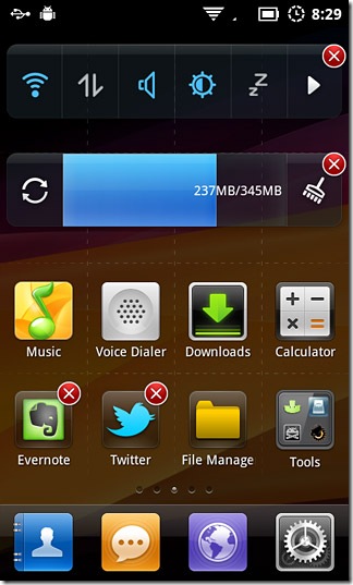
We have already taken MIUI Launcher for a spin so head on to our review where you can learn all the details about it.
At A Glance
- Type: Conventional | MIUI 2.* clone
- Tablet-optimized: No
- Dock Bar: Up to 6 icons | Customizable
- Home Screens: Unlimited
- Widgets: Unlimited | Not Scrollable | Not Resizable
- Live Wallpaper: Yes
- Themes: Very powerful theming engine | Several themes available
- Shortcuts: Not Customizable
- Folders: iOS-like drag-and-drop folder support
- Animations: Several eye-catching transitions and animations
- Custom Gesture Actions: No
- Screen Grid: 4 x 4
- App Drawer: No
- Landscape mode: No
- Limitations: None
Pros
- Quite fast and stable
- Great looks
- Gorgeous animation effects
- Detailed themes
Cons
- No dedicated app drawer
- No custom gestures
- Not enough customization options
- Widgets aren’t scrollable or resizable
- No options to choose app or folder icons
Our Verdict
If you are on Gingerbread and want MIUI’s look-and-feel without switching to the MIUI ROM itself, There isn’t a reason why you shouldn’t go for MIUI Launcher. The customization freaks amongst us might want to keep another one installed too for those times when we must have just the exact look that we want.
Espier Launcher
Want the exact iOS look on your Android phone? No problem, just install Espier Launcher and watch your Android phone’s home screen turn into iPhone’s Springboard.
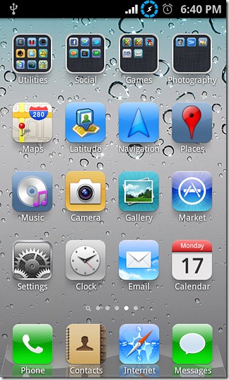
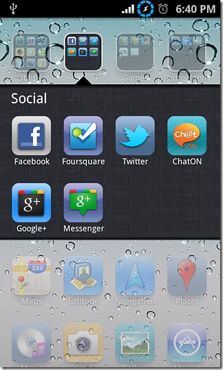
At A Glance
- Type: iOS-replica
- Tablet-optimized: Yes (portrait-only)
- Dock Bar: 4 icons in normal mode; up to 6 in pad mode | iOS-like recent apps & media controls
- Home Screens: Unlimited
- Widgets: Yes (On a dedicated widgets screen) | Not scrollable | Not resizable
- Live Wallpaper: Yes
- Themes: No
- Shortcuts: Not customizable
- Folders: iOS-like drag-and-drop folder support
- Animations: Yes (iOS-like)
- Custom Gesture Actions: No
- Screen Grid: 4 x 4 in normal mode; 5 x 4 in pad mode
- App Drawer: None (All app icons appear on home screens like on iOS)
- Landscape mode: No
- Limitations: None
We have already covered Espier Launcher previously, so check out our prior coverage to learn more about this iOS-replica home screen replacement for Android.
Pros
- As close to an iPhone-replica interface as you can possibly get on Android
- Quite user friendly
- Fast and snappy on most devices
- Pad mode toggle gives you an iPad-like interface even on phones
Cons
- No dedicated app drawer
- Apps and widgets can’t be together on the same screen
- Only one screen for widgets (which is scrollable though, so you can still add many widgets)
- No landscape mode
Our Verdict
If (for whatever inexplicable reason) you want your Android phone to look like an iPhone, Espier Launcher is what you are looking for. It’s also fun to just keep it installed on your phone and pop it up to show your iPhone-wielding friends how Android can do anything.
Espier Launcher HD
Want your Android tablet to have iPad looks? While Espier Launcher has a Pad mode that attempts to emulate the iPad look, it lacks in certain features such as landscape mode that can be especially handy on tablets. Espier Launcher HD is built by the same team specifically for Android tablets in an effort to bring the iPad look to them.
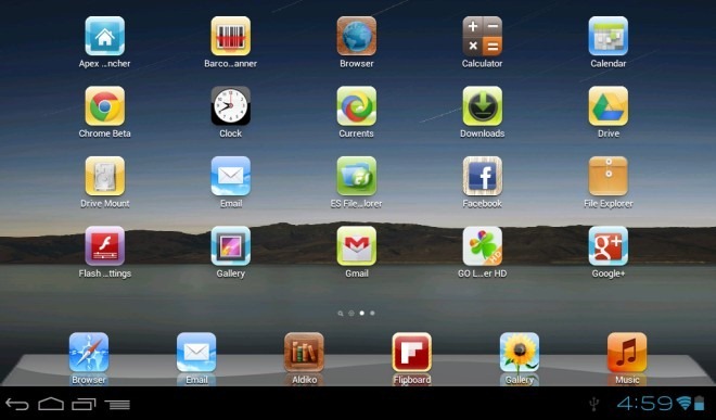
Like Espier Launcher, we have already reviewed Espier Launcher HD as well, so feel free to check out our coverage to learn more about this iPad-lookalike home screen replacement for Android tablets.
At A Glance
- Type: iOS-replica
- Tablet-optimized: Yes
- Dock Bar: Up to 6 icons | iOS-like recent apps & media controls
- Home Screens: Unlimited
- Widgets: Yes (On a dedicated widgets screen) | Not scrollable | Not resizable
- Live Wallpaper: No
- Themes: No
- Shortcuts: Not customizable
- Folders: iOS-like drag-and-drop folder support
- Animations: Yes (iOS-like)
- Custom Gesture Actions: No
- Screen Grid: 5 x 4 in portrait mode; 4 x 5 in landscape mode
- App Drawer: None (All app icons appear on home screens like on iOS)
- Landscape mode: Yes
- Limitations: None
Pros
- As close to an iPad-replica interface as you can possibly get on Android
- Quite user friendly
- Fast and snappy on most devices
Cons
- No dedicated app drawer
- Apps and widgets can’t be together on the same screen
- Only one screen for widgets (which is scrollable though, so you can still add many widgets)
- No landscape mode
- Too many restrictions in Play Store, making it unavailable for many devices it can run on. We are providing an alternative direct APK download link for this very reason.
Our Verdict
Just like its phone counterpart, if you want your Android tablet to look like an iPad, Espier Launcher will do that for you in a snap. Even if you don’t plan on using it, just keep it installed so that you could give your iPad-owner friends the ‘in-your-face’ look.
Install Espier Launcher HD | Direct APK Download
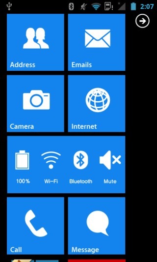
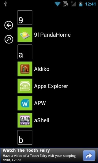
Launcher 7
Don’t care for iOS much and want the look of the awesome Metro UI from Windows Phone on your Android phone? Launcher 7 does just that for you.
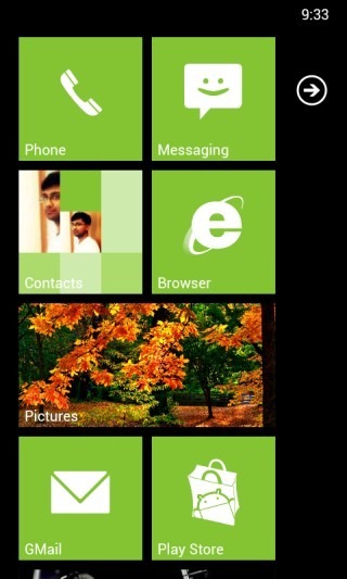
At A Glance
- Type: Windows Phone replica
- Tablet-optimized: No
- Dock Bar: No
- Home Screens: One (vertically scrollable)
- Widgets: Yes (in form of special widget tiles)
- Live Wallpaper: No
- Themes: Accent color choice for tiles
- Shortcuts: Customizable tiles
- Folders: No
- Animations: Windows Phone-like
- Custom Gesture Actions: No
- Screen Grid: Infinite rows and one large or two small tiles per row
- App Drawer: Windows Phone-like vertically scrollable, sorted alphabetically with search support
- Landscape mode: No
- Limitations: Free version shows ads in app drawer
Pros
- A close replica of Windows Phone user interface
- Custom tiles including widget tiles
- Fast and smooth
Cons
- Takes away several core features of most Android launchers
- Ads look hideous in the app drawer
Our Verdict
If you want to have the look-and-feel of Windows Phone while retaining all the functionality of Android, and don’t really mind ads appearing at the bottom of the app drawer, go for it! In addition to that, it doesn’t offer much.
Pure Breeze Launcher Lite
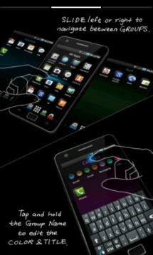
Did you think Samsung made only the TouchWiz launcher that ships with all their Android phones? Think again! Pure Breeze Launcher is Sammy’s rather unorthodox take on Android launchers. First, the intro:
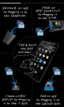
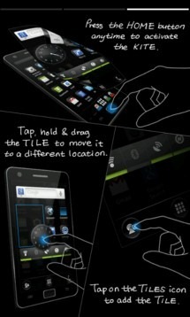
At A Glance
- Type: Unique, with conventional elements
- Tablet-optimized: No
- Dock Bar: Up to 5 icons in free version
- Home Screens: Up to 5 (including an app drawer) in free version, plus the kite screen
- Widgets: Only on the kite screen | Not scrollable | Not resizable
- Live Wallpaper: No
- Themes: No
- Shortcuts: Not customizable
- Folders: Yes (as groups)
- Animations: Yes
- Custom Gesture Actions: No
- Screen Grid: 4 by 4 for home screens; vertically scrollable by 4 in kite screen
- App Drawer: Very basic, present as central home screen
- Landscape mode: Yes
- Limitations: Many features restricted in free version
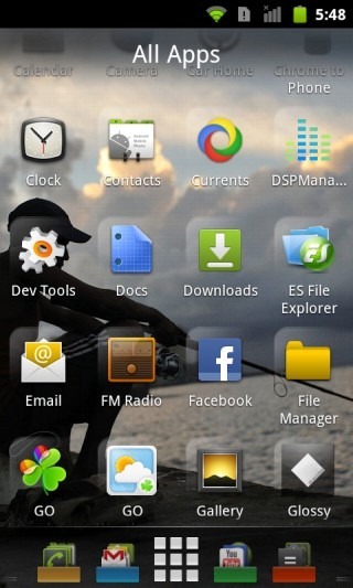
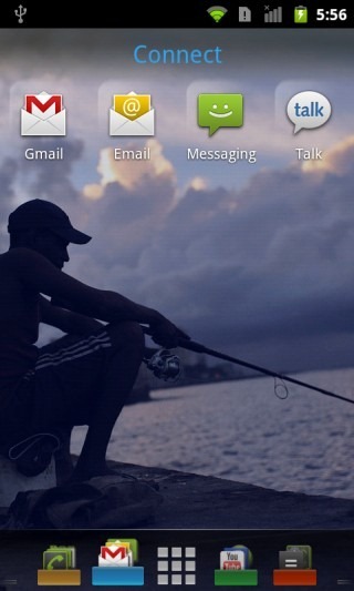
The concept is like this: You get multiple home screens, the central one of which is the app drawer called ‘All Apps’. You can have up to four more, which are also presented as groups of apps, with no widget support. Where do you place the widgets then, and what’s all that unique about it, you ask?
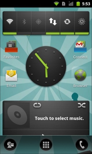
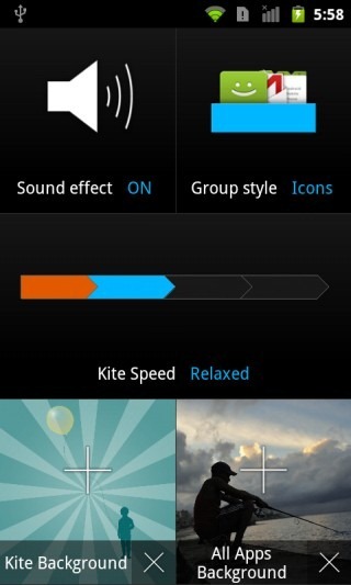
The answer: a kite mode! You know, breeze and kite. When you press the home button while already on one of the home screens, you get a cool animation of a screen flying on to the display, and that’s the kite screen. You can place your favorite widgets and app shortcuts on it to be accessible quickly, plus access the phone dialer. And this window is vertically scrollable, so you can keep adding widgets and shortcuts to it and access them all by scrolling vertically. Overall, it’s a novel concept. It’s got to be an acquired taste but hey, they did design a pretty cool settings window.
Pros
- Despite the unorthodox approach, the concept is quite usable
- Handy grouping of apps on the home screens
- Convenient vertically scrollable kite screen for widgets and shortcuts
Cons
- Too unorthodox to suit the taste of most
- Limited to 5 screens in free version
- Each screen takes up a dock icon, so no traditional dock for app shortcuts
- Rather limited customization options
Our Verdict
If you want to try something considerably different yet retaining the concept of side-scrolling screens with app icons, give Pure Breeze a shot and see if you can acquire the taste.
Install Pure Breeze Launcher Lite
netFront Life Screen
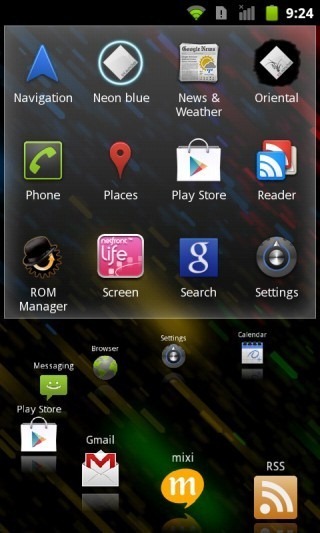
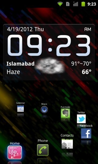
There is no limit to creativity when developing launchers for Android, and NetFront Life Screen is ample proof of that. It looks and feels nothing like your typical Android launcher. You don’t get countless home screens, you don’t get a lot of space for widgets. What you do get are two screens with all the functionality you need on your home screens right at your fingertips, and that includes the app drawer.
At A Glance
- Type: Unique
- Tablet-optimized: No
- Dock Bar: Circular, with one icon customizable | Elaborate menus for all default shortcuts
- Home Screens: 2
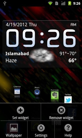
- Widgets: Limited to 2 x 4 space
- Live Wallpaper: No
- Themes: No
- Shortcuts: Not customizable
- Folders: No
- Animations: Yes
- Custom Gesture Actions: No
- Screen Grid: N/A
- App Drawer: Basic | Built into left screen in an eye-catching 3D cube
- Landscape mode: No
- Limitations: None
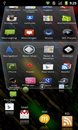
As you can see below, the app drawer is integrated into the left screen in form of a 3D cube that animates on swipe. Probably the best part of NetFront Life Screen is its circular dock. Not only can you rotate it, but tap on any of the default apps on it and instead of seeing the app get launched, you’ll be presented with a very elaborate menu with one-tap access to the key features of the app. You can see the example below in case of Settings. With the Messaging app, you get a similar list of messages, as well as a compose button.
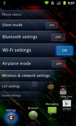
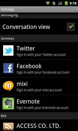
Not only that, but connect your social media accounts through the launcher’s settings and you can have similar lists of your social network status updates. Even RSS feeds can be viewed like this. When it comes to widgets though, you are limited to a space of 2 rows by 4 columns on the main screen (see the first screenshots), so you must utilize it wisely.
Pros
- Extremely intuitive to use
- Great animations and eye-candy
- Simple yet functional
- Jump lists for dock apps make quick access to your important stuff a breeze
Cons
- No customization options
- Not enough widget space
Our Verdict
If you don’t use many widgets and like to try something very different for a change, you will quite likely fall in love with NetFront Life Screen for its simple, intuitive and unorthodox take on Android Launchers.

Why isin’t NEXT launcher in the list?! It’s one of the best launchers ever created!!
Don’t be silly, this is brilliantly in depth and gives a one stop place to get a good look at all the worth launchers out there. Absolutely brilliant list. Except Nova is my favourite and it definitely tops Apex!
Excellent post! I personally use Nova Launcher Prime. Great for mimicking MyColorscreen setups since it’s the that’s mostly being utilized.
A very lightweight alternative to these nice but heavy launcher is HomeFlip (search the play store). Its in beta but already very solid. https://play.google.com/store/apps/details?id=com.lean_and_mean.HomeFlip&feature=search_result#?t=W251bGwsMSwyLDEsImNvbS5sZWFuX2FuZF9tZWFuLkhvbWVGbGlwIl0.
OMG….what an amazing list of launchers. !!! hats off to you
Thanks 4 this detailed review, very useful
QQ Launcher was forgotten
Fantastic Article! I love technology and the ever changing advancement and speed of it. With that said, This article has definitely been a huge help to me in finding several launchers that i didn’t know existed. Thank you!
P.S. GO Launcher EX and Apex Launcher are my daily drivers
Great Article. I’ve been trying and testing various launchers for my Evo 4g. Espier is nice, and I went with Go Launcher for a while, but when it boils down to it, I like the simple launchers so I ended up using Nemus Launcher. I’m running MikG Rom, which still has HTC Sense, so my next step is to find a non-sense based launcher and flash that to make my phone really streamlined!
Also, Espier does have a kind of app tray and you dont have to have all your apps on the desktop. You do a pinch out type action to show the apps that you have hidden.
This post its sooooo great! Thank you!
You mentioned none of the ICS Launchers support App Folders… However Go Launcher EX does support it!
‘ICS Launchers’ there was in reference to the launchers that are based on the stock ICS launcher . These include stock ICS launcher, Apex, Nova and Trebuchet.
super …i wanted someone to do an article like this. thanks so much. Perfect read…… oh does anyone know of any site that shows Android Apps Gone Free ……I cannot find any site just the IOS ones….thanks.
That’s a good idea…we can look into starting a section or regular posts series on that here. Will discuss it with the team.
Really great article. LauncherPro andTrebuchet Launcher according to me are the best and should top the list.
Nova Launcher does support folders in the Dock (but only when rooted).
Thanks for a very well-written and comprehensive article on Android launchers! It was a long read but well worth it, as I appreciate all the work that went into this. I was a LauncherPro fan until I read some of the other features of Apex, so I switched tonight (running Primos ROM on a HTC Desire HD) and I really like Apex.
Glad you liked it and it helped you choose the right launcher for you. Apex really rocks…I personally use it as my primary launcher.
I’ve been on something of a launcher quest for… well… let’s see… this is May… so maybe seven months. Seriously: Seven (7) — count ’em… seven — long months. Of course, so doing is not my job, and so I’ve only been able to devote a little time, now and then, to it… sometimes entire weekends at a time, though. Hence the reason it has taken me so long.
Because of it, though, I rather pride myself in being pretty darned expert about this particular subject. I’m also semi-well-known around here for knowing at least a little something about a few high-tech-related things… informed by 35+ years in IT; and, when it comes to phones, having been a VERY early pioneer of mobile phone use starting back in the early ’80s when the old VHF transceiver was the size of a briefcase (and had big cooling fins on it, and could actually heat-up) and was mounted in the vehicle’s trunk, and the “head” (the part with the corded handset and dialer) was mounted up next to the driver, and even though it had touchtone-looking keys on it, was nevertheless pulse dial. Users of those old devices shared however many VHF channels there were in the locale’s mobile phone network (I live in Chicago back then and I think there were only around a dozen, as I recall); and any of us could just pick-up the handset and manually run through the channels and listen to others’ conversation. It was like an over-the-air, multi-channel party line. You youngsters probably can’t even imagine it, but those were the pioneering early days of mobile telephony.
At any rate, I’m also a well-known to staff (and some readers), here, as a pulls-no-punches and suffers-no-fools (sometimes even insufferable) critic when I think it’s appropriate… though I’ve been so, so busy for the past almost six months, now, that I’ve not made a post here in a while. But I have tried to keep-up with as much of the reading as I could, whenever I can find a moment. The quality of the work around here, by the way, is just getting better and better and better. This web site is fast becoming best of its particular breed of site. Anyone writing about computers and software and phones and whatnot, who’s not routinely reading the stuff here, is simply out of touch. How magnificently far this site has come! Congratulations!
So, then, in any case, I hope it is taken as high praise from the likes of me when I write, here, that this article — in increasingly common form from this place — is just about as good as an article of this sort can possibly get. It is positively exceptional… excellent… far beyond merely “well done.” Its author, like the site, itself, is to be congratulated. Kudos!
I’m also at least a little bit proud of myself because after seven months of questing, I believe I would come to almost exactly the same conclusions about the various launchers as did this article’s author… and for much the same reasons. So that’s yet another reason why I’m impressed… because I know that the author of this article is pretty much dead-on about everthing written here. Oh, of course, there are a few little niggly things here and there with which I might not agree; and there are even some launchers, here, that I might have just lef out, altogether. By and large, though, this article, in my opinion, is now the definitive resource on its subject on the entire Internet, as of this writing. As they say, in the vernacular: “It just don’t get no better ‘dan ‘dis!”
And thank you, thank you, thank you for not being awe struck and starry-eyed with respect to Launcher Pro and ADW Launcher; and for correctly putting them in their proper respective places. And thank you for correctly assessing GO Launcher, in its present (finally mature) state, as having successfully culled the best from both those two other, now-long-in-the-tooth launchers, and putting them in one heck of a potent better-than-either-of-them, best-of-breed sort of launcher (albeit a bit of a behemoth which can, indeed, lag a phone which doesn’t have enough oomph; and albeit genuinely overwhelming, in some cases, because of its sheer number of configuration items and choices).
For those for whose phones GO Launcher is just too much, some of your other mentions are excellent alternatives for people with, for example, single-core phones with 1GHz-and-slower (particularly 800MHz and slower) processors, less than 512MB of RAM, and less than 2GB of “internal/processing” storage (not to be confused with whatever mass storage the phone may have in the form of internal or external SD). Again, Kudos.
ADW Launcher may not be quite an antique yet, but, yes, it’s finally now headed toward the old launchers’ home… at least if it doesn’t soon get an update.
Launcher Pro, though — oy! this makes me angry — should, in my opinion, be avoided like the plague. While it is, indeed, a better launcher in many ways than ADW, its developer is, in my opinion, leading Launcher Pro’s loyal users and fans down the primrose path by promising a rewrite which I now believe, to the core of me, he simply and deliberately never intends to do… never even plannned on it… likely never even really started on it, contrary to what he and his minions claim in Launcher Pro’s support forums. Or, if he really and truly did once have the intension of rewriting/updating it, he became so disheartened by a big change in the security/privacy of GMAIIL, and how it completely disabled a huge feature of Launcher Pro, that he took a giant step back and took cold-hearted stock of his situation and decided to just quit. The problem with that, though, is that he’s not admitting it to anyone; and he keeps promising a rewrite which I am convinced to the depths of my sould he will never deliver, and on which he’s not even working.
And the reason he’s doing it, I believe, is to milk the sales possibilities for as long as he can; to keep getting people to purchase it with the expectation that a new/rewritten (or at least updated) version is right around the corner. It is clearly not around the corner; and his promising that it will be is disingenuous — nay, worse: mean-spirited — and possibly even fraudulent. In another posting on the Internet… hmm… let me think… I believe it was on LifeHacker, I did the math… showed how much money he’s made from Launcher Pro so far, and how much more he can make by simply milking it, and stringing people along for only a year longer. It’s, trust me, a LOT of money… enough that he could literally never have to work again, based on the cost of living in his country; and so my theory is that that, right there, is quite likely sufficient motivation for him to just throw ethics and morals to the wind, and go for it; to promise the world with no intention of ever delivering, and to accumulate as much wealth from it as he can before finally pulling Launcher Pro from the Google Play Store, taking down his web site, and disappearing into the ether forever… as rich as he needs to be to live in his country more-than-merely-comfortably in his country, for the rest of his bereft-of-morals/ethics life!
The paid version (and I would argue, now, even the free one) of Launcher Pro, then, should be, again, avoided like the plague. Even the paid version of ADW Lancher, if it doesn’t soon get an update/upgrade, should be considered at least suspicious. But Launcher Pro’s developer, now, is finally being flat-out egregious, as clearly evidenced by his support forums and his aloofness in response to his loyal users’ frustrations. Shame on him! And caveat emptor to anyone considering purchasing the paid version of Launcher Pro (or, again, even using the free one)!
If I may, in closing, make one potentially helpful suggestion: Anyone who uses any launcher which is alternative to the one that came with his/her phone — and especially if s/he uses or experiments with more than one alternative launcher — should probably also install this little freeware badboy…
HomeSmack
http://bit.ly/KvxUmr
…by Teslacoil Software… the same developer who wrote the Nova Launcher, covered in this article. HomeSmack is the successor to a little utility Teslacoil used to distribute called “Clear Default Home;” and either product — but HomeSmack, in particular — can make it a breeze to control which launcher is in use. I, for one, wouldn’t even consider having an alternative launcher on my phone without HomeSmack. But, hey… that’s just me.
Thank you, Addictive Tips for a SUPERIOR article! Couldn’t have done it better myself… seriously… and I’m good! [grin]
Hope that helps!
_____________________________
Gregg L. DesElms
Napa, California USA
gregg at greggdeselms dot com
Glad you found this guide useful. And thank you for the HomeSmack suggestion. =)
You forgot one launcher…
https://play.google.com/store/apps/details?id=com.spb.shell3d&feature=search_result#?t=W251bGwsMSwxLDEsImNvbS5zcGIuc2hlbGwzZCJd
I didn’t forget it; it isn’t free.
Lightning launcher is a good one too …
Great find, really! Shouldn’t have missed that one. Will try to add it to the list too.
Great post !
Thanks =)
Would these launchers able to work on tablet? Just wondering…
A lot of them do. Some have dedicated variants for tablets. GO Launcher HD and Espier Launcher HD, for instance.
cool! then I’d have to learn how to install android on hp touchpad.
Excellent post! Thank you very much for the research and fine writing!
Glad you liked it. =)
Ermmm how exactly is Apex faster than Nova?
Everyone on XDA agrees that Nova is faster while Apex has more features.
I have found it to be faster on both the Galaxy Nexus and the Nexus S, in my personal experience.
Lots of xda members like apex way better than nova.
I love Go Launcher
A very fine comparison – thank you for the effort 🙂
Pleasure. Glad you liked it. =)
Great post!! Thanks for all those reviews, it is hard to find good launcher in the market!
Hope it helped you finally choose the right one for yourself.
too much to read
Heh. True. Though, you don’t need to read it all at once. Just bookmark it and return to it whenever you feel like trying out a new launcher.