Loopr Offers A Faster, More Fluid Alternative To The Default Android App Switcher
Task switching is an interesting aspect of smartphone usage, though it is not something that makes or breaks platforms, it certainly adds to the experience. On Android versions prior to Jelly Bean, task switching was more of a UI specific operation; but it did exist in one form or another. Lately, all platforms are reaching singularity (even iOS) and the task switching function is no exception. It takes a unique creation to look at this facet and figure out how it can be improved. Enter Loopr, a task switching app for Android, available for free at the Play Store.
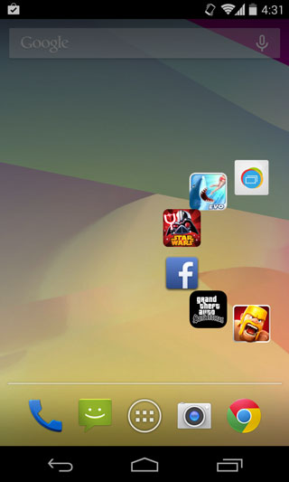
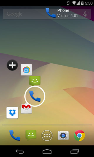
In the essence of apps like Switchr – not to be confused with Switcher, the now ancient Taskie and launchers like Unity – Loopr is, in purpose, another task switching app, but in function, it is a light app that simplifies the process. While the default Android switcher is a much appreciated feature inherent to the OS, Loopr improves the process by reducing the running apps to icons, making it faster to sift through. Premium users can get access to previews, though.
Loopr creates a pop up menu that you can access by touching designated areas and switching instantly between apps. An app doesn’t open until you lift your finger. While you are holding an app, it will give you information about that app. If the task list is empty, it will give you a list of the most frequently used apps.
What is astounding is that this app comes with a myriad of settings that are spot on, not too complicated that you can’t understand them and not so simple that they serve no real purpose.
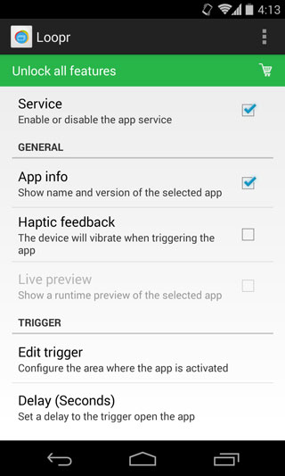
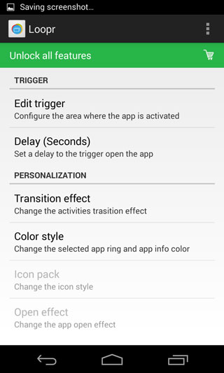
First you’ll want to customize the trigger zone from the ‘Edit Trigger’ option in Settings. Make sure they are situated on parts of the screen you don’t frequently use for other purposes; the default is in the center of the right and left margins, which is where I usually swipe to switch screens. It takes a second to customize it.
The app is light and doesn’t strain your battery or your memory, which is excellent given its passive nature. The only downside is that the app can get in the way if you’re playing a full-screen game and your finger enters the trigger zone.
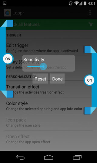
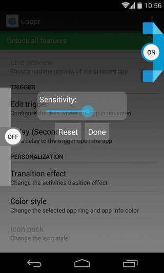
Originally, I felt that this isn’t exactly an innovative feature since I can already access apps through the app switcher button on my Nexus 4 , but then I realized that if you’re riding your device a little app heavy, Loopr makes sense. The default app switcher would take you ages to sift between previews and switching to the actual app, whereas in Loopr, the previews are very smoothly managed without crowding the screen and launching apps is faster even than the default switcher.
Loopr is an interesting implementation of the app switcher as it satisfies a need most of us didn’t know we had. After trying this app, I am starting to wonder if the default app switcher will adopt this model in future Android builds, as you will be surprised how smoothly it switches between apps. If you like riding your apps light, you might wonder what the point is, but don’t knock it ’til you’ve tried it.
