Hands On: Android Lollipop Developer Preview
Google has released the developer preview of Android L for Nexus devices. As impressive as Google I/O 2014 was, there is nothing that can compare to actually getting a user’s impression by going hands on with the OS and we did just that. The new Material Design isn’t just a fresh coat of paint; it’s a UI overhaul and we love it so far. We’ve detailed the new features end users are likely to love though there is plenty more, in the form of new APIs that will be of interest to developers. So, without further to do, here’s are new features.
Material Design
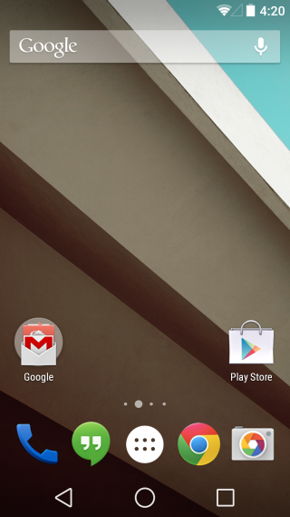
The new UI introduced at Google I/O 2014 is nice and elegant making use of shadows, light, and other elements that lend depth and dimensions. The point is to make interaction more ‘real’. The typography is more bold and a lot of vibrant colors have been used but it’s the subtle things that are more appealing when you get down to using it. For example, holding down a notification in the lock screen or when switching apps. The buttons, as shown in the dialler app, seem to float. You’ll also notice that new soft keys have been introduced.
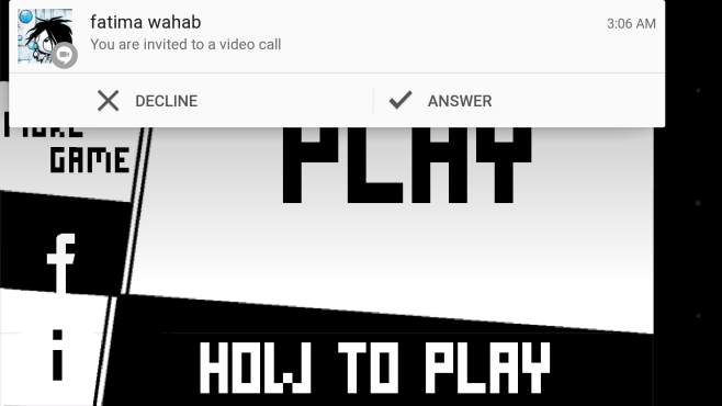
Dynamic Heads Up Notifications
These are notifications that you get for important events like a phone call, only they appear as a floating notification on top of whatever app you’re using. They can be dismissed or you can use them to interact with the app. The point is to allow you to interact with an app in response to an event without having to first open the notifications area.
Lock Screen Notification
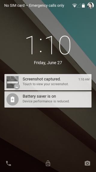
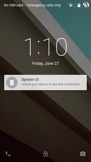
The feature speaks for itself but it’s worth mentioning that lock screen notifications have been implemented quite intelligently. Notifications, like an email or perhaps an text message hide the actual content and simply alert you to new activity. The content is only hidden if you’ve set a password for the lock screen. The difference can be seen below; the left shot shows how notifications appear when there is no passcode and the right one shows how notifications appear when there is a passcode.
New Lock Screen
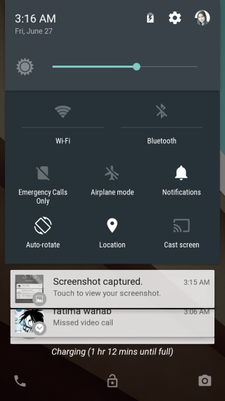
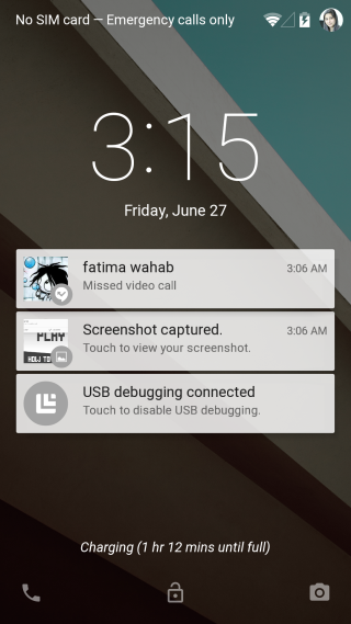
The lock screen has a nice new look too; swipe right to open the dialler app, left to open the camera, down to open quick settings, and up to unlock. This update comes at the price of lock screen widgets. Google didn’t explicitly say they were doing away with lock screen widgets but there appears to be no way to add them to the lock screen any more. If your device is plugged into a power source, the lock screen will also tell you how long it will take for it to fully charge.
3D Multi-tasking
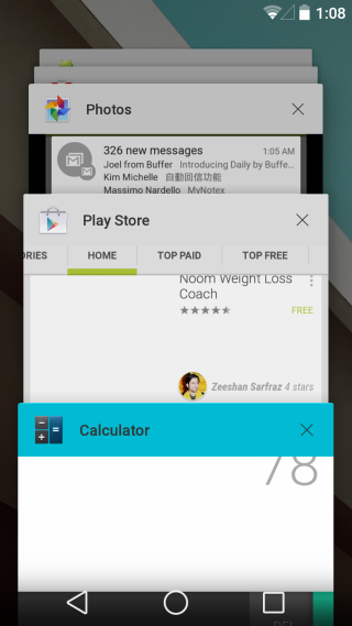
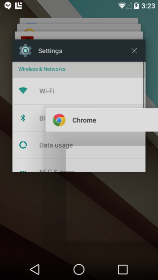
The app switcher has a very impressive new look; instead of a list of apps that you swipe through, you have stacked apps that give a sense of depth. This is mostly a visual change and an extension of the Material design but it’s worth a mention. To quit an app, tap the close button or use the usual swipe gesture.
Battery Saver
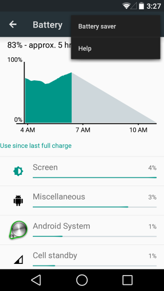
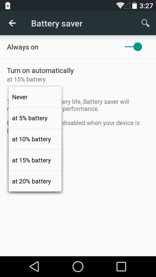
Battery saver is a new feature that, as the name obviously implies, helps the battery on your device last longer. It’s a new mode that your device runs in and it can get you 90 minutes extra on your device, according to Google. You can set it to turn on automatically when battery is at a 5%, 10%, 15%, or 20% battery.
Quick Settings
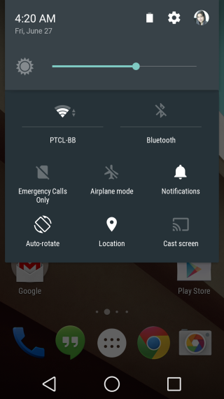
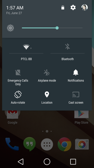
Another UI change and some new buttons have been added to quick settings. Noteworthy additions are the new rotation buttons and the cast screen buttons, as well as the do not disturb buttons. Your profile image is a lot smaller now and the brightness slider appears by default.
Do Not Disturb
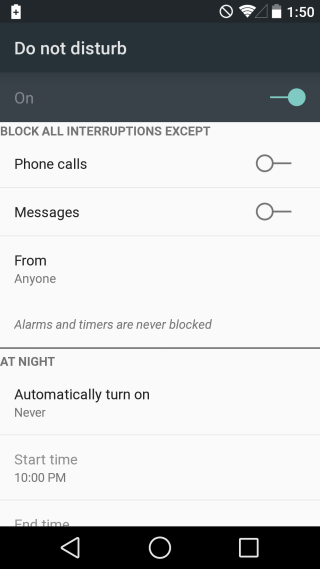
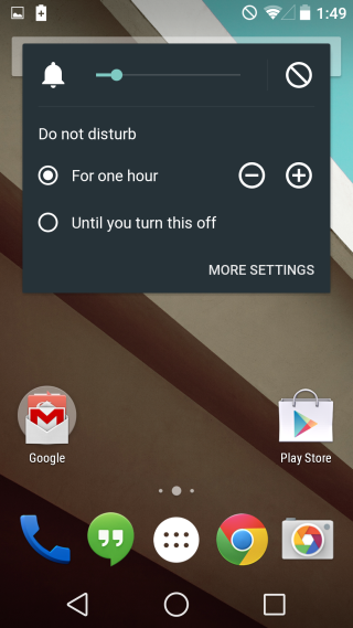
This feature is something iOS users have had since iOS 7 but it seems that it’s Google that’s gotten it right. Do not disturb is a mode that can be enabled on schedule or manually to silence notifications. Scheduling is incredibly flexible but that’s not the reason I love it. I love it because in Do Not Disturb mode, I can select contacts whose phone calls and messages can come through when it is enabled. Phone call and message settings are handled independently of each other and I can choose one or both. It has its own quick settings panel where you can choose to turn the mode off manually or after a certain number of hours.
Closed Captions
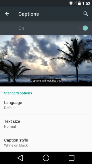
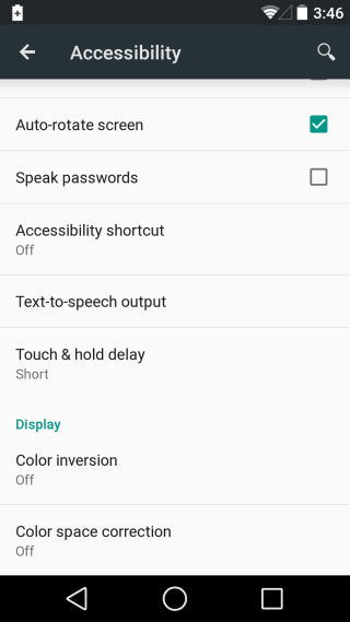
Closed caption support has been added for Chrome cast and can be enabled from the accessibility settings. The feature is complete with language selection, text size, and text color options.
Color Inversion & Space Correction
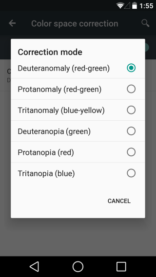
The new version of Android has two new color options for the visually impaired. A color inversion mode that inverts colors on your screen and a space correction mode for people suffering from different types of color blindness. You can choose which type you need to adjust for and the colors on your display will change accordingly.
Developer builds for Android L are available for Nexus devices here.

I’m especially looking forward to using the color inversion settings. Bring it on, Google! 🙂