4 Tips To Make The New Gmail v4.5 Android App Easier To Use
Google introduced a tabbed inbox for Gmail a little over a week ago and earlier this week, the search giant updated its Android and iOS Gmail apps to accommodate the new inbox tabs. For now, tabbed inboxes are opt-in but Android users will find that these new tabs aren’t the only thing that’s changed. With the arrival of tabs and the updated app, how you select messages in bulk, receive notifications for each label i.e. inbox tab, and the way messages are deleted has all changed. Sender images are a new addition to the app. The old features are all still there but they need to be enabled, and it isn’t very clear how to do so. In this post, we will show you how to view notifications for emails for all labels, disable the sender image, restore the delete button to the actions bar, and select messages in bulk.
Disable Sender Image
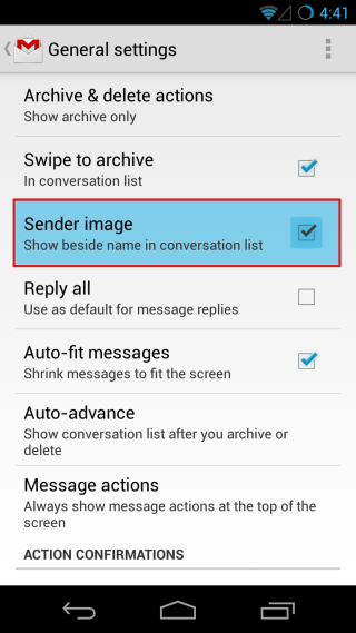
If your Android device has a modest screen size and you feel that the sender images are encroaching on your precious screen real estate too much, you can turn them off. Just go to the app’s settings and under ‘General Settings’, deselect ‘Sender Image’.
Selecting And Opening Messages
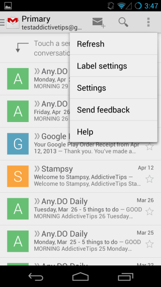
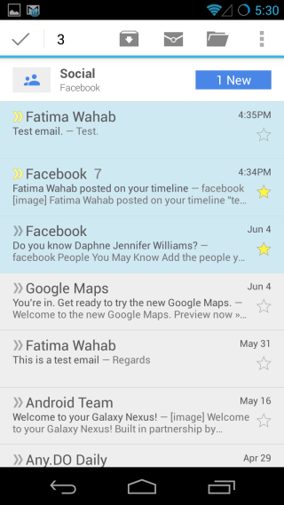
When you first visit your Primary inbox after upgrading to the new app, it will tell you to tap the sender’s image to select a message. To select messages in bulk, you have to always tap the senders’ images. If you accidentally tap the subject and preview area of an item, that particular email will open. You don’t lose your previous selection, but this is an easy slip up to make.
If you’ve hidden the sender image (as shown in the previous section), you will be able to select messages in bulk more comfortably. Tap and hold a single message until it appears as selected and then continue to tap messages to select them. With the sender image hidden, you can tap-and-hold anywhere on the entire message to select it, and as long as one message is selected, the rest can be selected easily with a tap.
Restoring The Delete Button
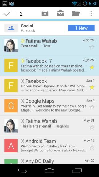
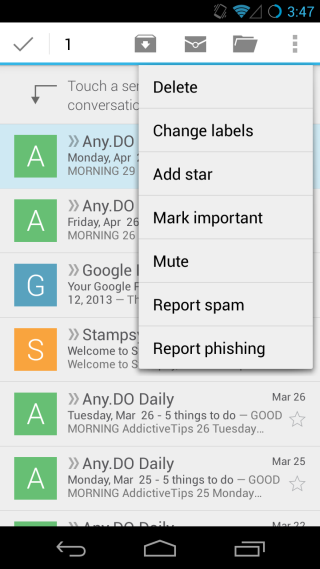
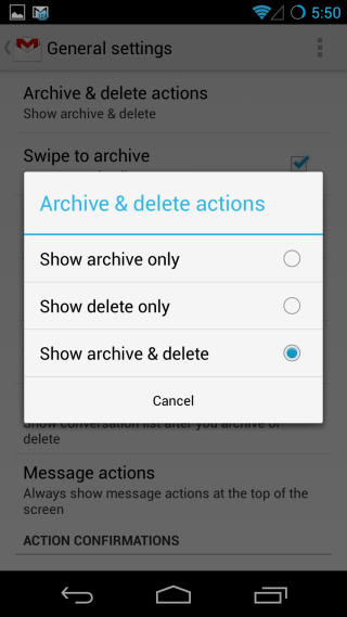
Another change you will notice is that the Delete button is no longer there in the action bar when you select a message. Swiping archives an email, but does not delete it. The delete option is actually hiding under the additional options when you select a message so it’s still there, but less conveniently so. To bring it back, go to the app’s settings and under General Settings, tap ‘Archive and delete actions’.
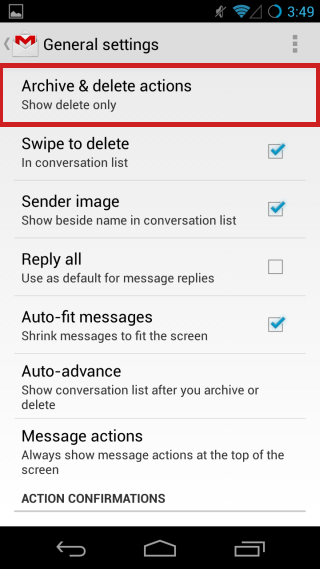
A popup opens listing three different options, of which ‘Show archive only’ is selected by default. If you select ‘Show delete only’ the archive button will disappear and move to the additional options menu where the delete option previously was. The ‘Swipe to archive’ option on the previous screen will also be changed to ‘Swipe to delete’ now.
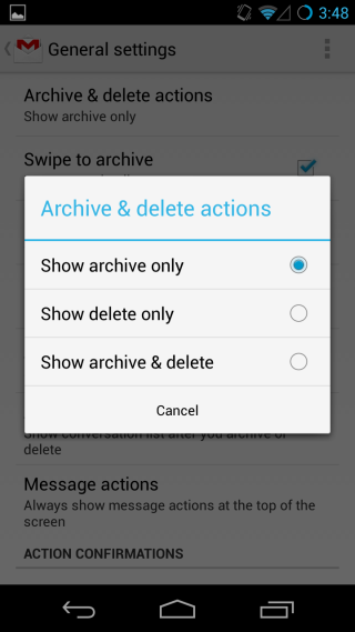
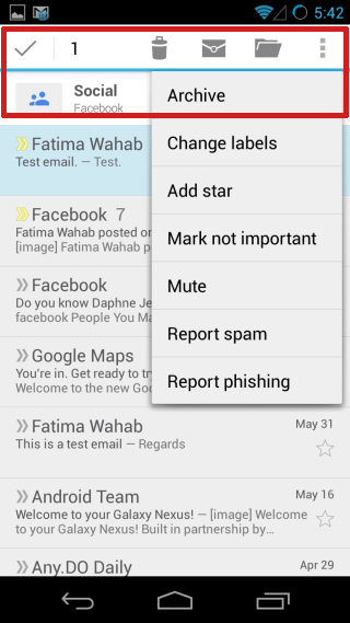
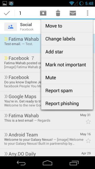
If you select the ‘Show archive & delete’ option, you will see both the delete and archive buttons in the actions bar for any selected message, and removed from the overflow menu. In this mode, swiping will archive messages.
View Notifications For All Categories / Labels
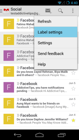
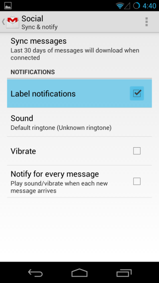
The concept of Gmail labels might have become somewhat confusing to many with the arrival of the tabbed inbox. Labels refer to the ones we add manually for certain types of emails. All new messages have the ‘inbox’ label added to them automatically (unless you have filters set that skip inbox for certain messages) but in the new Gmail for Android, the new tabs are being considered as labels as well. If you’ve been missing notifications for the message in any of the tabs, it’s because by default, you will only get them for the Primary one. To receive notifications for the other ones, open that particular tab/label on your device from the navigation drawer and then go to ‘Label Settings’. Check the ‘Label notifications’ option and you will begin receiving notifications for that particular label. You can also customize the notifications for that label here.
Though individually quite small, these changes might have overall been a nuisance for users who liked to receive and read email a particular way. Though thankfully, there is a workaround for most of them, and you can now take back the control of your Gmail to set it just the way you want!

I must have missed where it said how to delete all mail. Please someone help? It’s been days and I can not figure out how.
I dunno ’bout anyone else, but I’ve ALWAYS found the GMAIL app confusing. I’m not saying that I don’t understand it; I’m simply saying that it behaves differently than the way most people use email, and so it just gets in the way. This new version is just more of same, from what I can see.
The truth is, the easiest and most straightforward GMAIL interface on an Android phone is the one accessible via the web browser… believe it or not. So I have a shortcut to it right on my homescreen. It’s just way easier.
But, hey… that’s just me.
___________________________
Gregg L. DesElms
Napa, California USA
gregg at greggdeselms dot com
I think the images are fine. I hate seeing a grayed out person in the list because I don’t have a contact picture for them. At least it fills some kind of void and looks a little bit personal.
A few features I’d like to see implemented: Swipe LEFT to archive; swipe RIGHT to delete. // Have Archive, Delete, Reply as buttons in the notification bar when expanding a new email notification.
The new layout is a bit confusing IMO
I can’t grasp how it’s working with all the letters and stuff 🙁 What do they stand for? F A G S. Lol
The first letter of the name who’s sending the mail…
That’s useless
Agreed !
It’s only useless if you don’t have images for your contacts. If the sender is a contact and has an image, it will show that instead of the letter. My contacts sync with Facebook & Google profiles so most of the people I communicate with frequently have images. It’s very useful to see their image when glancing at the list.