Sleek Android Twitter App ‘Carbon’ Finally Arrives In Play Store
The official Android client of Twitter is decent enough to keep you hooked into your micro-blogging world on the move, but compared to some of the feature-filled third-party alternatives out there, it just doesn’t seem to suffice for power users. Many of us prefer aesthetics and user-friendliness over a relatively huge feature set, while others wish to have as many neat tricks at their disposal as possible, even if they have to pay for it. If you’re still in search of the ideal Twitter app for your Android device, Carbon for Twitter might be worth a try. After staying in testing phases for quite long, Carbon for Twitter has finally made it to the Play Store as a slick and animation-filled Twitter client. Though not as feature-rich as OneLouder Apps’ Slices or as gorgeous as Falcon or Plume, Carbon for Twitter certainly has quite a few goodies of its own that we shall explore past the break.
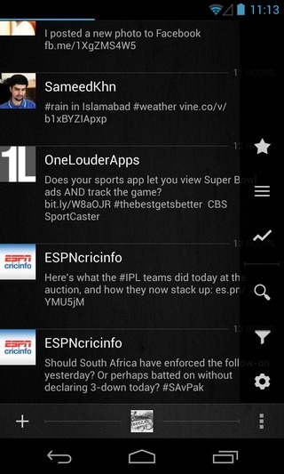
The first thing you’ll notice about the app is its sleek and beautiful layout, which is unique in quite a few aspects. A touch of Holo can be seen throughout the app’s UI that also sports multiple information-rich sidebars, semi-translucent new item notifications, detailed user profile views atop avatar-oriented full-screen backgrounds, visually-rich conversation threads, and a nice tilted effect for the drag-to-refresh gesture.

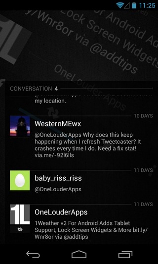
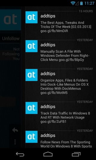
The main UI of the app is split into three tabs dedicated to displaying your Twitter Timeline, @Mentions and Direct Messages. The Timeline view shows all the latest tweets from the people you’re following, complete with inline photo and video thumbnail previews. You can interact with an item either by tapping it and performing the required action from the conversation screen, or by using the long-press gesture to select the action from the app’s main screen itself. To quickly navigate to the top or bottom of the screen, you can use two finger scrolling gesture. While switching between the three main screens, you’ll be able to see a quick navigation bar at the top that can help you jump to the required screen without having to swipe multiple times.

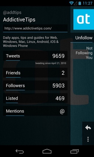
Tapping a user’s avatar lets you view their detailed Twitter profiles, complete with the number of tweets, friends, followers and @Mentions. From the same screen, you can retweet them, send them a Direct Message, add them to your Twitter Lists, filter their Tweets to keep them from showing on the Timeline without actually blocking them, report them as spammers, or block them completely.
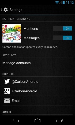
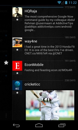
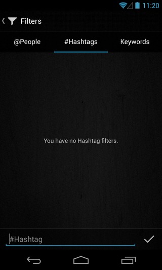
Tapping the Menu button on the app’s main screen reveals a compact right sidebar that allows you to check out your favorite/starred items, items posted under your Lists, and all the trending tweets from a region of your choice. It is also from the same screen that you can perform a search across Twitter, keep a close tab on your Twitter filters in terms of people, hashtags & keywords, and head over to the app’s settings screen to manage notifications for @Mentions & Direct Messages, as well as add, remove and manage your Twitter accounts.

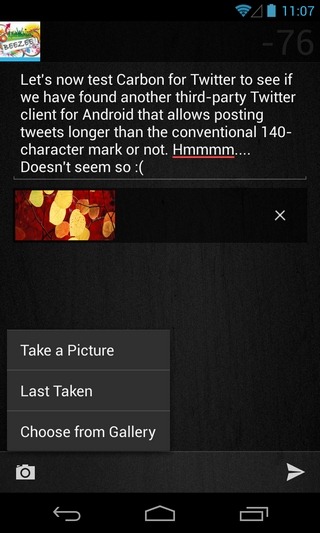
Now to the missing bits – as of now, Carbon doesn’t support posting tweets longer than the conventional 140-character mark – a feature supported by various third-party Twitter apps. Moreover, the app is not optimized for tablets, and does not support push notifications. You can’t save tweets as drafts, or attach videos or locations to them. Landscape orientation is also not supported, and there is no widget available for your Android home or lock screen.
If you don’t care about the aforementioned shortcomings, Carbon for Twitter will be worth a shot for you. The app requires Android 4.0 Ice Cream Sandwich or higher to run, and can be downloaded for free via the Play Store link provided below.
Download Carbon For Twitter For Android

Awaiting the tablet version of application for some time, wondering if it will ever arrive
i still prefer Slices over this.. has a better over experience imho…