AppDJ Suggests Android Apps Based On Your Interest Level For Each Category
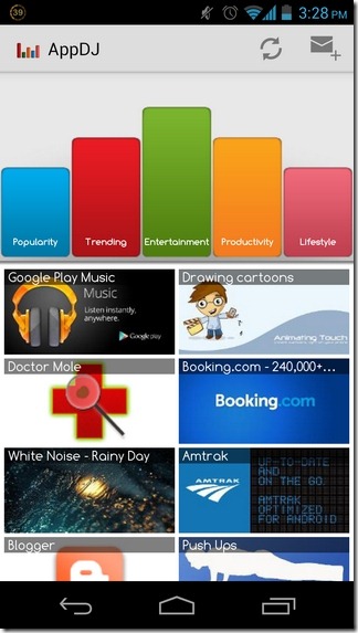
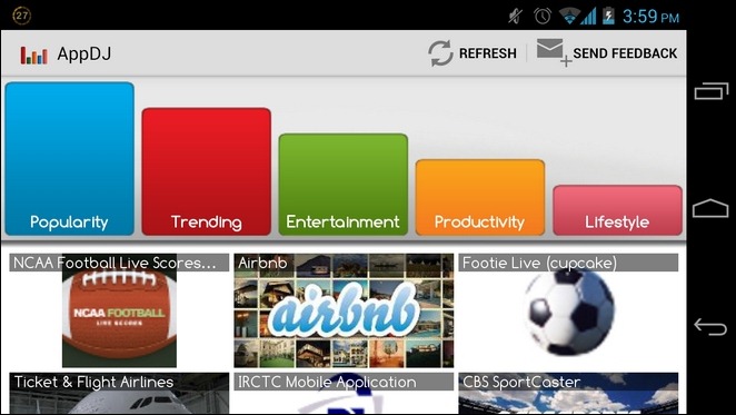
Looking for a simple Android app discovery tool? You’d be hard-pressed to find a simpler solution than AppDJ. While most alternatives focus on presenting the latest Android apps from the Google Play Store under various user-specified criteria and genres, AppDJ offers a maximum of five different app categories and discovery criteria – Popularity, Trending, Entertainment, Productivity and Lifestyle – according to which it fetches all its content. The app’s UI comprises resizable bars, each referring to one of the five aforementioned categories or criteria, where the height of each bar determines the ratio of apps falling under that category that will appear in suggestions. Instead of cluttering your screen with a multitude of categories, AppDJ offers all the apps under just the five mentioned categories. For example, security tools can be found under the Productivity tab, media players under Entertainment, and personalization tools are grouped with the Lifestyle category.
More than any other aspect, it’s the user experience of AppDJ that makes it a worthy contender in its genre. Just by tweaking the lengths of a handful of bars, you can set the exact mix of app suggestions that you’re looking to get. And it’s all pretty hassle-free, too, since you don’t have to sift through any pre-configuration menus. Instead, it’s all a touch away on the app’s home screen.

For instance, you may opt to get recommendations for all the Trending apps from the Entertainment category, with a dash of Lifestyle apps, or you may want the app to list out all the popular apps from the productivity category only. If you wish to keep an eye on the most popular apps falling under each category, simply extend the Popularity bar to the max, drag Trending to minimum, and keeping the remaining categories at equal levels.

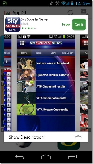
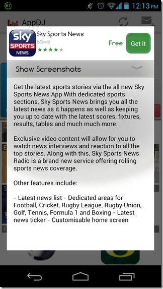
Once a bar’s length is adjusted, the app automatically updates the screen content to present you with the relevant suggestions. Unfortunately, there is no way to distinguish between free and paid apps from the suggestions list. In fact, the list doesn’t display anything other than app titles along with their icons or banners. You’ll have to select an app to view details such as pricing, screenshots, description, developer and star ratings etc. Hitting the Get It button on the app’s description screen will take you to its Play Store page. If, for some reason, the app fails to automatically update content, you can do so yourself by hitting the refresh button at the top.


In terms of aesthetics, AppDJ is undoubtedly at par with previously covered AppAware, Mapsaurus, and AppZapp etc, but in terms of features, we can safely state that AppDJ is still a long way behind its peers. That being said, if you prefer speed and simplicity, AppDJ may be right up your alley.
However restricted, the app certainly deserves a try for its unique app exploration concept, and a loveable layout. Still, we’d love to see a bit more customization offered along with the app. For instance, the user should have control over the app categories that appear on the home screen. Not to mention, the pool of supported criteria could be expanded to include release date, free/paid, sports, weather, travel, photography and eBook readers etc.

Pretty cool idea! This would be really cool with BAM’s http://www.gamegenomeproject.com/