A Closer Look At Android 4.2 Jelly Bean Lock Screen With Widgets
As every Android enthusiast would know by now, Google’s latest flagship Nexus devices – the LG Nexus 4 and Samsung Nexus 10 – are now available for sale on Google Play Store in select locations all across the globe. Both devices are powered by Google’s latest mobile operating system, Android 4.2 Jelly Bean. We have already seen the latest distinguished features of Android 4.2 in detail but for a quick recap, the freshest version of Android brings a totally revamped Camera & Gallery app with Photo Sphere, notification power controls, multi-user support (tablets only), verification of APKs prior to app installations, Daydream, wireless display with Miracast support, stock keyboard app & enhanced stock clock app with various additional goodies, including alarm, stopwatch, timer and revamped home screen widgets, amongst others. A relatively less talked about yet eye-catching feature of the firmware is its brand new customizable lockscreen app with multiple screens and widgets support. As we’ve just found out, this particular aspect of Android deserves a special mention, which is why we’ve decided to compile an entirely separate post on it. Continue reading past the break to find out exactly how the latest Android 4.2 Jelly Bean lockscreen looks like and operates.
Before proceeding any further, let us inform you that the lockscreen has been tested on Galaxy Nexus sporting the official Android 4.2 Jelly Bean ROM. You may follow our guide to manually install stock Android 4.2 JB ROM on Galaxy Nexus GSM. For your information, an official latest Jelly Bean 4.2 is also available for the Nexus 7 Android tablet. Let’s now take a closer look at the lockscreen app itself.
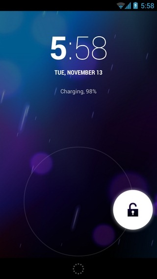
By default, the stock lockscreen app in Android 4.2 still uses the ring-shaped Slide unlock pattern that was introduced in Android 4.0 Ice Cream Sandwich, with each subsequent OS iteration simply following suit. The difference in the latest lockscreen app however, lies in the way it lets you unlock directly to your home screen, Google Now and the camera app. All three said features can now be accessed using totally different swipe gestures. For instance, to unlock to your home screen, just swipe the padlock icon towards any random direction you wish. On the other hand, the camera app can now be directly launched by swiping leftward from the right edge of the lockscreen, whereas Google Now can be accessed by swiping upwards from a dedicated button at the bottom-center of the lockscreen.
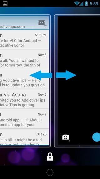
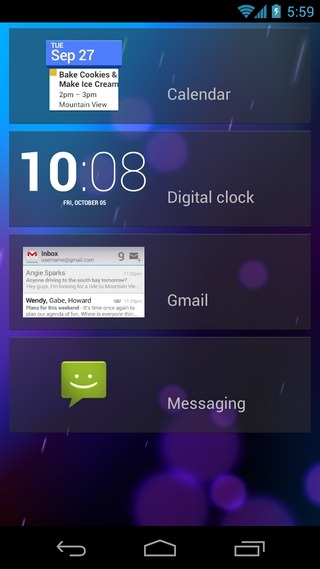
Now let’s move on to some of the other lockscreen tweaks, multiple pages and widget additions that have been recently introduced in Android 4.2 Jelly Bean. You can now have multiple pages on the lock screen and the most fascinating part about this is that you can set any lockscreen as your default one. Swiping sideways from either edge of the lockscreen activates the lockscreen navigation mode, complete with the option to add and switch to other screens, each capable of sporting one of the following app widgets:
- Calendar
- Digital Clock
- Gmail
- Messaging
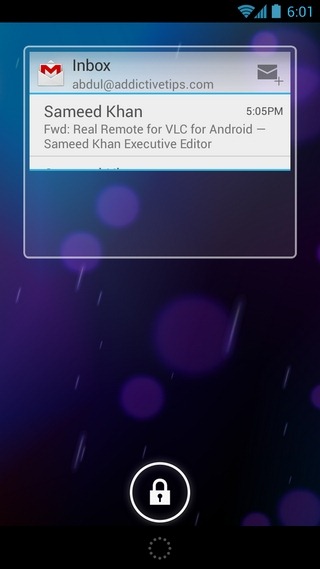
To initially activate the side-scrolling interface for the lock screens, you will need to swipe from the left or right edge of the device towards the center. Once this lockscreen navigation mode is activated, you can switch between different screens by swiping sideways from anywhere on the screen. By default, said mode remains active till your screen goes to sleep. However, it can be manually deactivated by hitting the padlock button at the bottom. Once it is tapped, the current lockscreen becomes your default lockscreen.
Here’s some more cool stuff. Tapping a lockscreen widget helps you navigate to the corresponding app. Furthermore, all supported widgets are resizable, meaning you can shrink or expand them by simply swiping upwards or downwards from their bottom edges. Also, resizing any widget gets you into the side-scrolling interface automatically.
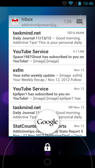
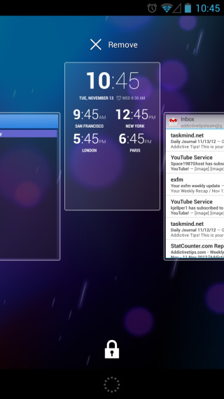
Apparently, only the aforementioned app widgets are supported at present, and you have the option to add a maximum of five different lockscreens, in addition to the default camera app screen. Each screen must sport one of the aforementioned widgets. That’s not all; you also have control over the arrangement of your lockscreens. Holding down on a screen lets you reposition it in the desired order by just gliding it over other ones. To remove a specific screen/widget altogether, make sure the lockscreen navigation mode is enabled. You may then use the aforementioned long-press gesture and just fling the widget towards the Remove option at the top to get rid of it.
As ever, the notification bar can be dragged down right from the lockscreen to access the notification panel and for those still unaware, you now have a brand new toggle present at the top-right of the region. Tapping it reveals the new notification power toggles introduced in Android 4.2, complete with shortcuts to user accounts, brightness, system settings, Wi-Fi, mobile data, charging, Airplane mode and Bluetooth.
Conclusion
With the latest feature-laden lockscreen app in Android 4.2, Google has outsmarted all the third-party lock screen app developers out there. Right from the subtle variations in the way users can now unlock to their preferred apps, to the promising concept of multiple ‘lockscreen’ tweaking and management, there is something for everyone to love about the latest Android lockscreen.
Personally speaking, I see a massive window of opportunity being opened for worldwide developers to exploit this particular feature of Android 4.2, and come up with some magical stuff of their own, provided Google allows an API for third-party lock screen widgets. After all, if your messaging/email app widget can be installed within the lockscreen, there is no doubt why it can’t sport your favorite social network client’s widget, a system/third-party app widget, or, even better, multiple widgets. It’s all about waiting and watching, isn’t it?
Note: If you don’t want to keep the camera and/or widgets accessible from the lockscreen, you can resolve the issue with the help of Lockscreen Policy.

Try Beautiful Clock Widget on Jelly Bean 4.2 Lock screen widget – https://www.addictivetips.com/android/add-weather-clock-widgets-to-android-4-2-jelly-bean-lock-screen/
In the “Pattern screen”, the widgets are visible too?
Of course, they are. After all, the widgets are for the ‘lockscreen’ itself, and are meant to work regardless of whatever unlock type you intend to use them with. Needless to say, unlocking is for your home screen, whereas these lockscreen widgets are existing outside it.
I’m wondering if Android are deliberately trying to move away from Apple ‘elegance’. Love the functionality but before this you had a lock symbol with unnecessary expanding ‘press me’ rings. Now the lock screen also has flashing ‘swipe me’ side windows and bold HOUR numbers that just look unbalanced. Note to Android, “elegance” is not copyrighted, you can still employ some.
Good, no, great job Google!
What is really weird about the new lockscreen, though, is that there are no settings for it. You always get into lockscreen edit mode if you swipe left to a new page, you can never get rid of the camera widget to the right etc. Either they leave you with such a permanently malleable UI or I am blind and haven’t managed to find those settings despite looking around for them.
You’re not alone in this. Even we tried to look for some sort of settings for the lockscreen, but without any luck. You get what you get, and that’s what it is as of now.
You can find a simple app that gives you some control over the lockscreen (primarly to turn it off) in Play here: https://play.google.com/store/apps/details?id=com.wordpress.chislonchow.deviceadminkeyguard#?t=W251bGwsMSwxLDIxMiwiY29tLndvcmRwcmVzcy5jaGlzbG9uY2hvdy5kZXZpY2VhZG1pbmtleWd1YXJkIl0
I have wanted this on an android lock screen since forever. cant wait for this on the S3
This is all and all amazing but I dont quite understand what is the reason of putting all these on the “lock screen” ? Where is then the purpose of the lock screen ? You now have access to some features which are not protected anymore.