Windows 8 vs OS X Mountain Lion: A Battle Of Features
Three years after Windows 7, Microsoft has released the next version of Windows dubbed Windows 8. If you’ve been following any of the pre-launch buzz surrounding this release or have tried your hand at either the consumer or developer preview, you will know that it’s the largest interface overhaul that Microsoft has ever made to its operating system. It’s also something of a hybrid that’s meant for both desktop PCs and tablets, specifically the Surface. Windows 8 is mostly being compared to its predecessor and how easy or difficult it will be to adapt to for users running Windows 7. In what follows, we will take a look at some of the salient features of Windows 8 and Mac OS X Mountain Lion, and see how they are implemented in their respective OS.
On its own, Windows 8 looks to close the gap between Microsoft’s tablet and desktop operating systems, and the interface itself is strikingly similar to the Windows Phone interface. The only other operating system that does something similar is OS X, particularly Mountain Lion that brings it closer to iOS. Apple has long been in the tablet and smartphone business and has been successful in terms of both hardware and software. It makes sense to wonder just how up to scratch is Windows 8 when compared to the current state of OS X in general and Mountain Lion in particular. This post looks at the functional similarities between both operating systems. While it would be incorrect to say that any aspect of Windows 8 has been replicated from OS X, it would nevertheless be apt to say that Microsoft has made a viable attempt at combining its mobile and desktop platforms.
Desktop vs Modern UI
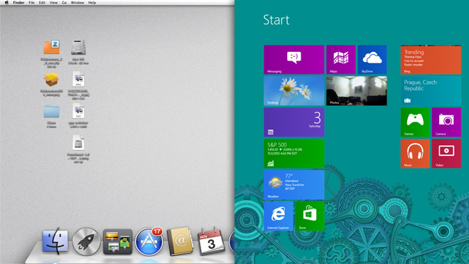
The Windows 8 interface is new; Microsoft has rebuilt it from scratch and it’s one of the biggest points of criticism for the new operating system. It’s a far fling from what you were used to in Windows 7 but if you were or are a Windows Phone user, the interface will seem familiar to you.
OS X only recently began to look more like Apple’s mobile operating system. Starting with the addition of Launch Pad in Lion and culminating with Mountain Lion’s Notification Center, OS X has slowly started to look and behave more and more like iOS.
If you compare how the two companies have brought their desktop operating systems closer to their respective mobile counterparts, Apple has taken a much more subtle approach by slowly integrating new features and interface changes over several updates, while Microsoft has made the changes almost painfully abrupt. When it comes to the user interface similarity between Windows 8 and Windows Phone, it goes only as far as being called familiar; overall, the average Windows Phone user will have to learn their way around the new OS just like any iOS device user would have to learn their way around OS X.
Apart from the similarities between the desktop and mobile operating systems, there is the concept of how a desktop works that now differs greatly between the two operating systems. With OS X Mountain Lion, all functions are built around the desktop; Launch Pad, Finder and Notification Center are accessed from the desktop; Apps and files open on your desktop, and all setting are still managed from there.
In Windows 8 however, the desktop has been pushed aside. The new Modern UI has taken over and the classic desktop is now just a part of it. While the desktop is still there and apps run on it the same as they did in Windows 7 or as they do in OS X, the interface is segregated between the desktop and the Modern UI, with the desktop taking pretty much a back seat and Windows 8 pushing it consistently to the back with the whole interface built to promote the Modern UI aspects with apps that run exclusively in it. To best compare it with OS X, the desktop in Windows 8 is now to Modern UI what the Dashboard is to the Desktop in OS X, although the comparison reverses when it comes to the functionality of the Dashboard and the Modern UI.
LaunchPad vs Start Screen
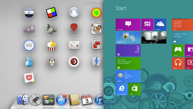
Windows 8 has introduced an altogether new way of launching apps, the Start Screen which is also the first thing you see when you boot into Windows 8. Launch Pad – introduced to OS X Lion, as mentioned in the previous section – is an app itself that you launch from the Dock. All apps that you install are accessible from here, though alternatively, you can also access apps from the Applications folder.
To compare the two, the App Launcher is an app in OS X, whereas the Start Screen in the Modern UI is at the same time an app launcher, your home screen and a means of accessing the desktop, My Computer and your files. You can group apps and rearrange them much like you can in Launch Pad, but the similarities end here.
The Start Screen is an excellent app launcher; it supports live tiles and notifications for new items, but is self-limiting compared to the classic desktop since it works only for apps. Opening a file with the Start Screen involves a couple more steps, though admittedly, it isn’t something you can do at all with Launch Pad in OS X. In terms of features, the Start Screen does infinitely more than the Launch Pad but to say it does it well is somewhat of a personal preference. Since the Start Screen serves multiple purposes, you will find yourself constantly switching between the Modern UI and the desktop mode. As a simple example of this, when opening a drive from My Computer, you will switch to the Desktop view. Files can be searched from the Start Screen but folders cannot, and you have to head over to the desktop view to do so.
Menu Bar vs Charms Bar
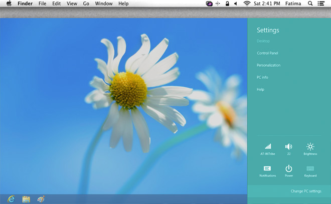
In Windows 8, Microsoft introduced the Charms bar – an omnipresent sidebar that presents both context sensitive options for the currently active app and system wide options for managing the volume, brightness, internet connections, power options, notifications, devices, and context sensitive search.
To some extent, you can compare this to the Menu Bar in OS X, which is a functionally similar omnipresent bar that sits at the top with options that change as per the active app while retaining options for accessing basic system settings like System Preferences and power options.
If you compare the two, the Charms bar has a long way to go in terms of consistency across apps. The system settings are good to go but few apps offer sufficient support for other settings. These same apps – when used in their desktop versions – offer a lot more options. At this point, it is a matter of which Charms bar feature a Modern UI app supports. You won’t find this problem in OS X, since the Menu Bar options are fairly uniform and apps’ options are completely accessible from it.
Overall, it’s good to see a context sensitive bar in Windows 8, but the execution is something that needs more work or perhaps just more support in apps.
iCloud vs SkyDrive (And Windows Live ID)
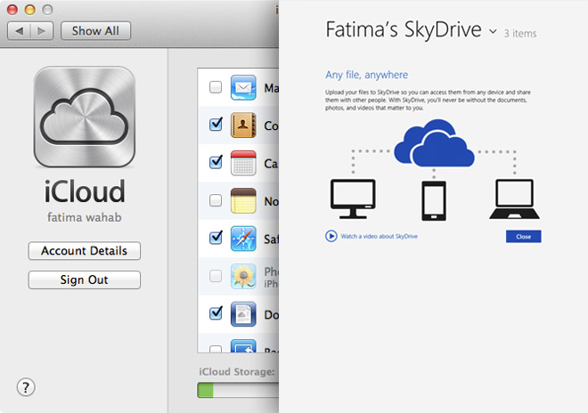
Windows 8 comes with cloud integration for backing up both your PC settings and your data. PC settings are backed up using your Microsoft Live ID – an essential for using a PC running Windows if you want to use its Chrome OS-like cloud features – while the data is backed up to SkyDrive with a Modern UI app that is integrated system-wide. OS X Mountain Lion also allows you to back up data to iCloud and your Apple ID will allow you to download apps across multiple Macs, but it doesn’t offer support for syncing Mac settings like your privacy preferences or which accounts you’ve added to Messages.
Cloud integration, data backup and syncing – though present in both Windows 8 and Mountain Lion – is executed very differently. Windows 8 backs up your files and your PC settings, ensuring that it’s easy for you to set up a new Windows 8 device (like perhaps a tablet) and your important files are available on all your devices. Mountain Lion makes sure you can see data from Mac apps on other apps and your iOS devices, such as reminders and calendar events. While you can use iCloud in OS X to backup your photo stream or create files directly in iCloud, it’s focus is mainly on app data, and even pictures and files are synced via apps.
If you have a preference for using apps other than the stock apps that come with the operating system, you’re probably going to prefer data syncing the way it is implemented in Windows 8.
Notification Center vs Toaster Notifications
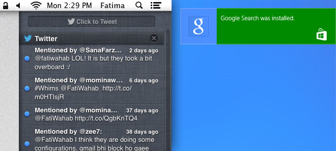
Windows 8 has renewed the way it handles notifications. System notifications still appear in the system tray like they used in Windows 7 but Windows 8 has added Toaster Notifications support, which is basically a curated system for showing notifications from different apps on your screen. The notifications are fairly passive, informing you only of things like a download that’s started or completed.
Mountain Lion introduced Notification Center (ported over from iOS) and it too shows notifications from different apps. It is, however, a very sophisticated system for viewing notifications from different apps and is miles ahead of what Windows 8 has just now. Windows 8 does not give you a consolidated view of notifications sent from different apps, whereas Mountain Lion will let you revisit them any time as well as switch to the app and open the item in the notification. Windows 8 does none of that and it’s easy to say that Mountain Lion is the winner here.
Mac App Store vs Windows Store
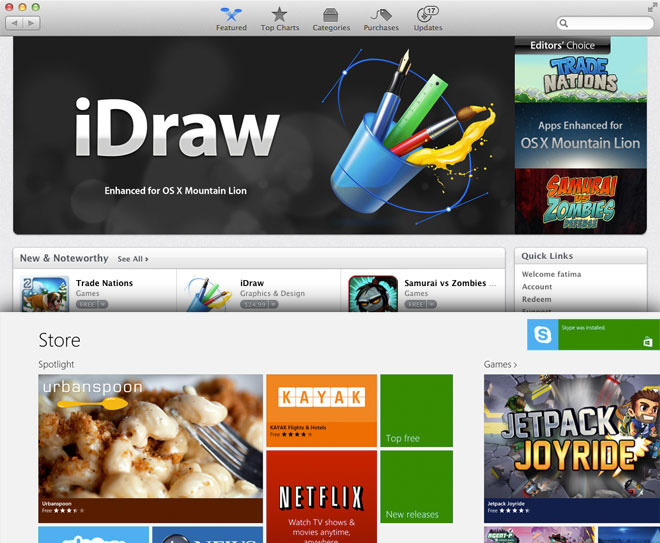
Apps have had a huge impact on both the smartphone and tablet market. Seeing the influence and role a central app repository can play, Apple introduced the Mac App Store in Lion, which has grown to over 10,000 apps.
Microsoft hasn’t had much success with Windows Phone Marketplace but that might be attributed to the small Windows Phone user base. It has, nevertheless introduced Windows Store in Windows 8 that will act as the primary source for downloading Modern UI apps. The Windows Store is young, has comparatively fewer apps, and the quality of the apps present is currently nowhere near what you see in some of the better Mac App Store apps. It is still welcome because it means that in the future, you won’t be pegged down to app installers, as the Windows Store will take care of all app downloads for you and will eventually fill with more apps. The quality of those apps, however, is something for Microsoft to work on. Currently, the Skype app for Windows 8 only supports some very basic features, for example you cannot even sign out of it for now.
Windows 8 has also introduced Xbox Games and Xbox Music as apps that allow you to download games and music from Windows Store, in addition to viewing popular games. The Xbox Music app is for downloading music and shouldn’t be thought of in terms of an iTunes counterpart. Similarly, Xbox Video allows you to buy movies and TV series. On another note, just like the Mac App Store, the Windows App Store handles app updates, but not updates for the OS itself.
Finder vs File Explorer
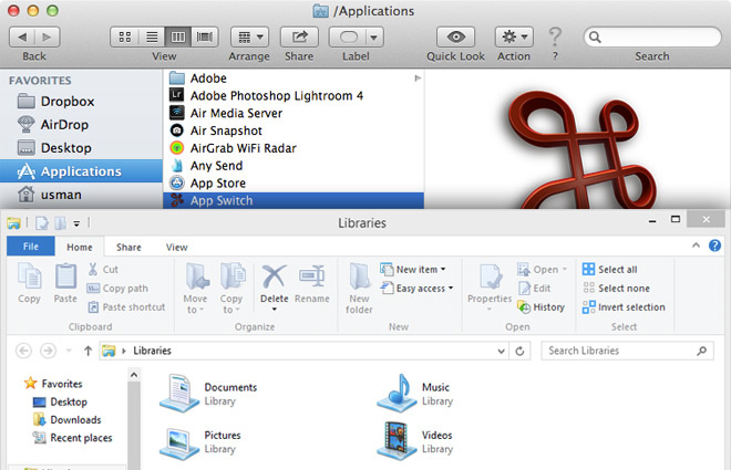
Windows 8 not only redesigned the windows explorer but also renamed it to File Explorer. It never had much of a file viewer but has introduced a PDF reader called Reader that is very basic on the features, allowing you to bookmark pages and nothing more. File Explorer is just as feature rich as it ever was; no complains there. Windows has always had a better file browser than OS X. The revamped interface adds few new features, though the menus and top toolbar have been replaced with the ribbon UI, and the options that it shows are sensitive to the type of file currently selected. In addition to standard Windows file management, these options allows you to burn items to a CD, send a fax, print a file, start a slideshow, change how files are grouped and manage the preview and details pane.
Finder in OS X lets you share files to Facebook or Twitter, or add them to an email. Other than that, there’s little else that it does. Finder is meant for only basic file browsing. The OS X file viewer on the other hand has improved over the ages. Not only will it open some of the most common file types, but it also lets you edit PDF files – something that Reader in Windows 8 does not allow.
To put it simply, Windows 8 has the more sophisticated file manager but OS X wins when it comes to a good file viewer. The “All Files” view in OS X is worth mentioning here since it makes it quite easy to search through all files on your system and sort them by last opened, last modified, date added, date created, size or label. It is possible to do so in Windows’ File Explorer as well, by searching for * (which denotes everything) and then sorting the search results using the ‘View’ toolbar in the ribbon.
Switch List vs App Switching
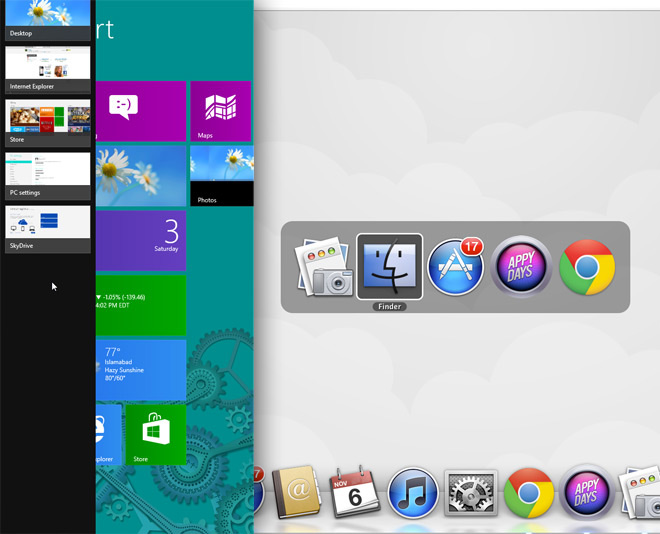
App Switching was never a great experience in OS X before the introduction of gestures in Lion. You have the Command+Tab shortcut that shows open app icons on your screen and lets you switch to them, along with the Command+Backtik shortcut that allows you to switch between windows of the same app. However, it doesn’t give you the preview you get with the trackpad gesture.
Windows 8 retains both the Alt+Tab and Windows+Tab shortcut keys for switching between apps. The Windows+Tab shortcut brings up the Switch List at the left, which you can otherwise open by moving your mouse vertically downward from the top left to the bottom left. Windows+Tab or the Switch List allows you to switch between Modern UI apps while Alt+Tab allows you to switch between both Modern UI and Desktop apps. It’s possibly one of the best and most helpful features for working with the Desktop view and the Modern UI.
Lock Screen vs Login Screen
The Windows 8 login screen now sits behind a lock screen that has a striking resemblance to the Windows Phone screen with on-screen widgets and all. It allows you to view information from apps, your power source and/or battery level and network connectivity & signal strength. For both tablets and desktops, you have to slide it open to get to the login screen. You now have a choice between three different types of passwords for the login screen: the typical alphanumeric password that’s been featured in past versions of Windows, a PIN password, or a picture password that requires you to tap three spots on a picture of your choice. The picture password may not be the best option for locking or unlocking a desktop PC as a keyboard based password would still be more suitable for it but on tablets, it’s pretty good, as it’s easier to enter and has less of a chance to be seen by others.
OS X Mountain Lion still has a simple login screen and no lock screen. It has evolved slightly to show the power source and network connectivity, but only offers an alphanumeric password to lock and unlock your system. Since this OS is meant only for desktop use, the password functionality is sufficient, though you will find apps in the Mac App Store that allow you to add more sophisticated passwords. The login screen could still use notifications from apps.
File Versions vs File History
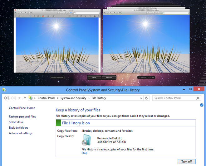
When it comes to saving older file versions, Windows 7 had built-in support for it but relied on other OS features like System Restore and Windows Backup to save older file versions. The new File History feature introduced in Windows 8 lets you specify any location for saving file backups, easily customize the backup interval, and maintain caches for old files. You can choose when to expire the cache, and files can be restored from File Explorer. Do note however, that you will require an external or network storage drive to make use of this feature.
OS X Mountain Lion introduced a similar feature in Preview, its default file viewer. Time Machine has long been a part of OS X allowing users to schedule periodic backups of all their data to an external location. The difference here is that OS X offers fewer customization options and those that are there aren’t easy for the average user to change. File History in Windows 8 on the other hand, is linked to changes to the file and not to a time interval.
This is yet another area where you can find a similar feature between the two operating systems but with a contrast in how it’s executed. Windows 8 offers more control and customization, though it will obviously take a little extra effort to set things up. With Windows 8, you can choose which folders to exclude from the backup. Retrieving the back up is super simple in both Windows 8 and OS X, so there is little to compare there. Windows 8 lets you do it from the File Explorer while OS X allows you to open an older version from Preview.
As far as simplicity and a learning curve for users is concerned, Mountain Lion’s file history was somewhat confusing with the new behavior of the Save As function, as it effected both the original version of a file and a new document. This difference is there perhaps because OS X relies on the file viewer to save file versions, whereas Windows 8 goes about it in an entirely different way with file versions being saved as an external function of the OS that does not depend on an app or how the user saves a file.
Gatekeeper vs SmartScreen
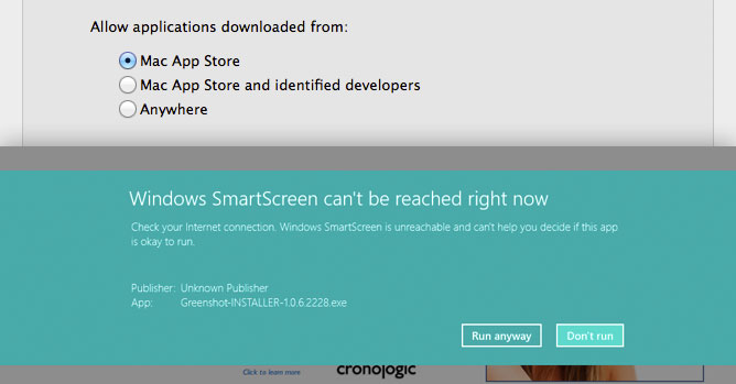
Prior to OS X in Lion all previous versions of Mac OS X from Tiger to Snow Leopard relied on developer sites or unofficial app repositories for app downloads. After introducing Mac App Store in Lion, Apple realized that with a great app store, comes great responsibility. In Mountain Lion, Apple introduced Gatekeeper: a security feature to help protect users from potentially malicious apps. Apple subsequently rolled out Gatekeeper for Lion as well. While it may have taken a little time for an app security feature to appear in OS X, Windows 8 has added one off the bat and called it SmartScreen.
SmartScreen isn’t just for apps; it also scans websites and links opened in Internet Explorer 10 for malware or phishing scams. Files that you download are scanned and apps from unknown authors are prevented from running unless you explicitly allow them to.
The idea behind the feature in both operating systems is again similar yet implemented differently. Gatekeeper in OS X focuses on the origin of an app and its author, and users use that as a benchmark to judge if they would allow the app to run on their Mac or not. SmartScreen isn’t focused solely on apps. though one of its triggers is an unidentified source or an app that hasn’t been digitally signed by an author. SmartScreen – as a security feature – doesn’t just cover apps; it’s like system wide protection that you will see on both the Modern UI and the Desktop ensuring that malicious content is kept out of your system.
Gatekeeper, although confined to apps alone, is the level of security needed by an average Mac user since apps from unidentifiable sources are the most likely source that a malware attack could originate from. Windows 8 on the other hand has only recently introduced a app store, and considering its low population of apps as well as the years-long convention of direct app installers, plenty of users will be downloading apps from other sources and thus, the extra protection can come really handy. This makes the security layer SmartScreen adds to Internet Explorer and files that you download a good call on Microsoft’s part.
Multiple Monitor Support: Taskbar vs Single Desktop Space
Windows 8 has added two features for supporting dual/additional monitors; the wallpaper on the first screen will now appear in continuation on the second screen, and the task bar will appear at the bottom of it as well. You will not be able to pin programs to the taskbar on each screen separately, but it will be accessible from all monitors. Also, you can choose to have the Start Screen on one monitor and the Desktop on another. Even if you have the Desktop on both, you can invoke the start screen on any monitor, simply by clicking anywhere on it to activate it and then pressing the Windows key.
OS X lets you set a different wallpaper on each monitor. The Menu Bar and the Dock appear exclusively on your main display and the entire setup is treated as a single desktop space.
Both Windows and Mac users struggle with their OS when it comes to using two or more monitors. The second or additional monitors are easily detected but they are little more than an extension of the screen. At this point though, Mac users have it the hardest; if you choose to view an app in full screen on one monitor, your second one is rendered completely useless with the grey linen background taking over. Of course, when you imagine real dual/multiple monitor support, you’re probably thinking of something far more impressive than what Windows 8 has to offer as well but between the two, Windows 8 does it better for now.
Bitlocker vs File Vault
Bitlocker debuted in Windows 7 and the smart thing Microsoft has done with it in Windows 8 is keeping it around, same as it was. On the Mac, a file encryption utility i.e. File Vault was introduced only recently in Mountain Lion, allowing you to encrypt external storage devices or your Mac HD. Although feature-wise it’s a tie between the two, Microsoft’s file encryption utility is more mature and that is probably going to give it somewhat of an edge.
Both utilities are essentially the same but given you have a single disk partition on your Mac by default (and most do), File Vault will prohibit users who do not have the authority to unlock the disk from using the system unless it has been unlocked by an authorized user first. In stark contrast, you can lock a drive on Windows 8 and other users can continue using the OS without gaining access to your protected drive, thanks to multiple partitioning being the norm on Windows computers.
Game Center vs Xbox Games
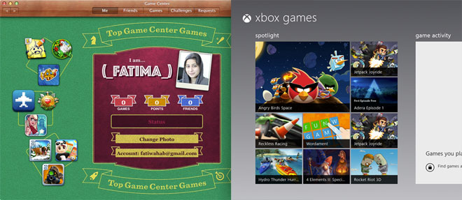
Xbox Games introduced in Windows 8 lets you monitor your gaming activity on Xbox and buy games. Games purchased from the Windows Store can be launched and you can see your friends’ gaming activity there. It’s essentially the Xbox Arcade ported to Windows 8. At present, you won’t be able to play a game you’ve bought for Xbox in Xbox Games on Windows 8 and while it isn’t likely to change considering that may translate to Microsoft killing the Xbox platform itself, there may be another possibility of allowing you to sync your game progress across Xbox and Windows for the games you have purchased on both the platforms. Games you’re playing on the Surface can be resumed on your desktop and some games like Skulls of the Shogun are already set to take advantage of this. Players of the game, regardless of whether they are on a PC or Xbox, will be able to play against each other live. Microsoft is leveraging its position in the gaming industry excellently here and improving an already excellent experience.
OS X Mountain Lion has Game Center – another app ported from its mobile platform. Unlike Xbox Games that serves as a dashboard for your Xbox, Game Center is where you can connect with your friends and challenge them to games. The only problem is that Mac is not a very popular gaming platform and there isn’t much scope here at present.
Whether you attribute the intelligent integration of Xbox Games to Microsoft already having a very popular gaming platform to connect with and tossing it on to the OS, or you recognize that Microsoft has aptly understood what it takes to create a great gaming experience, Xbox Games has more promise than Game Center could have in years to come. More importantly, this might open new avenues for generating revenue for developers and they will favor it for that reason alone.
Start Search vs Spotlight Search
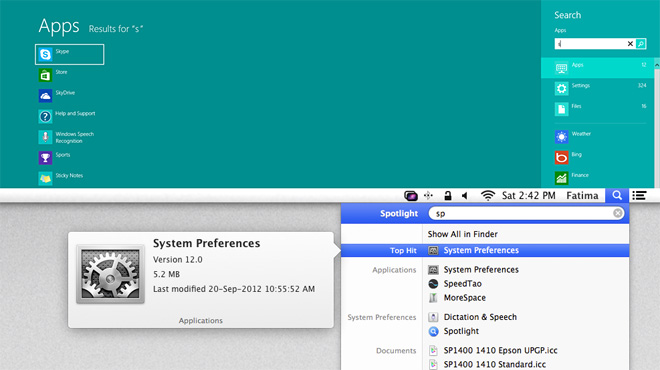
Windows 8 has introduced context sensitive search for apps, files and settings. The feature itself – called Smart Search – is actually very smart, but with the segregation of items into apps, settings and files, you have to know which category a particular item falls under when you decide to search for it. The search feature lives in the Charms Bar and can be invoked from anywhere but has a major shortcoming – you can’t use it to search for folders, and must to return to the Desktop view and open File Explorer there to do so. Apart from that, search is still as good as ever and makes it considerably easier to open an app in Modern UI mode.
OS X Mountain Lion has Spotlight search – an equally sophisticated file and app search feature that allows you to search your system extensively using additional operands to narrow the search down.
While both search features are good, Spotlight seems to be slightly annoying since keeping unwanted files out of it is a bit of a challenge for the average user, as Spotlight indexes everything and it takes the knowledge of its additional operands to hide unwanted results from it. Smart Search in Windows 8 on the other hand appears to be faster and more tame, but switching between the Modern UI and Desktop View to search folders and apps isn’t what you can call convenient.
Activity Monitor vs Process Manager
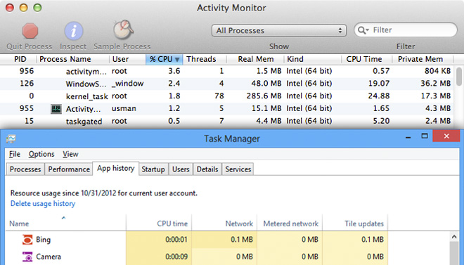
Windows 8 has a new task manager; it has a simplified view and a more complex detailed view to suit the needs of both average and power users. The new task manager, known as Process Manager, is excellent; it gives you a segregated view of apps, background processes, and windows processes. You can view the CPU, memory disk and network usage for each one but best of all, you can view how much data an app is consuming and view recently accessed apps from the App History tab. Managing startup items is also delegated to the Process Manager with details on how important a process is and a dedicated tab for viewing the services that are currently running.
Activity Monitor in Mountain Lion gives you fewer details. It would be unfair to call it insufficient since it gets the job done for most users; you can quit an app and get similar memory usage details for it, but it doesn’t give much further information. CPU and Network usage is not as detailed and there is no way of identifying Mac processes from it.
Windows has always had a more feature rich, albeit complicated task manager and it’s been simplified in Windows 8 without losing functionality or reducing the amount of information that’s provided.
Metered Connection vs Third party apps
Windows 8 introduced a data usage monitoring utility that should have you drooling rainbows no matter which operating system you favor. Metered Connections monitors how much data has been consumed for any connection of your choice. It’s possibly something you will appreciate more if you’re using a data plan on a tablet, but even for your desktop, it’s a great way to see how much data you’ve used, especially if your ISP has monthly data download restrictions. Mountain Lion has nothing on this built into the OS, though there are a few apps you can install to achieve the same functionality, provided their price tag isn’t an issue.
Windows 8 Gestures vs Mac Gestures
Windows 8 has introduced gestures for navigating the OS; the gestures differ for touch screens (think tablets) and track pads (think laptops) and currently, only devices that ship with Windows 8 support it at the moment. Though once the appropriate Windows 8 drivers for your track pads are released, you should be able to bring up the Charms bar, the app bar, and the right-click menu with a few fancy wrist flicks.
Mountain Lion has a more rich list of gestures; provided you have a track pad, you will likely find its easier to navigate your way around Mountain Lion with gestures than you would on Windows 8. Windows 8 users on a touch screen device will probably have an easier time but Mountain Lion has the edge for track pad users for now.
Safari vs Internet Explorer 10
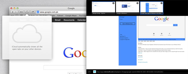
Internet Explorer 10 is catching up with other, more popular browsers, with added support for HMTL5 forms, drag & drop, link previews, the extra layer of security added by SmartScreen, Do Not Track, and spell check. Safari 6.0.2 likewise had a little catching up to do itself with the addition of an Omnibar and the Do Not Track feature.
Both browsers even things out when it comes to features and in all honesty, the real browser war to fight would be against Chrome or Firefox. Safari does make it possible for you to send tabs to Safari on iOS and when you’re trying to bridge the gap between desktop and tablet, features like this matter.
Conclusion
As mentioned at the start, this post doesn’t compare one operating system with another. It compares how each operating system has implemented a particular feature in itself. The conclusion here is that the major interface overhaul that Windows 8 has gone through has, to some extent, effected the execution of its new features. OS X still has a more cohesive feel to its feature set, though the gap between its desktop and tablet OS is wider compared to Windows 8, which eliminates this gap entirely.
There are definitely some excellent new features in Windows 8 that OS X users might want but likewise, Windows 8 users might like some features from OS X. Windows 8 will have a longer learning curve for many; the introduction of several new features in a new UI and their consequent execution could be something of a source of frustration for those who don’t adapt to change easily. In contrast, OS X Mountain Lion doesn’t have a learning curve that steep, with users coming from previous versions being able to adapt and use its new features easily. So the first conclusion to draw here is that Windows 8 has great features but the way they function now, learning and getting used to them will be a challenge.
With respect to bringing tablets and PCs closer, Windows 8 looks to do it by providing the same platform for both types of devices, ensuring that the apps you have available on both devices are the same with not so much as a pixel of a difference. It falls short when you look at how data across apps can’t be synced at the moment, but file backups to Skydrive should help diminish the problem. It doesn’t solve it entirely though, since the amount of space you have in your Skydrive, free or otherwise, will always be limited. In some cases, you really do need to backup app data and not files, and that’s where there is a sinking gap in Windows 8.
On a more positive note, Windows 8 is not the horror many are imagining it to be. There are hiccups to it and there is no doubting that, but some features like Metered Connections, Bitlocker, the Process Manager, File History, the login screen, Windows Store and even the Modern UI are worth the few tears you will shed going through the learning process.
What needs immediate attention and will probably be most irksome for users is the constant jumping around between the Modern UI and the classic Desktop. Lastly, the adoption rate for the Surface in particular and other Windows 8 tablets will impact how well the OS is received. It’s likely that users with a Windows 8 tablet will react better to a Windows 8 PC.

Great review thanks 😀
Used windows for 4 years, now started using OSX it rocks.. 🙂
Beautifully written! 🙂
The difference between lion and mountain lion is much smaller than windows 7 and windows 8. Of course the learning curve is less steep on OS X.
All evidence suggests it has to be less steep.
I believe bitlocker was first introduced in Vista, and not 7. It was one of the selling points of Vista Ultimate.
Also, in terms of notification system, this has been hotly debated in Windows Phone. The notifications system of Windows now is two parts. You get the toasts, which are similar to the notification popups of iOS, but then the notifications are going to be on the Start Screen themselves, which is a main feature of Windows and Windows Phone; you can see all your new notifications from the Start. So not only do you get quantitative notifications like the iOS Home screen, but you also get details depending on how the app handles its app tile just like a notification system generally tells you.
For file explorer, the argument about not being able to see all files and which are recently accessed is slightly skewed imo. There’s that link in under favorites that says Recent Places, and it will bring you to the folders you were at recently. You can also add Recent Items there to see recently accessed files. That just takes one click to accomplish. Now, if you were to talk about there being no ModernUI explorer from Microsoft, that sounds a bit more valid.
Windows 8 really doesn’t compare with OSX MTL in terms of features, function, reliability, or value. So far, most people think it’s laughable, even compared to Win 7. It’s just another Vista or Window 98… see a pattern here?
So when you give a thumbs up to it in an article that skipped half the value of OSX, you just look bad. Won’t be back to this site.
By 98, you mean ME? 98 was good. I still run a win98se Server.
Nice article. There is no doubt that mobile and desktop are converging. Windows is moving faster in this convergence than OSX/iOS, but both are moving there. I have been impressed with Windows 8. In the section on search, you left out the ability of the OS to extend its search capability well beyond the files and settings….but also to reach deep into application specific content. It is extremely powerful and rewarding.
Please note: *effect* is NOT a synonym for *affect*.
Thanks for pointing it out; corrected.
Was Mission Control even mentioned in this article??? Because this single feature wins the battle in favour of OSX. End of story.
I think the single feature that is MISSION CONTROL with multiple desktop, easy rearrangement and advanced multitasking puts OSX way ahead of windows 8. There is no other feature on Widows or Mac that i use as much as MIssion Control. It is a complete and essential feature, which should be an example of modern computer and every system should implement it in the feature. BTW, windows 8…is still just windows 7, just with refreshed UI. I find metro style quite useless.
The Windows vs Mac question will always be more of a personal preference; as in your opinion Mac OS X is superior, in someone else’s opinion Windows 8 would be superior. It’s all about the OS we are more comfortable with and more productive on, and that differs for different people.
Oh I love both. But Windows need to do some sort of FullScreen and multiple desktops features.. It increases productivity so so so much.
No it was not mentioned because its insignificant (you can just alt + tab or window key + tab in windows). And no windows 8 is not a refreshed windows 7 Microsoft performed some great enhancements within the code itself and lets not forget direct x 11, and a more efficient memory management, and games who will be optimized for this new OS, sadly Macs are on the lower spectrum when it comes to games. Game companies place you at the last in their priorty charts, (excluding the IOS).
Mission control is insignificant? Ok, good for you. See you have progressed a lot in the last 15 years since windows 95. Btw, games are insignificant, i dont care about games when i buy macbook. They have nothing ro do wirh productivity, only procrastination.
It was windows 98, but most people were stuck on 95 because they were too poor or stubborn. Obviously you dont know how to take advantage of mission control and simply call it a hassle.
Im Mac user about 5 years, and i already tested Windows 8, he got much more speed than Mountain Lion. Wheres the performance comparatives? Here in my mbp i5 the Windows 8 run so much faster in every segment.
hmmm….well, i think you cant really compare speed. I found windows really slow many times. Mac is always fast if you dont jam it with too many apps. I can see when my mac slows dows if i have many useless apps.
Funny, because I have a ton of applications and games installed in Windows and it’s still fast. That is a severe design flaw if an OS actually slows down due simply to the number of install programs.
i dont really measure the speed. But I know if I am running multiple apps in the background on MacBook and play movie and browse safari. Mac sometimes can get a hiccup (rare). Another thing i noticed, is that my PC is always more efficient than Macbook. Bigger hard rives and better all other components will always be better.
I bet that Mac Desktop is blazing fast no matter how many apps are there.
Don’t always be a good side at a Mac, let see for real! Windows 8 is the super fast operating system that Microsoft ever built. Shut Down and Start these two are better than Mac OS X Mountain Lion or whatever. Mac users always like that then they should have beaten by Windows users cause they called black as white and white as black, and these makes a very big mistake! Finally Windows is the best! easy and cool with various apps more better then the Mac!
i will say it again…Windows is far from the best. It is still the same as Windows 7, as a matter of fact…it works the same as windows vista or XP. There is no revolutionary difference between these four OSs.
Mountain Lion has two features that change the entire game and windows does not have it. They are : MISSION CONTROL and FULL SCREEN MODE. Mac maintains to be the best when we speak of being productive.
Once Windows guys decide to implement somthing similar to Mission Control, I will be impressed.
LOL really, those features are hardly a step forward. Being productive? have you heard of MS Office that productivity at its finest and it has mac version too. My ipod shuffle is more groundbreaking than Mission Control or Full Screen Mode.
Ms office? Who care about ms office, i use it once every 3 months if i have to write essay. Ms is not a part of built os system. Ipod shuffle is more ground breaking than mission control, ok. Then it means is 10 years ahead of any windows version. Since windows does not really offer such intuitive multitasking. And i dont use window key + tab because it is conterproductive and not even close to mission control. Just wake up.
Damian, just a friendly reminder that I must always be capitalized in English. “…i use it once every….” is incorrect, and retarded looking. Makes you look like my eight-year old niece. Try “…I use it once every…”. That will make you look like a man.
Typing on ipads and iphones is retarded, therefore i am not gonna use capital letters. It is just slows the typing a lot and it is too much hassle to correct stupid “i”. I doubt that using capital i has anything to do with my mamhood. Unless i have some serious issues.
Weird I have a fully loaded PC and it still runs like fresh out of the box.
That thing is a positive point with PC. If someone want PC only for web surfing and checking mails, he doesn’t need to invest too much and he can buy a Windows PC with low configuration and at much cheaper prices than Mac. And if a user want gaming on his PC, he can modify his PC.
Windows 8 Rocks! 🙂
you had versioning in 2003, Vista, 7, and in 8.
the difference here is that in 8, it got its own dedicated application, File History.
before, if you recall, it was called Previous Versions, where you could right-click a file or folder, go to Properties and click the tab called “Previous versions”. see http://weblogs.asp.net/jgalloway/archive/2008/05/21/using-vista-previous-versions-to-restore-files-you-thought-you-d-lost.aspx for an example.
“…unless you have a track pad, switching between windows of the same app will not be comfortable.” Command-backtick (the key above the Tab key) has always been the direct way to switch between an app’s windows, just as Command-Tab switches between apps. Or did I misunderstand the issue?
Thanks for pointing that out, 🙂 I’ve updated the post to include the shortcut you just mentioned though it still doesn’t preview the windows and that is a bummer.