Test & Easily Present Responsive Websites To Others With Dimensions
Websites are increasingly being accessed from mobile devices instead of PCs. When viewed on a tablet or a mobile phone, not all websites scale properly to show a mobile-friendly UI. To overcome this issue, website owners have the choice to either make a dedicated mobile version of their website, or develop a responsive design that scales based on the device it is being accessed on. That’s where an app like Dimensions comes handy. It’s a simple web app for developers, designers, and website owners that lets you view any website in your browser as it would appear on three different types of devices: mobile phones, tablets, and PCs. The app is excellent for both testing and demonstration purposes.
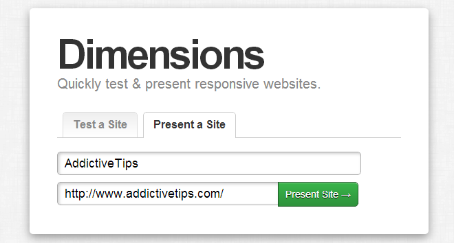
Firefox users might not have much need for Dimensions, thanks to the Responsive Design Tool. Though even with the tool, it isn’t possible to share the output with someone else – something Dimensions allows you to do. The service is easy to use and has a clean interface. The landing page lets you test the app out with a URL already added. Click the ‘Present a Site’ tab and enter the URL for the website you’re working on. You can add a custom title for the website as well, and it will appear on the preview page.

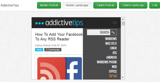
Hit ‘Present Site’ and you will be redirected to the website in a frame sized to match the screen size of a mobile phone. The title you entered will appear at the top-left, and the right side will be dedicated to buttons for switching to a different view. Dimensions allows you to view a website in both portrait and landscape mode. The dimensions that it supports include 320×480 for mobile phones, 1026×770 for tablets, and full i.e. as large as your browser window can go for PC view.

There aren’t any sharing options for the view you get, i.e. you don’t get a link or any social media buttons that will let you share the design publicly or privately, but the URL of the page is all you need. Paste it anywhere and whoever clicks the link will see exactly what you see on your end.
Dimensions is different from other web apps that offer the same functionality in that it lets you view a website in different screen orientations. It falls short when you think about different screen resolution in each category though. If it had a wider selection of mobile and tablet screen resolutions to choose from, it would be significantly more useful. Since responsive design is triggered by screen resolution, knowing how your website will look like on popular high-resolution mobile devices like the Galaxy note or one of the many other mobile phones with screen resolutions larger than 320×480 would be a good feature.

now i can test my site faster. thank for this, pretty useful.