Remove Your Name Badge From The Top Right Corner Of Chrome
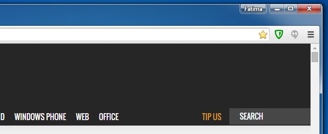
Chrome looks different this morning. It’s obviously received an update and this update comes with a nice new account manager, and a guest account feature. The new feature and the new profile manager look good, once you have them open, I’m not too wild about the profile icon changing to read my name, and that it now sits next to the minimize, maximize, and close buttons of the Chrome window. All I foresee happening to me is an increase in incidents of accidental clicks and doing things I never meant to do. On top of all this it looks terrible with the otherwise clean interface that we’ve loved in Chrome for so long. Dare I say it but it looks like Firefox with the Menu bar enabled. Chrome kind of fixed something that wasn’t broken. It’s also decided to use the profile picture associated with the Google account that’s currently signed in to Chrome as the new user profile icon. However, for anyone not happy with either of these visual changes you can revert back to the old UI. Here’s how.
Update: This post has been updated to solve this problem for Chrome v.44.0.2403.107.
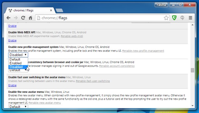
Go to Chrome://flags and look for ‘Enable the new avatar menu’ flag which is set to the ‘Default’ value. Set the value to ‘Disable’and relaunch Chrome.
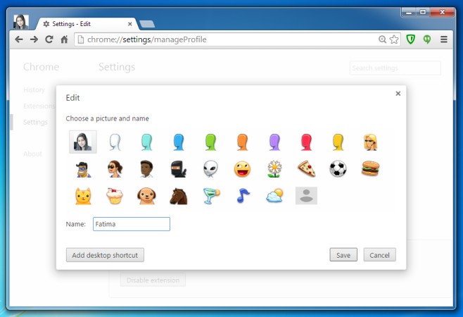
This removes the name badge from the top right and what you end up with is your profile picture at the top left, where the user icon originally appeared. To revert to the old pizza, ninja, or flower profiles pictures, click the profile picture you have now and select the ‘Edit’ option. Alternatively, you can just go to chrome://settings/manageProfile. From the icons listed, select which one you want to use.
You will have Chrome looking more or less exactly how it did before the update. The shortcomings of this are that you are effectively disabling the new account manager which, apart from its UI change, is kind of nice. It isn’t kidding around when it says it lets you delete your profile and that was definitely a much needed feature. It allows you to delete all your account information with a few clicks and is pretty great if you’re wiping Chrome clean.
For Chrome v.44.0.2403.107.
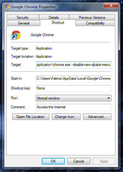
One of our readers, Luff has reported that this isn’t working on the latest version of Chrome and has given us a work around. To remove the name badge, you will instead have to use a switch. Right-click on the Chrome shortcut you use to launch it and select properties. Append this switch “–disable-new-avatar-menu” at the end of the Target field without the quote marks. It ought to look like this;
Click Apply and relaunch Chrome. You will be rid of the name badge.


windows 7 did not allow me to do the switch?? any ideas
What error are you seeing when you try to make the change?
chrome flags for avatar said disabled yet person1 still there.
i finally got the chrome.exe –disable-new-avatar-menus… to work however it’s clunky in that i have to be care to execute the correct one with the switches.
apparently version 44 is the last version the switches work. so chrome is on life support in my estimation, what am one of 3 million effected, i expect i will be dropping chrome.
my computer seems to accept the command but when i open my browser its still there. is there anything else i could do?
With the new version, this method is not working and adding the “–disable-new-avatar-menu” to the shortcut isn’t working either. :S HELP!!! Somebody help me please.
Thank you!
You’re welcome.
do you know how to do it on a Mac?
With the newest Chrome update, the stupid profile button is back and changing the flag now does nothing. Wonderful. Any ideas?
That option “Enable the new avatar menu” is not listed.
Thank you so much! That was a very annoying thing, Bro!
thanks person it helped a lot i like updates but that was so annoying to look at i mean come on why is it even there in the first place thanks again.
It is terrible, not only its distracting but I don’t think most people want to display their name on every single tab. Privacy reasons comes into my mind. Do you want someone that peaks your screen in some public place to know your name?
Or how about you need to send someone a screen-shot about something on the Internet or to fix some issue, now your name is on top of the browser.
I don’t think most people are going to like this from Google at all. Its also stupid. Why do you need a constant remember that you are logged in? Do you guys also put your name on top of your monitor to know its you? I assume Google wants users to stay logged in but this is going to cause the opposite effect. They are going to log out just to clear their name from the browser.
The change, in my opinion, might be more useful for people using Chromebooks. Google is pushing them to education institutes and that does call for a lot of sharing. It still would have been nice to have a more obvious ‘off’ switch for this.
very good tip for me
Cheers for that. It was strange to see the change, especially because I didn’t get a notification of the update.
And you will never get one. Google updates things in silence in the background. Its not even optional to install something. Actually the updater checks several times a day and sends data to Google servers as well, including a unique ID of every install. Creepy.
*looks over shoulder*
That is creepy indeed!
That’s why I use Chromium instead.