Get The Google Reader Look & Feel In Feedly For Chrome With This Theme
July is inching closer, and that means some of us will soon be faced with a tough decision: what service to use in Google Reader’s place? We have compiled a handy list that you can take a look at and find a suitable Google Reader alternative. By far, Feedly is one of the most preferred services of many Google Reader that they will be migrating to, and I’m personally inclined towards it myself since they’ve been proactive about filing the gap that Google Reader will leave behind, and because the interface is the best I’ve seen. For those who are planning on switching to the service, Feedly Reader is a Chrome extension that modifies Feedly so that its interface is more like Google Reader. The extension has no customization options and acts like another theme for Feedly.
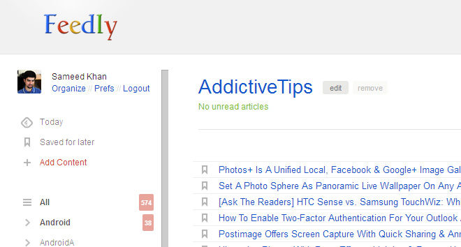
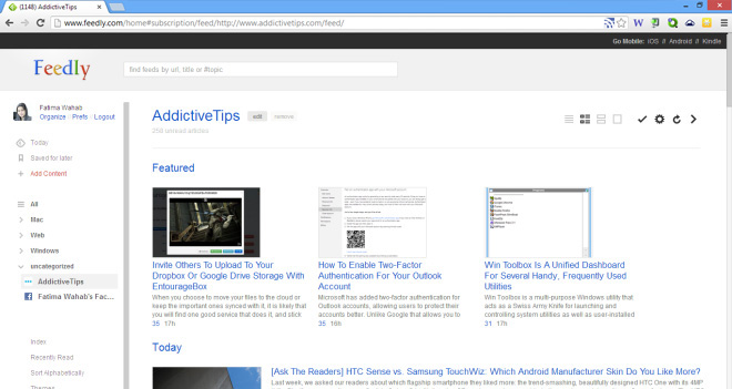
Install Feedly first if you haven’t done already, followed by Feedly Reader. Feedly Reader will take effect immediately after it’s installed, and there is no need to reload Feedly if you already have it open. You’ll immediately notice that the right sidebar in Feedly will no longer be visible, and the color scheme will resemble what you’re used to seeing in Google Reader.

Every page in Feedly Reader is modified to make it look as much like Google Reader as possible. You will find that the themes provided by Feedly are no longer effective. The layout remains mostly the same, except one or two features that are now hidden. No labels are changed, but the reader now takes up all available space inside the window like Google Reader did. Resizing the window will resize its contents as well. Most noticeably, the Feedly logo will shed its original color and take on Google’s colors.

The selected feed that you’re reading is also highlighted differently with Feedly Reader installed. In Feedly, the feed was represented by a grey highlight whereas with Feedly Reader, it turns red. It is not quite the same as the small vertical red bar that appears next to a feed, but it’s close enough. This only applies to the left sidebar, and the news items within a feed are not marked the same way as they are in Google Reader i.e. with a yellow highlight and a thin vertical blue bar on the left. In their list view, the feed items still appear greyed out.
The extension has no impact on the service’s functionality, and loading feeds or scrolling through items works just as fine as it always did. Feedly Reader does a good job of mimicking the color scheme of Google Reader, but there’s some room for improvement in certain areas, and the extension can be developed further to imitate it even better.
Install Feedly Reader From Chrome Web Store

tnx!