Hands-On Review Of The Redesigned iOS 6 App Store
The App Store is Apple’s crown jewel in iOS and with the release of iOS 6, it has received a major overhaul. From user interface changes to new features, the App Store has been significantly improved from its previous iteration. There have also been several under-the-hood changes and improvements to existing features. In what follows, we will take a look at all the new features and improvements App Store has received in iOS 6.
Apple Apps Recommendation
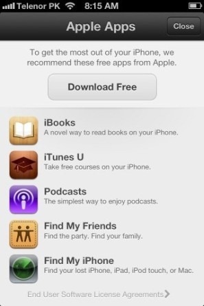
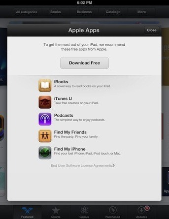
When you first launch App Store on your device, you should see a recommendation popup by Apple, suggesting a few free apps by Apple and allowing you to install them together in one click.
Revamped User Interface
Whether you have used the new App Store or just seen it in action, the most major change you must have noticed has to be the revamped user interface. Those of you familiar with the Chomp app discovery app will instantly recognize these changes to be inspired by it, and that indeed is the case. Apple acquired Chomp earlier this year and it seems the developers of Chomp have since been busy working with the App Store development team to deliver the new, ‘Chompy’ App Store experience in iOS 6.
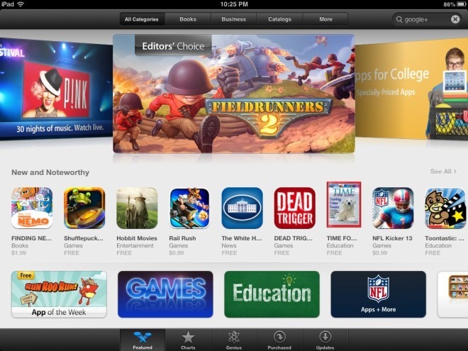
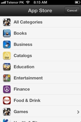
As you can see above, the ‘Categories’ tab has been removed in favor of the ‘Genius’ tab. The whole UI has seen a major upgrade, incorporating a beautiful featured apps slide show on top, with several curated lists of popular apps below. Categories have been integrated into the Featured tab itself. Here is how it looks on the iPhone/iPod Touch.

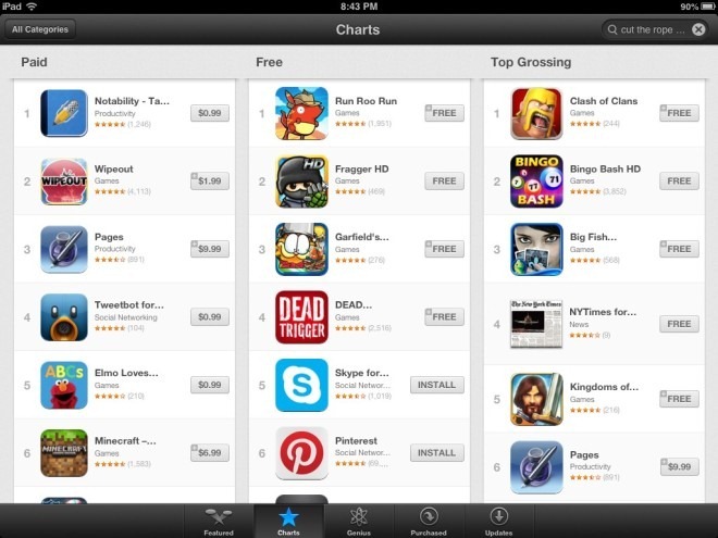
The ‘Top Charts/Top 25’ tab has been replaced with ‘Charts’, simplifying and unifying things. This feature has also seen an interface overhaul, showing the Paid/Free/Top Grossing categories in vertical columns and eliminating horizontal scrolling altogether. The result is a much more refreshed, clean and fluid UI that doesn’t look overwhelmingly busy or cluttered.
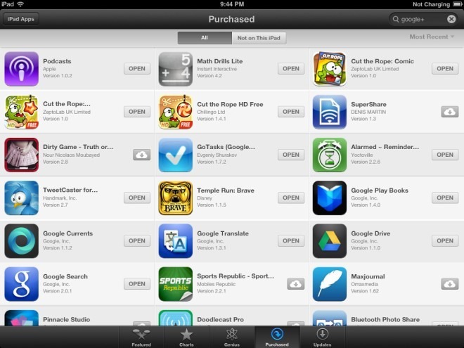
The ‘Purchased’ tab has been updated to utilize the new and refreshed interface and replace horizontal scrolling with vertical while keeping its content and functionality unchanged. To emphasize iCloud integration, the apps you have purchased or previously installed will now show up in the Purchased section with a iCloud icon next to them that you can tap to install them on your current device.
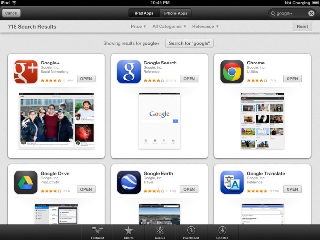
The enhanced Genius feature now utilizes the recommendation engine from Chomp to offer more relevant app suggestions, displaying results in fancy looking cards rather than a list. The Search feature has been similarly changed to display results in cards.


We must say these cards look really amazing, and flicking them left and right to scroll between the Genius recommendations and Search results is a pleasure. Both Search and Genius features display a similar card interface on the iPad as well. As you can see below, Search on iPad no longer has a ‘Device’ selection box and instead offers two tabs for iPad and iPhone apps on top. In addition, the category and price selection menus have been made compact and the sorting menu has been added in the same line with them along with the result count, providing more room for displaying the results.
App Info Pages
A lot has changed on the info pages for apps. Previously, you were shown a detailed description on top and had to scroll down to view screenshots, see app information like company, size, version etc., and access the ratings button, which took you to yet another page to view ratings or add your own. In iOS 6, all of this has been replaced with a refreshingly revamped interface that integrates all these features together in a much more useful way. If you have used Android, you will be surprised at how similar to Google Play Store this area feels.
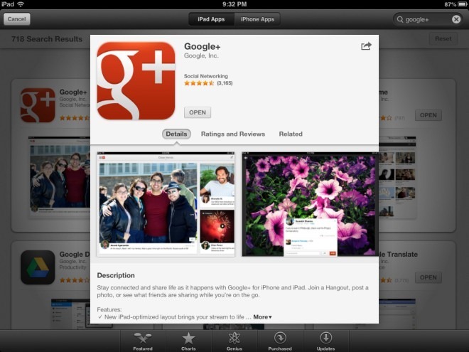
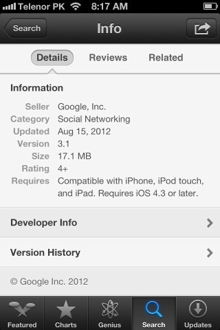
On the new Info page, you can see app Details, Ratings and Reviews and a newly added section for ‘Related’ apps. It’s the same information, just organized in a better way. Screenshots are now shown on top in the ‘Details’ view, similar to Google Play Store on Android, and the rest of the information is neatly organized in the sections below, showing an expandable Description, What’s New, detailed Information, Developer Info and Version History.

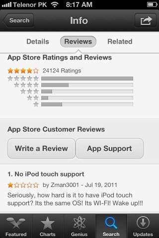
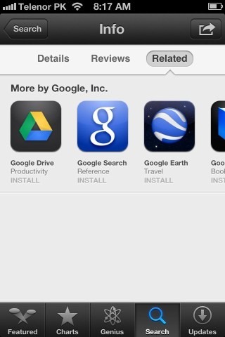
The ‘Reviews and Ratings’ section has also been enhanced with Play Store-like details on star ratings. The App Support page link has also been relocated to this section. The ‘Related’ feature also seems to be inspired by Android’s Play Store, and shows you apps related to the one you’re viewing. It could definitely use some improvement, as currently it only showed us more apps from Google as related apps for Google+, when it should have instead shown similar social networking apps like Facebook and Twitter.
New Sharing Menu
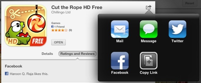
The new universal sharing menu integrated throughout iOS has also been added to App Store, replacing the old ‘Tell a Friend’ feature. You can now share an app using Mail, Message, Facebook or Twitter, or just copy its direct web link.
Facebook Integration
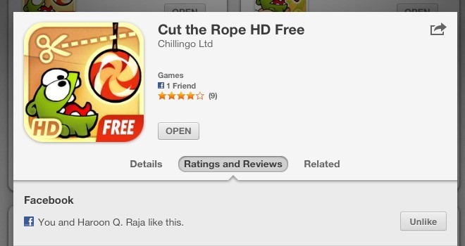
The deep Facebook integration newly introduced in iOS 6 is also visible in the new App Store. In app cards, you can now see how many of your friends have liked that app, right above its rating stars. You can like or unlike an app under ‘Ratings and Reviews’, where you are also shown the names of your Facebook friends who have liked it.
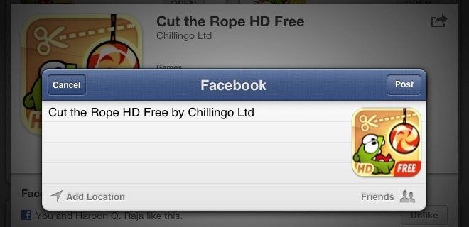
You can also share the app’s iTunes Store link on Facebook from its option in the Share menu.
App Installation and Updates
iOS 6 also brings some changes to the app installation and update experience, aimed to eliminate a couple of annoyances that were there in the way applications were installed in iOS 5 or earlier.
Ideally, there should be options in App Store settings to choose when you want to be asked for your Apple ID password while installing or updating apps. While iOS 6 doesn’t quite bring that flexibility, it does take a step in the right direction. You no longer need to provide your Apple ID password each time you update a currently installed app or install a paid app that you have already purchased. However, you still need to provide it when installing any app for the first time, which is just ridiculous for free apps. Let’s hope a future update addresses this annoyance too by at least offering an option to disable it.
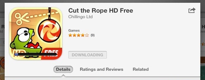
Upon installing an app, you are no longer kicked back to the home screen to view the app’s icon and progress bar while it installs. Instead, you can stay in the App Store to browse and install more apps to your heart’s content. Don’t worry about keeping up with the app installation progress – it’s now visible on the app’s card right in the App Store itself. It’s a completely logical step since not many find the idea of sitting and looking at progress bars on icons on your home screen very amusing. It will also urge many to browse and install more apps by keeping them in the App Store. Progress bars still show up on the app icons so if you do find looking at them while they install amusing, by all means feel free.
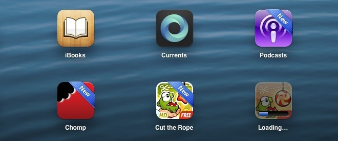
Lastly, your recently installed apps now have a nice, shiny ‘New’ ribbon on their home screen icons. This makes spotting these fresh arrivals on your iOS device much easier.
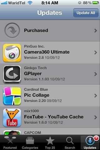
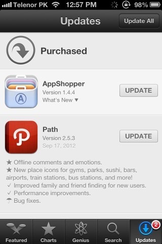
When it comes to app updates, you can now see the new changes made in the update by simply tapping “What’s New” under the app’s name in the list of updates. In addition, ‘Update’ buttons have been added on all the apps in the list, letting you directly update them individually without having to open their details screen. The comparison below shows these changes, with iOS 5 on the left and iOS 6 on the right.
Changes in Settings
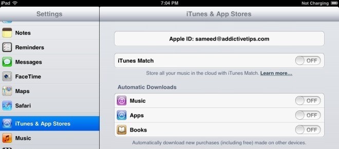
Apple has combined settings for all its stores into one in iOS 6. The section for App Store in iOS 6 Settings has been renamed to ‘iTunes & App Stores’ from ‘Store’, thus combining settings of both these stores together. Therefore, the ‘iTunes Match’ toggle is now available under this section.
Under the Hood
In addition to the visible changes, there have also been several improvements under the hood. First and foremost, the app ranking algorithm has been tweaked, reflecting the work done by the Chomp team since its acquisition by Apple. The visible aspect of this change can be seen in the way the ‘Genius’ feature has been made more prominent, while giving the ‘Categories’ section a backseat.
This will call for a need at the developers’ ends for better app store optimization, as app rankings now incorporate Chomp’s algorithms that rank them based on several factors including popularity on blogs and social media websites, user response to recommendations and an analysis of search terms used by users in App Store, browser as well as certain other search apps.
This concludes our coverage of the new iOS 6 App Store. Stay tuned as we continue bringing you details on the latest and greatest from iOS 6.
This guide is a part of our guide to new features in iOS 6, which covers the following topics:
- Panorama Camera Mode
- Facebook Integration
- Shared Photo Streams
- Brand New Maps App
- Passbook
- New Native iPad Clock App
- Phone App Improvements & Do Not Disturb
- Privacy Control
- Siri Improvements
- Remodeled App Store (Currently viewing)
- Safari Improvements
- Mail App Improvements & VIP Inbox
- New Accessibility Features
- List Of Other Lesser Known Features & UI Changes

The new card based result list totally breaks the possibility to discover a new great app that has yet to climb the Apple rating. This change truly sucks, and will discourage many new developers from creating apps. Let’s say that you release a new app called “Dog training explained” and let’s say that this app is truly awesome, breaking new ground in usability or whatever. Upon first release, it would enter rank 1000 or so in it’s category. The only way this app would ever be displayed to a user in the App Store is if somebody searched for “dog training”. Still, the new awesome app would be at around place 40 or so. Previously, the user would have to scroll _once_ to see the app in the result list. Now, the user needs to swipe 40 times. This will never happen. Instead, the user will download one of the first three apps, that has been around for years (that’s why they end up top three). This new change will simply put stop new apps from being discovered. This is bad, really bad. Please Apple, this is wrong, revert the change now!